Industrial Playground was founded by Ajay Shah in 2008 as a way to design and create furniture that expresses his personal style. What started out as a personal exploration resulted in a collection of furniture characterised by graphic forms, material construct, and bold colours.
Each piece expresses his natural desire to break away from monotony and expected outcomes.
Industrial Playground is a furniture design practice based in Mumbai. Its work finds application in homes, leisure, retail, hospitality, institutions, and work spaces.
We work closely with architects, designers, and clients to propose our collection, as well as custom design for specific projects.
Contact us to discuss your project requirements.
We work closely with architects, designers, and clients to propose our collection, as well as custom design for specific projects.
Contact us to discuss your project requirements.
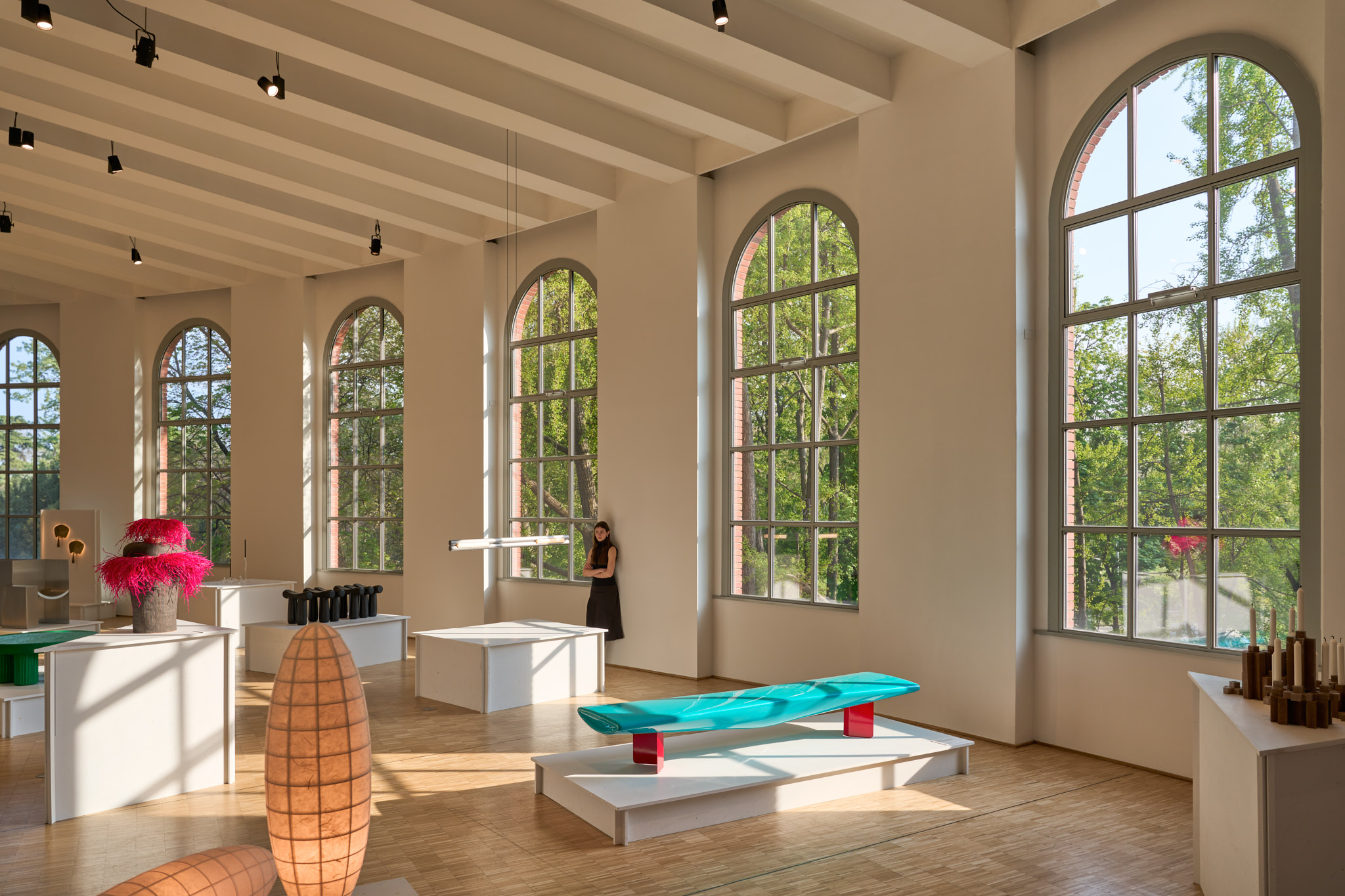
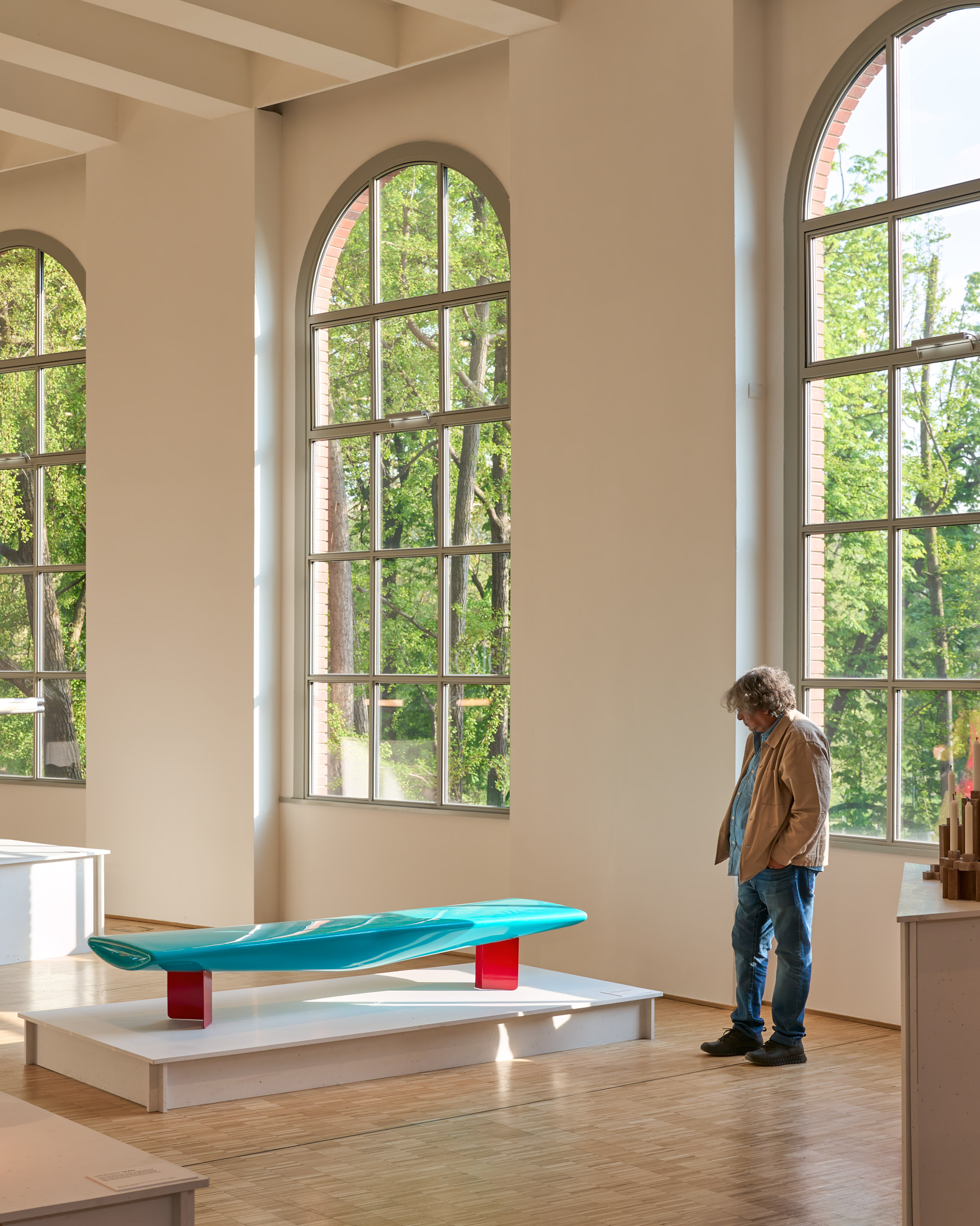
Float bench special edition at Design Mumbai 2026

The Float Bench was first designed in 2024. Since then, there has been an ongoing interest in exploring how the idea could evolve. Through a series of design studies, this has led to two new editions of the Float Bench.
These 2 editions were presented at the Design Mumbai Exhibition in 2025. The graphics for the exhibition were designed by Naomi Shah.
These 2 editions were presented at the Design Mumbai Exhibition in 2025. The graphics for the exhibition were designed by Naomi Shah.
Each edition is a one-off and will not be reproduced. They introduce a graphic composition of pattern and colour mapped onto the form of the bench - adding to its original character and giving it a presence that feels buoyant. The colours and patterns draw references from diverse worlds such as art and fashion.
The project represents a speculative design process - an exploration toward generating a new vocabulary for product design.
The project represents a speculative design process - an exploration toward generating a new vocabulary for product design.
Silicon Forest - Fortius Infra graphic design

Silicon Forest reflects a dual narrative—rooted in the culture of startups and innovation while drawing from the presence of a nearby reserved forest. The identity responds to a changing landscape of work where environments are shaped around people, enabling comfort, collaboration, and meaningful connections. It speaks to a younger, globally aware demographic that is technologically fluent and culturally fluid, seeking spaces that align with their evolving lifestyles. The visual language emerges from a contemporary aesthetic influenced by fashion, cinema, and new cultural formats, while remaining sensitive to sustainability and conscious material choices. The approach moves beyond a conventional logo to establish a cohesive graphic system—expressed through form, colour, material, and scale—extending seamlessly across architecture, spaces, and objects to create a distinct and integrated identity.
The representation of the graphic identity is demonstrated through a curated selection of well-regarded architectural projects from around the world, with the identity applied across both 2D surface graphics and 3D objects and signage, illustrating how it can inform and inspire the built expression of the development.


SIT bench at Triennale di Milano for Milan Design Week 2025
The SIT Bench measures 2400 mm in length and features a soft, rounded form with smooth edges throughout. Its seat resembles a bowtie in plan—wider at the ends and tapering at the center. In section, the form deepens at the center, creating a gentle dip that tapers outwards. This sculptural seat rests on two folded metal panels, creating a striking contrast between the curved volume and the angular base.
Designed in 2008, SIT emerged from a desire to blur the boundaries between art and design. Its bold colour palette challenges convention, offering a fresh visual identity. The seat is crafted in fibreglass, chosen for its fluid formability and seamless finish.
Designed in 2008, SIT emerged from a desire to blur the boundaries between art and design. Its bold colour palette challenges convention, offering a fresh visual identity. The seat is crafted in fibreglass, chosen for its fluid formability and seamless finish.
Ajay was selected as part of Material Alchemists, Wallpaper* Class of ‘25—a showcase of 20 designers from around the world pushing the boundaries of material and form.
SIT bench was on view at the Curva space in the Triennale di Milano for Milan Design Week 2025.
SIT bench was on view at the Curva space in the Triennale di Milano for Milan Design Week 2025.

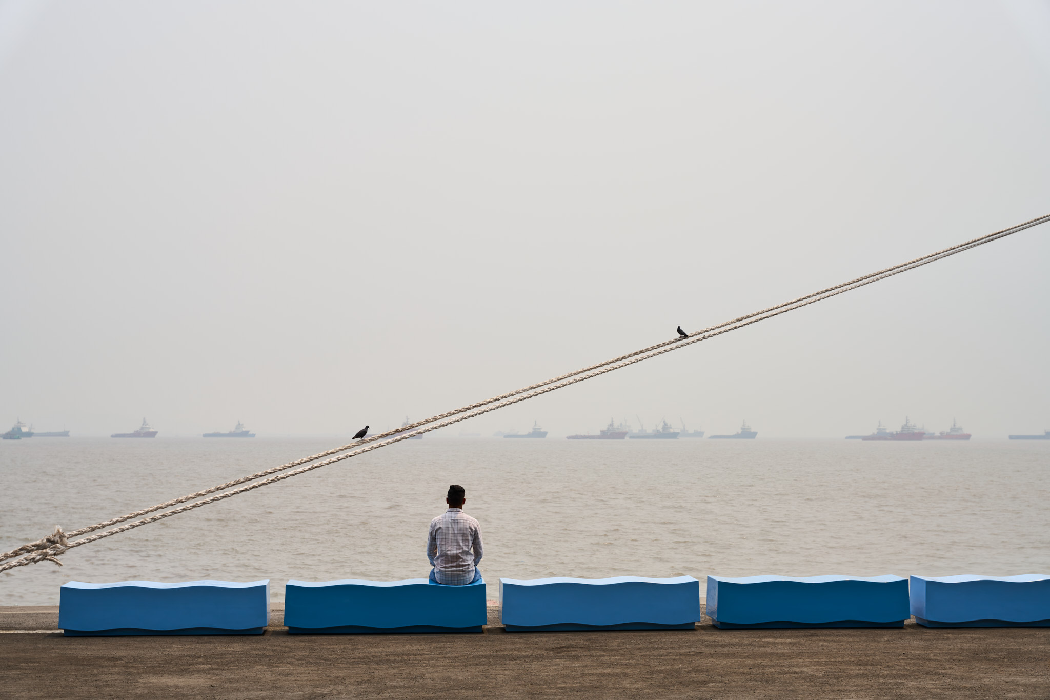
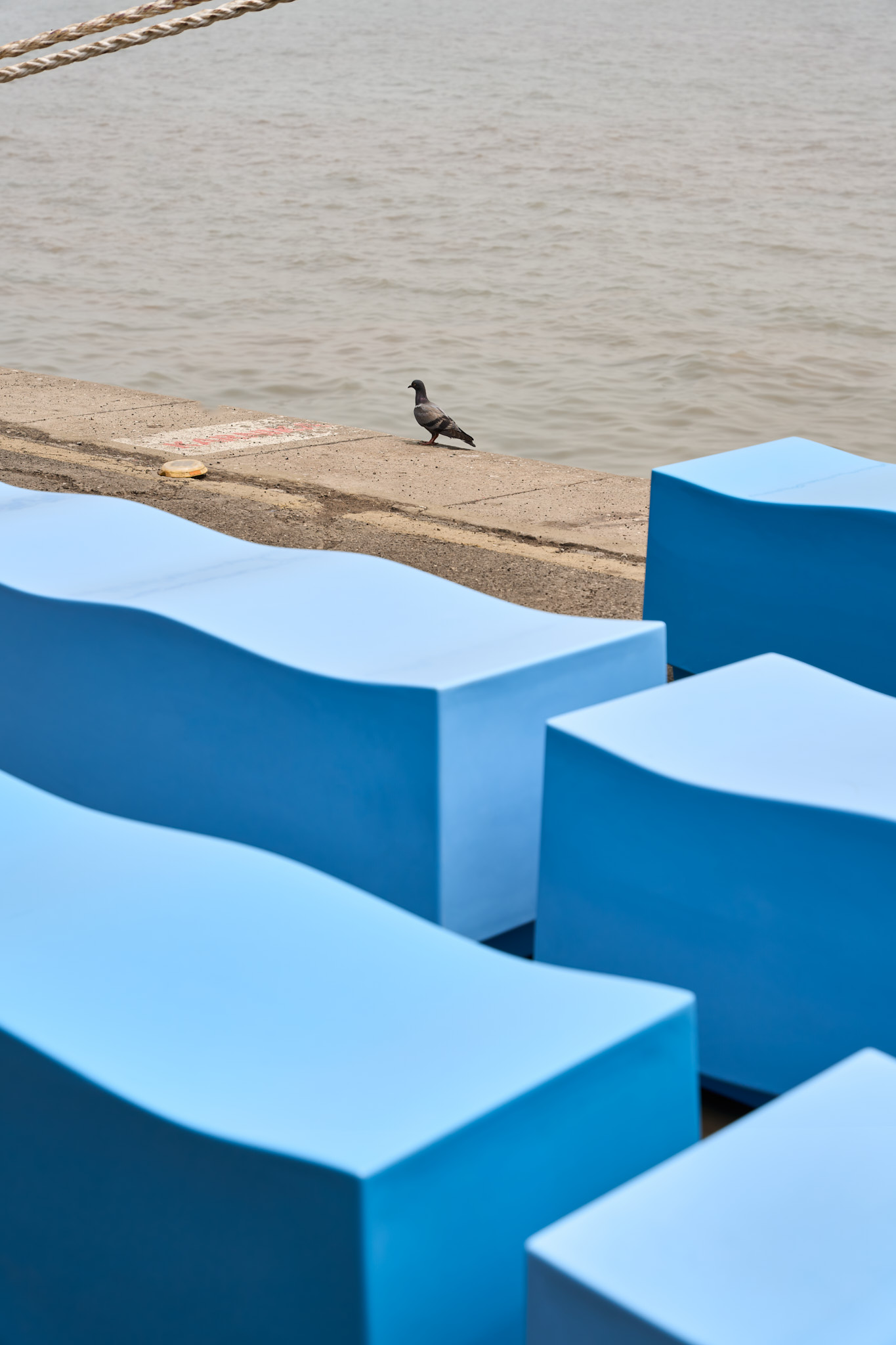
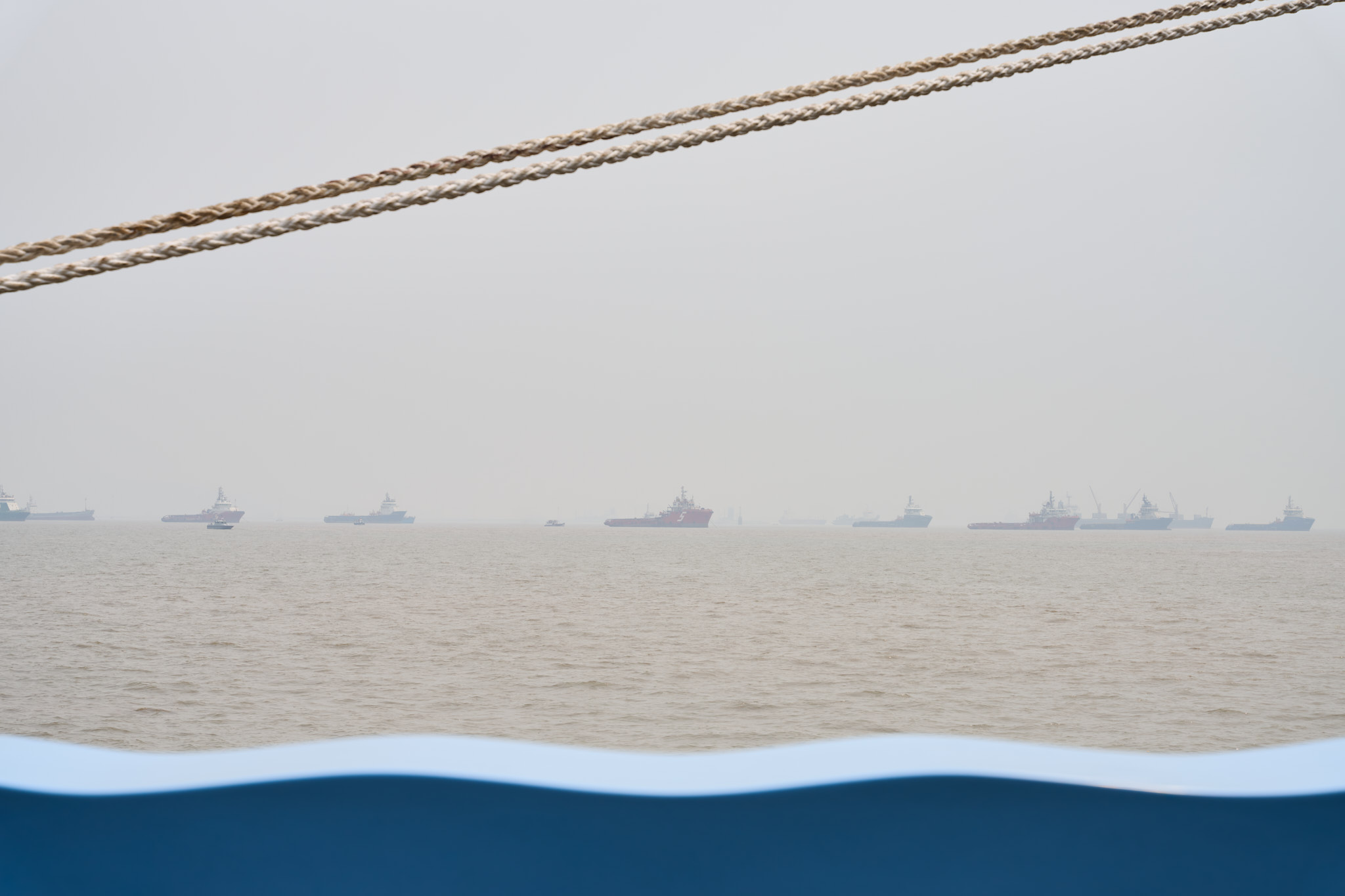
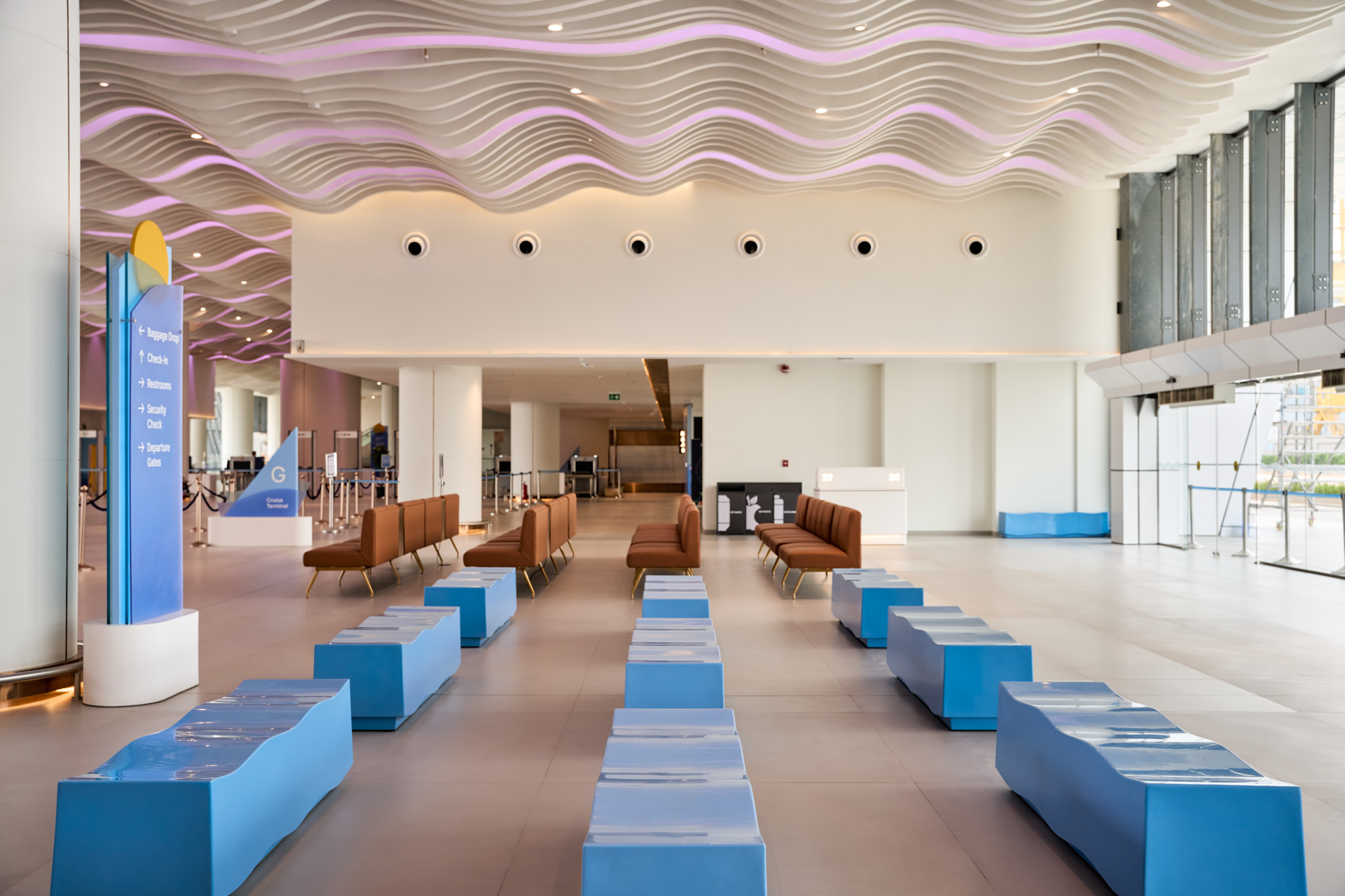
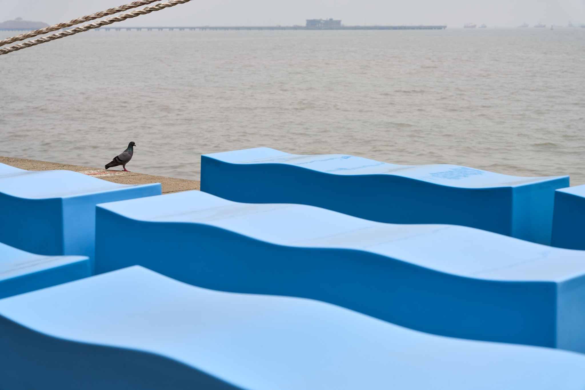
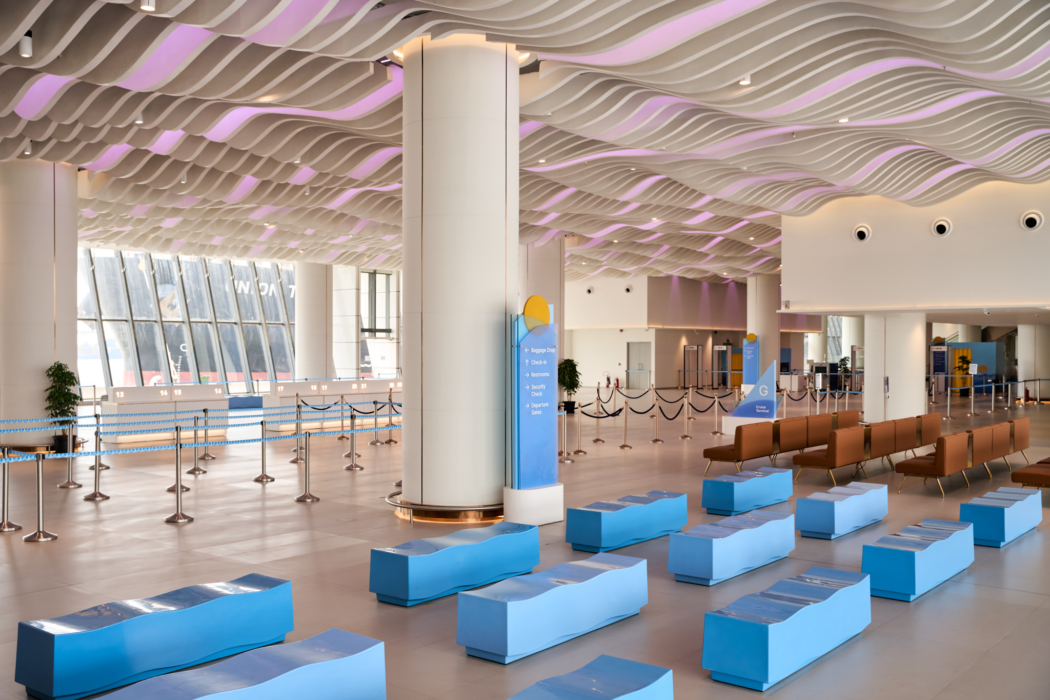
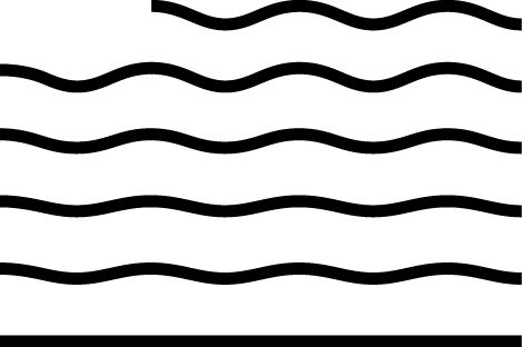
Wave Bench furniture design

The Ballard Pier Cruise Terminal is Mumbai’s first international cruise terminal, located in the city’s historic downtown near the Gateway of India. As part of a broader revitalization effort—including upcoming cafés and restaurants—we were commissioned to design seating for the departure and arrival lobbies. The seating, conceived as benches, draws from the terminal’s visual identity. Inspired by the wave motif in the brand language, we developed the Wave Bench—a sculptural, undulating form crafted in fiberglass for both comfort and character.
Finished in two custom RAL blues derived from the brand palette, the benches echo the colours of the sea visible from the terminal. Strategically placed across the space, the Wave Benches unify function, identity, and context—bringing a calm visual rhythm to the passenger experience.

The Ballad Pier’s graphic identity and one of their graphic assets