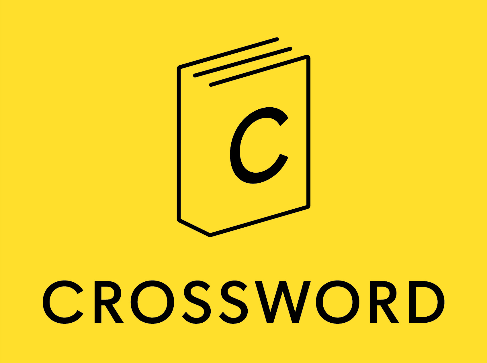
Crossword symbol


Crossword is a well-known bookstore chain across India.
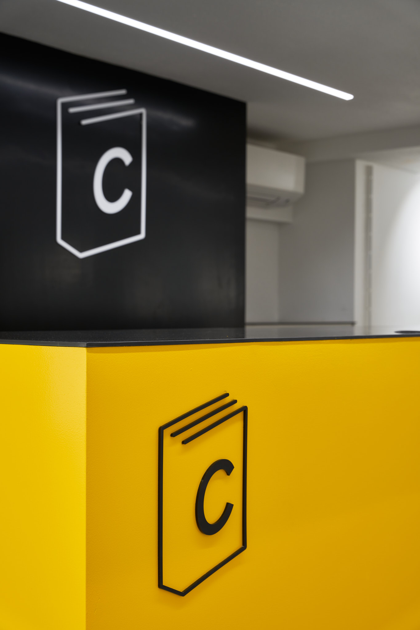
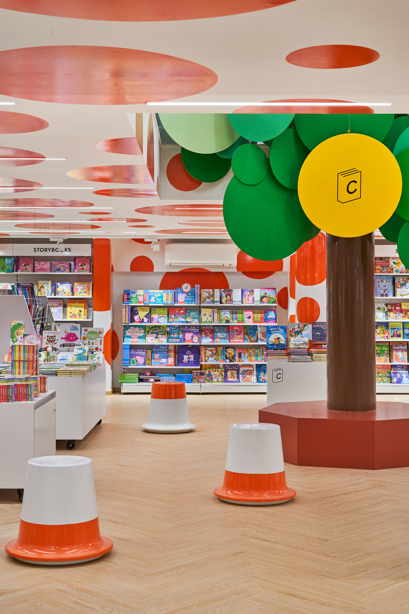
When we began designing their flagship store at Kemps Corner, there was a shared recognition that the existing symbol lacked a clear connection to books or reading. While retaining the original wordmark and brand colour, we set out to create a new symbol that more directly conveyed the identity of a bookstore.
When we began designing their flagship store at Kemps Corner, there was a shared recognition that the existing symbol lacked a clear connection to books or reading. While retaining the original wordmark and brand colour, we set out to create a new symbol that more directly conveyed the identity of a bookstore.
The result is a clean, line-based graphic that lends itself well to various applications—signage, merchandise, staff uniforms, and more. The long-term vision is for the symbol to stand on its own, becoming instantly recognisable and allowing the brand to be identified even without the wordmark.