Crossword Kemps Corner retail shop design
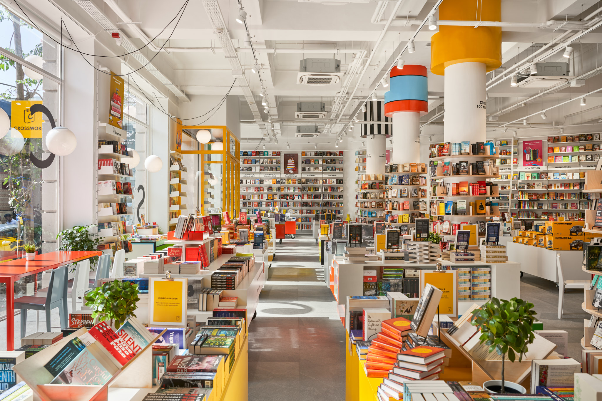
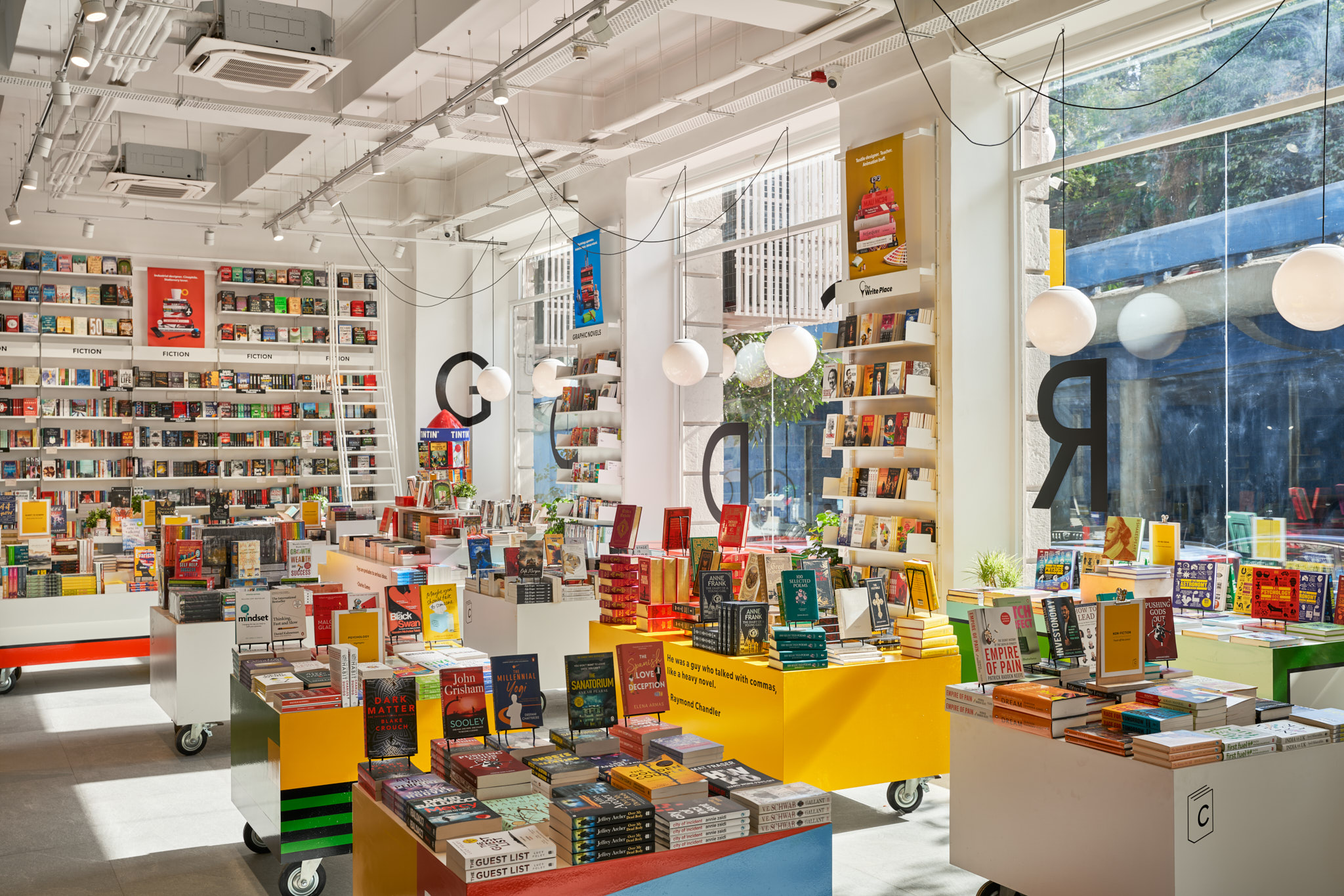
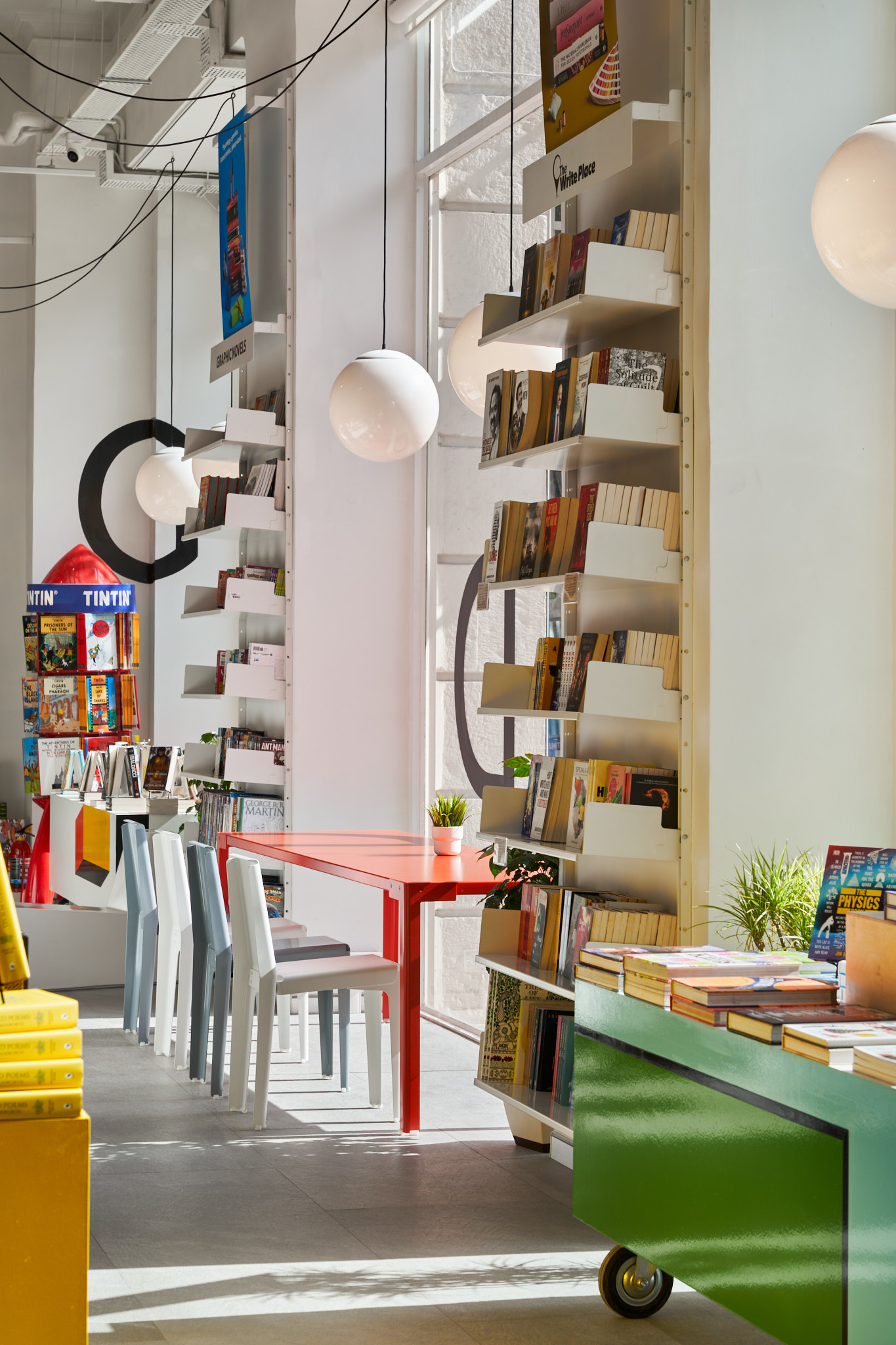
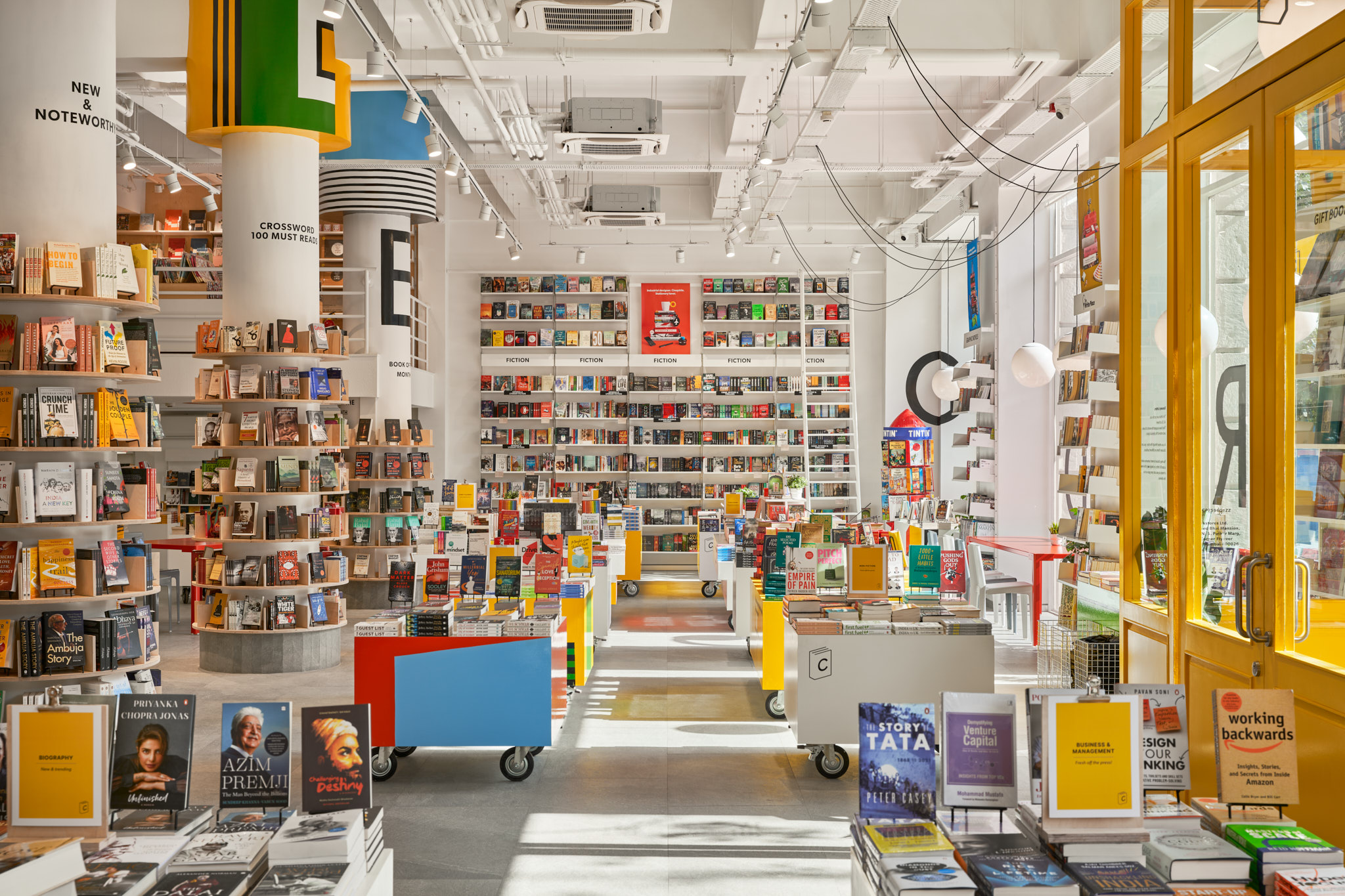
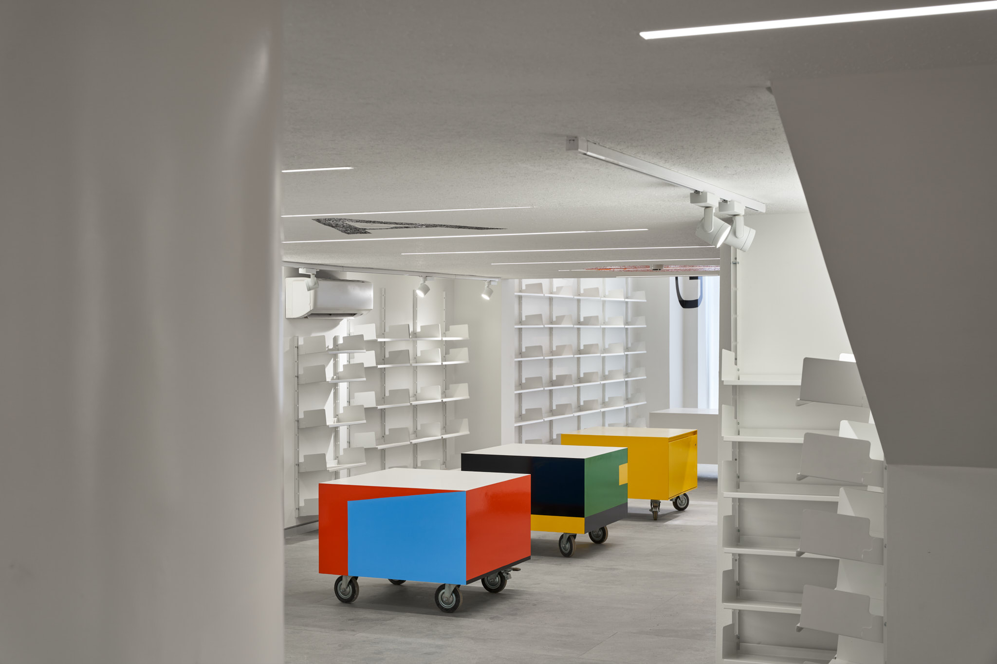
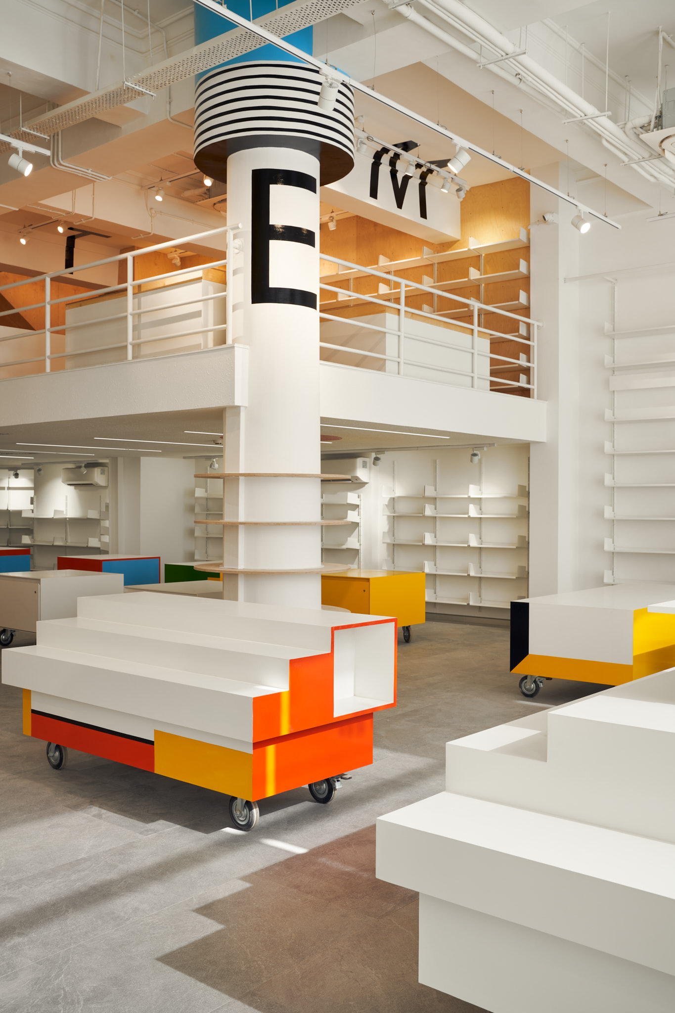
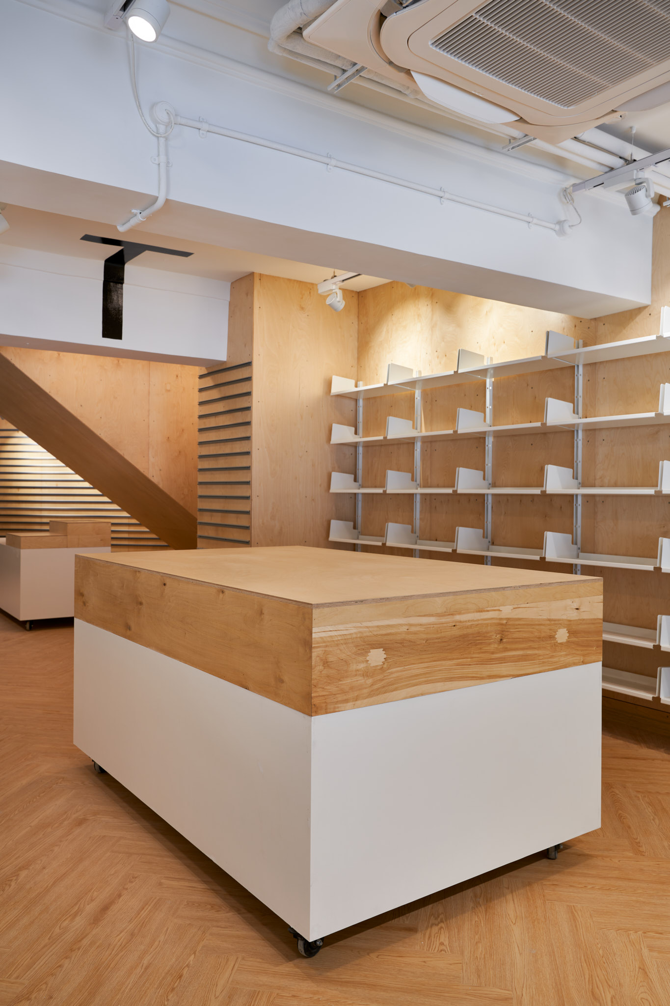
Crossword is a well-known chain of bookstores across India, with its Kemps Corner location in Mumbai serving as a flagship standalone store. Housed in a heritage building and spread over 10,000 square feet, our design focused on revealing the character of the original structure—exposing cast iron columns and ceiling details by stripping away excess cladding. The space encourages curiosity and attention to detail, with tall shelving that extends to the ceiling, accessed by a sliding staircase. Mobile display units on industrial wheels allow for flexible layouts.
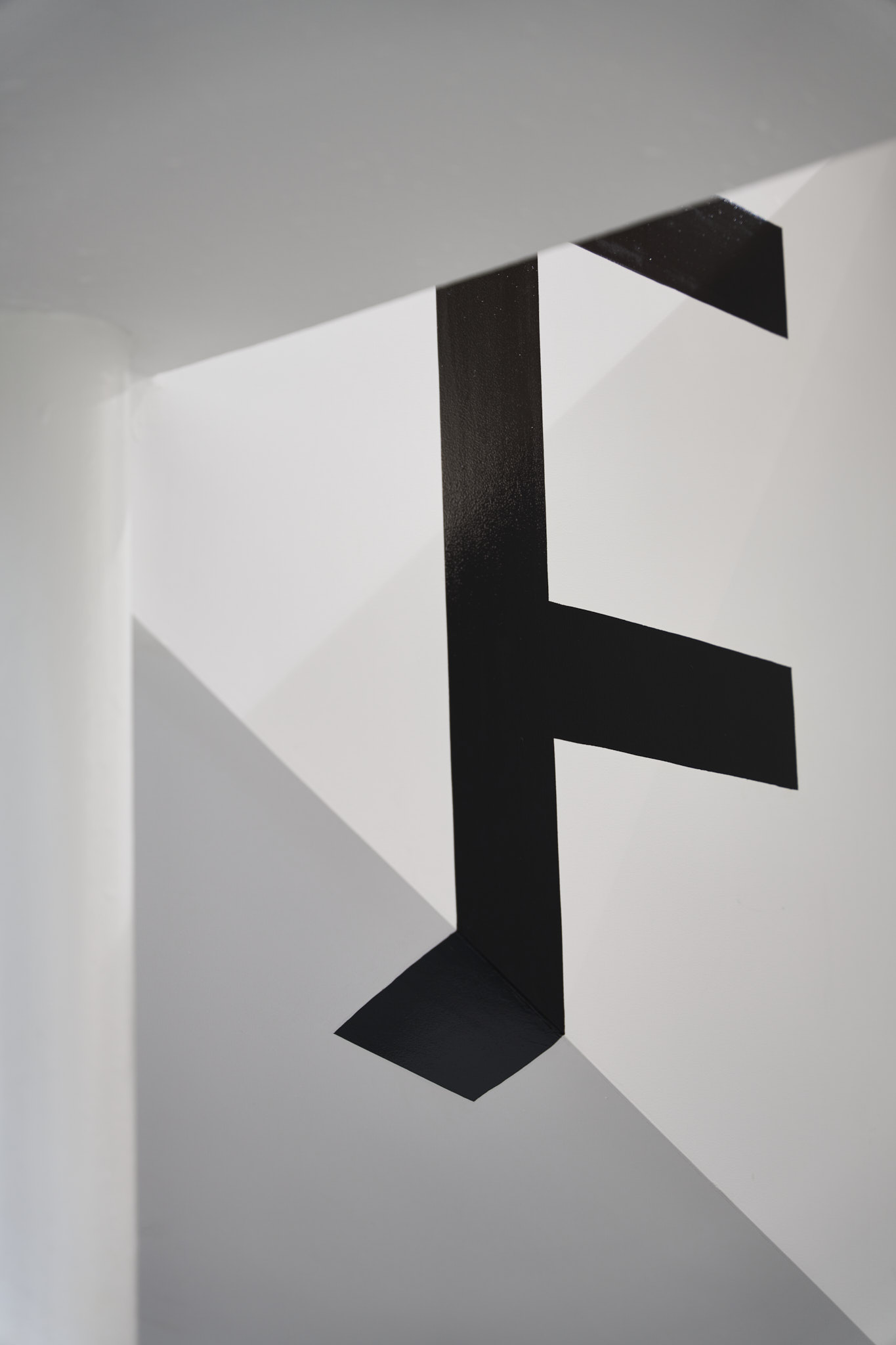
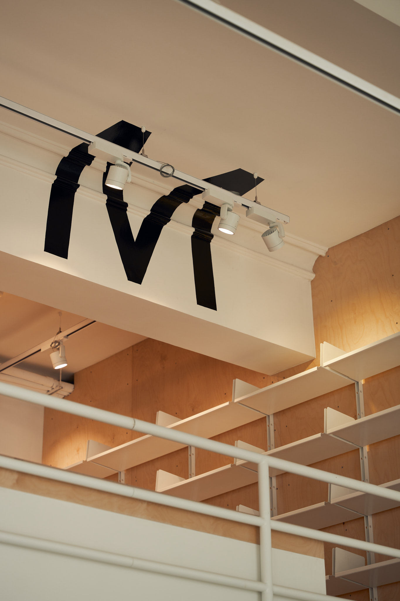
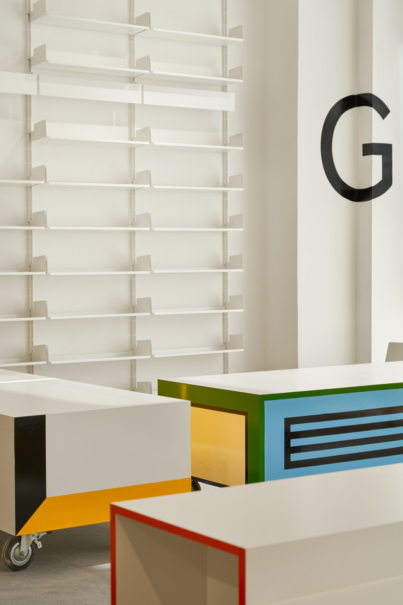
Graphic elements are woven throughout the store: the 26 letters of the alphabet appear playfully on surfaces like walls, ceilings, windows, and pillars, while colour and pattern accents nod to the Memphis design movement. A neutral white palette provides a quiet backdrop that lets the books stand out. Furniture from Industrial Playground complements the store’s modern, creative spirit.

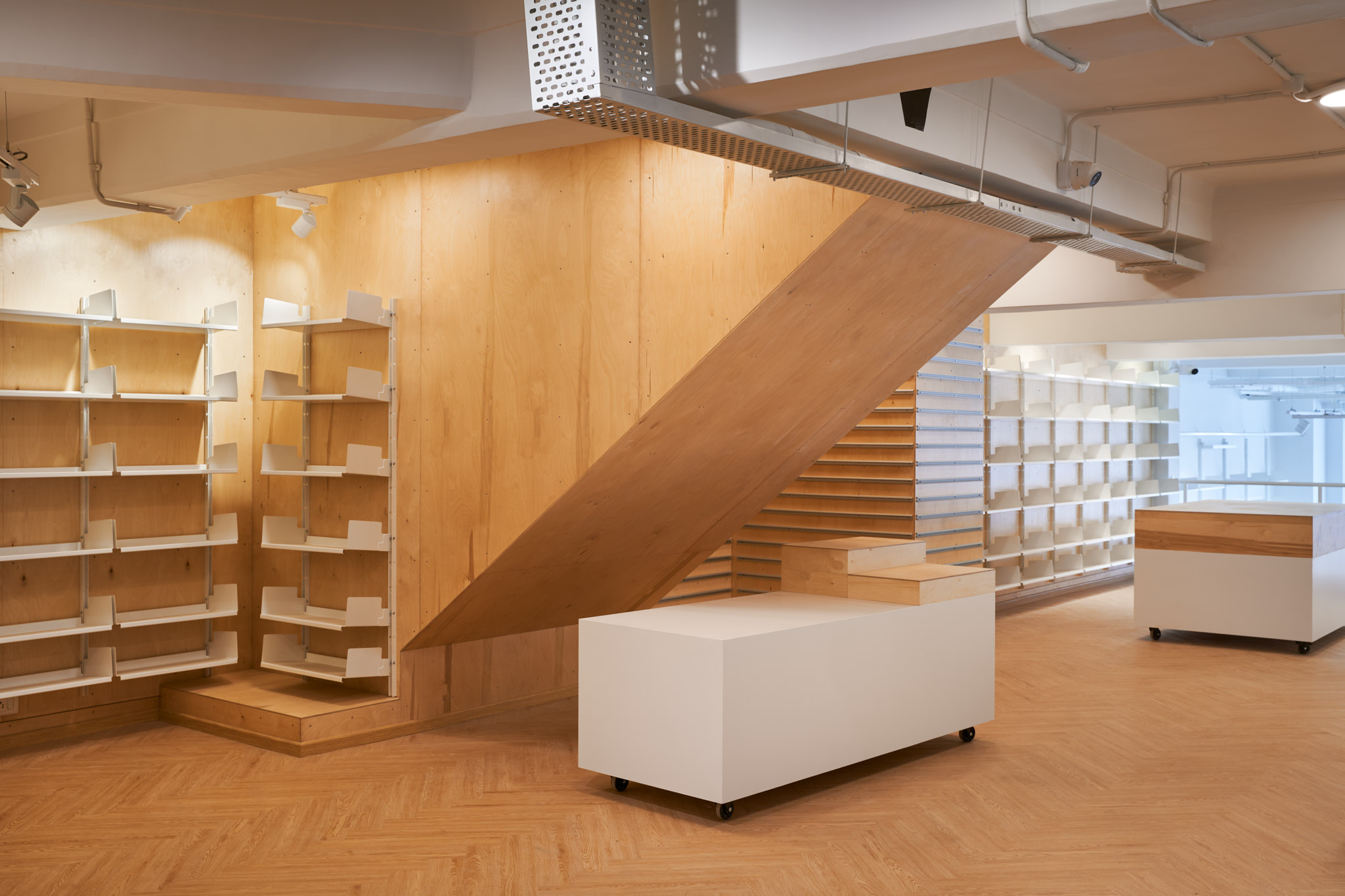
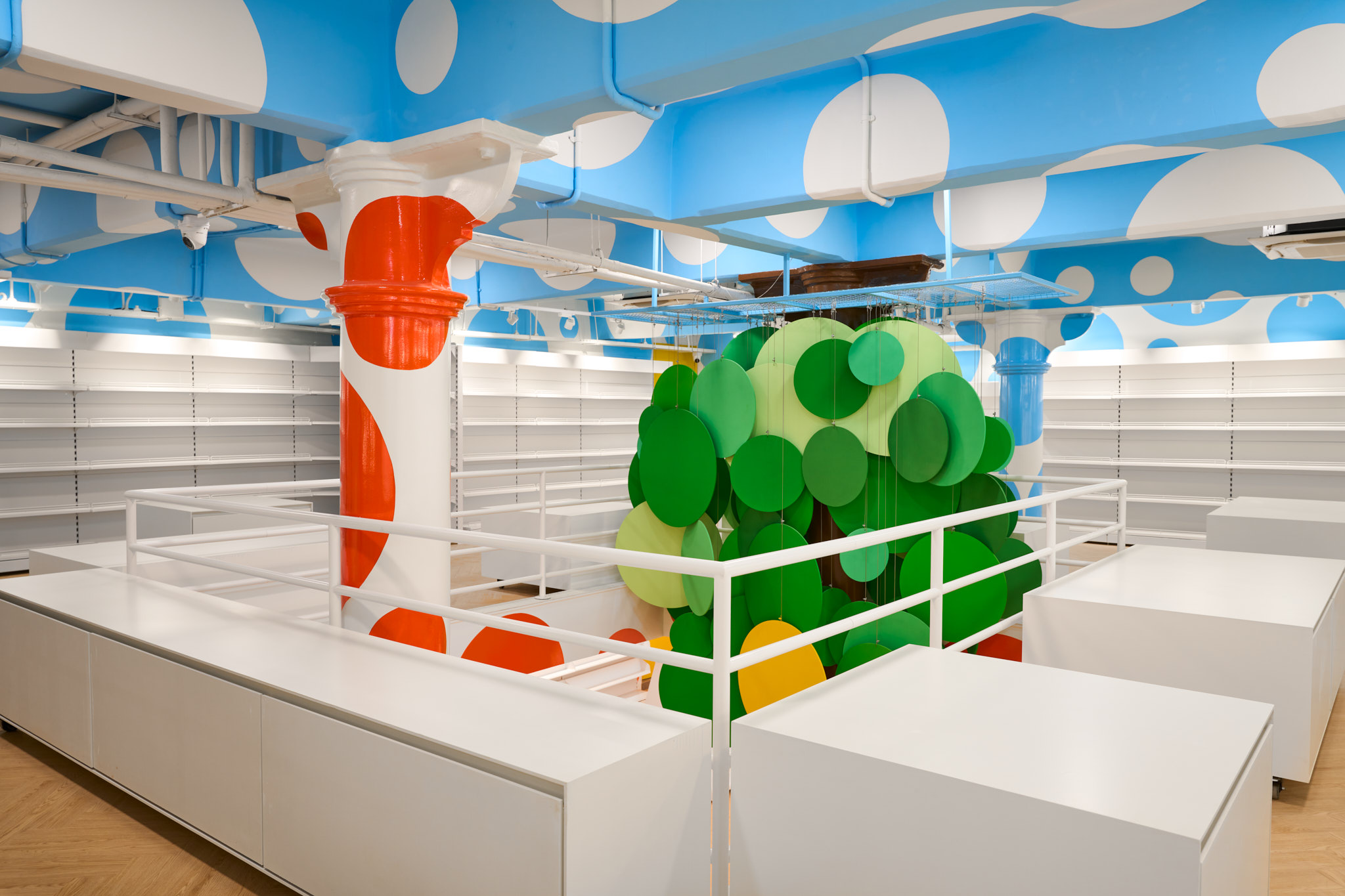
The exercise started with dismantling the existing shop. The earlier shop had evolved organically and spaces and shelves were created as the store's needs grew. We discovered the original building’s round columns that had been cladded in laminate ply, some cast metal columns, and other spaces that were unused for retail. The complex and decorative suspended ceiling, once an interior statement, when taken down, revealed a beautiful double-height ceiling of 16.0’ with original details of coffers, refined mouldings, and beams. The structure of the shop revealed itself as a classic interior, as this is one of the older stone buildings Mumbai has.
Having decided that it is vital to let the store breathe and reflect its original glory, the rest of the design planning followed to make the most of the openness. We now had the opportunity to have shelving that could go to heights of 12.0’, an entrance with a defined landing point that would become the transition space from outside to inside, and making the most of the limitations of the existing loft pockets.
Iterations of zoning developed; the front and all of the ground space upon entry for books, the loft for stationery and gifts, a coffee shop-in-shop, and toys.
A parallel exercise was underway to design a symbol for Crossword that set the tone for the brand being a bookshop first. The development of the symbol in some sense set the tone for the store design language; concise, clear, silent, and the ideal balance between impact and timelessness.
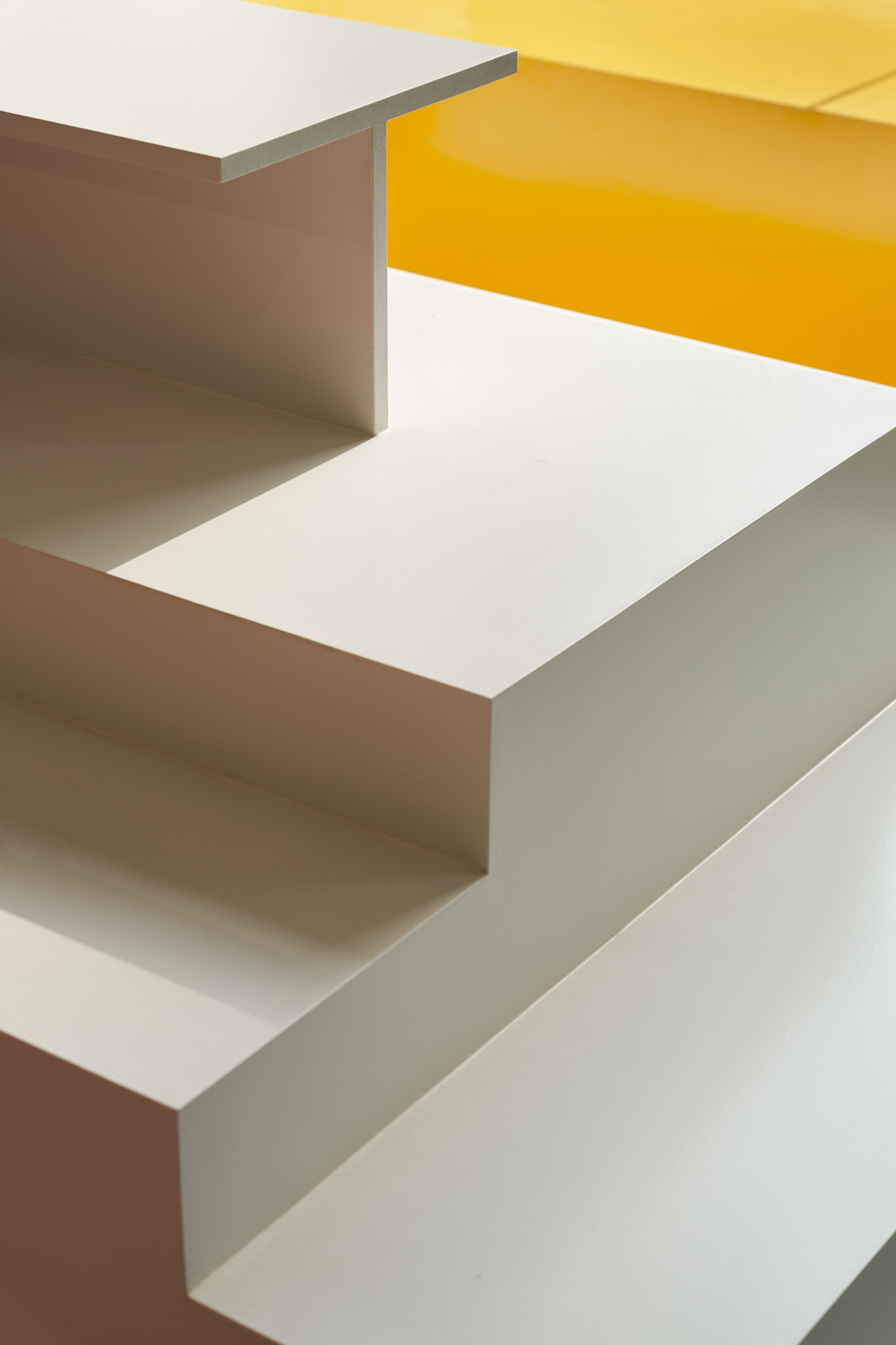
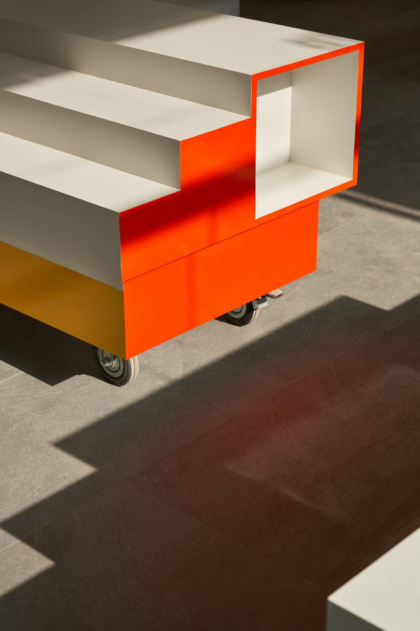
The decision to display books went through several form explorations; table formats, taller units, units with pockets on both sides, and structures that would create aisles. We looked at materials and finishes from light wood to metal finishes. We realised that the height of the store in the front allowed us to consider forms that have volume, rather than just tables. We also realised that rather than closing the store with taller structures and shelves; openness and flexibility of re-organizing the shop are better considerations.
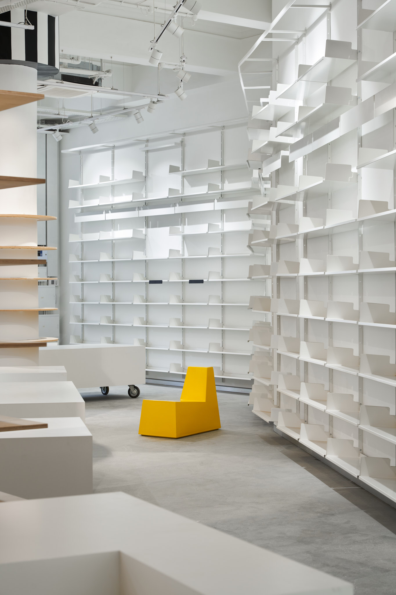
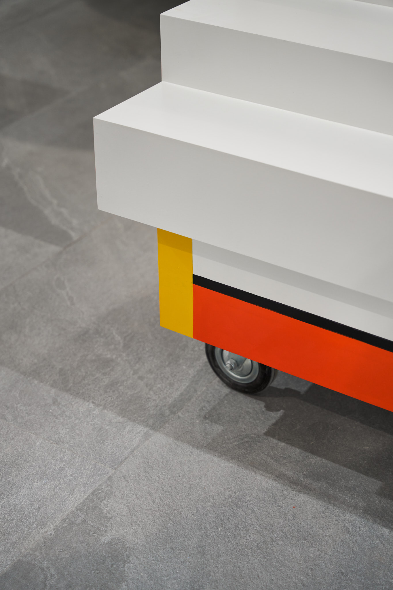
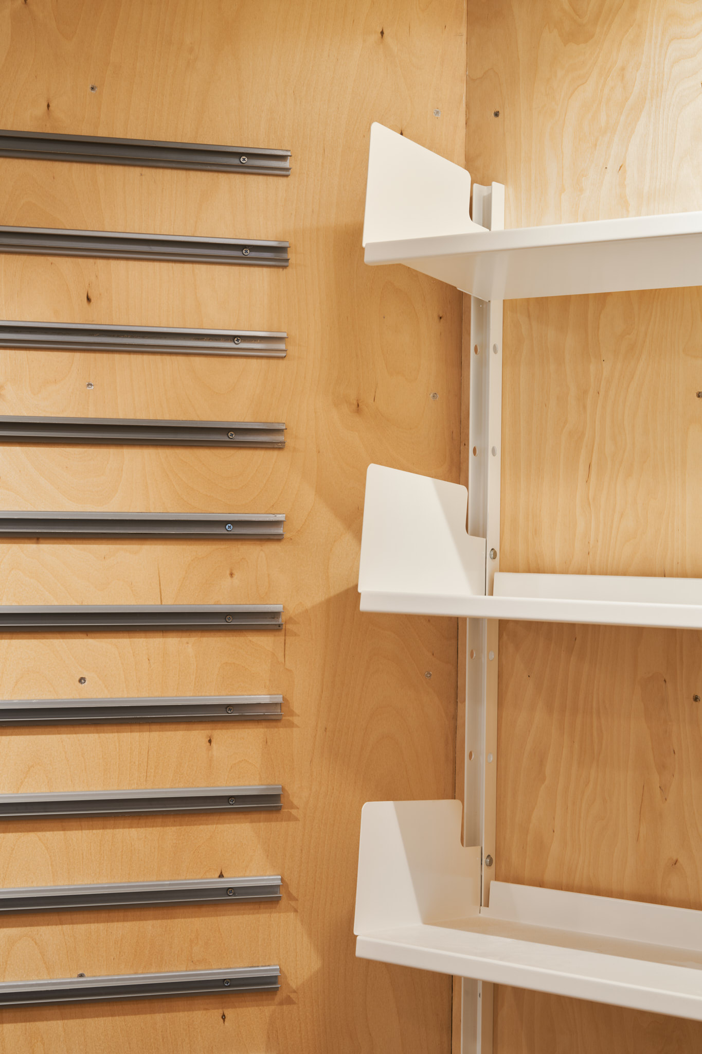
This resulted in the final design of the center display units-boxes with industrial wheels that can be moved or locked in place. The system of the display boxes became a family; sizes, flat, and one with steps. The wall shelving unit was a quicker decision; as having made one earlier, we expanded the system to make it suitable for books.
This resulted in the final design of the center display units-boxes with industrial wheels that can be moved or locked in place. The system of the display boxes became a family; sizes, flat, and one with steps. The wall shelving unit was a quicker decision; as having made one earlier, we expanded the system to make it suitable for books.
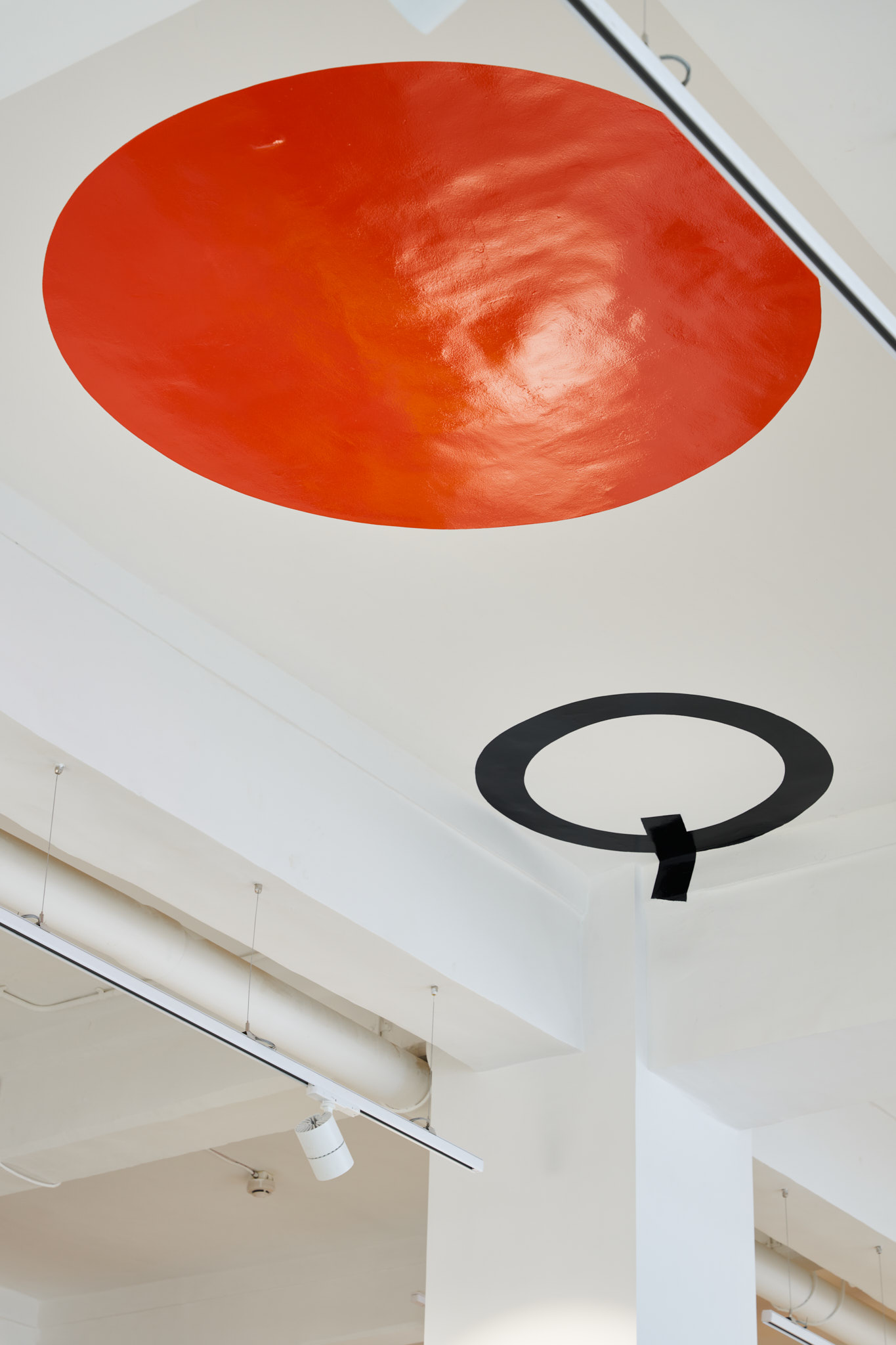
In the space where we were to have books for the kids and toys, the client was keen to follow up on an idea they had once implemented of a tree around which there could be reading sessions. We imagined a more playful abstract idea of a tree, made with circles in shades of green colour, suspended from the ceiling to form a graphic tree.
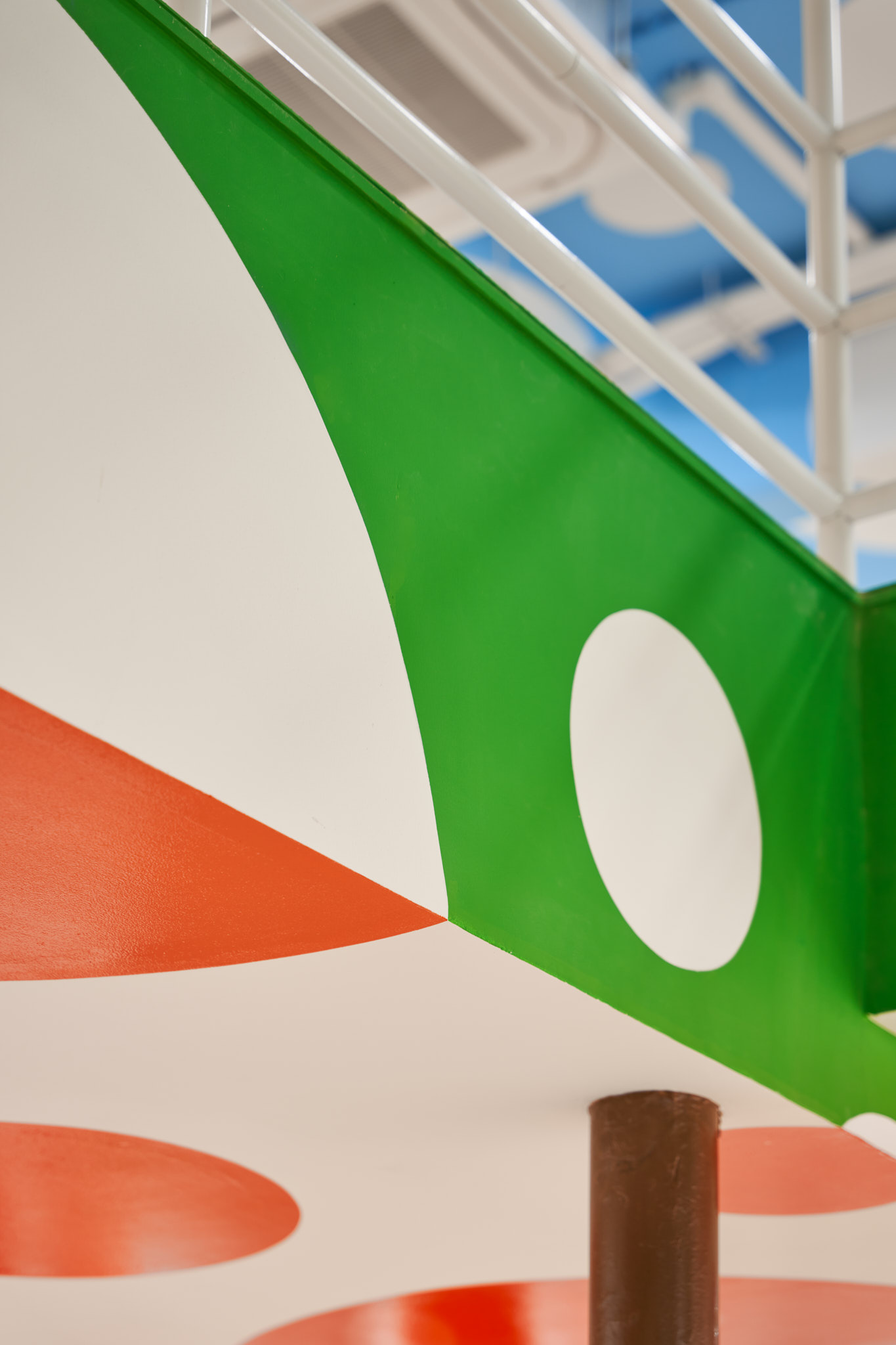
Avoiding the clichés of kiddy forms and colours, we proposed the 'dot’ wrapping itself on the walls, ceiling, and columns in a red-orange colour against a white background, white against blue, and green against white. As a playful gesture, one of the red circle escapes from the kid’s book zone and makes a run onto the ceiling.
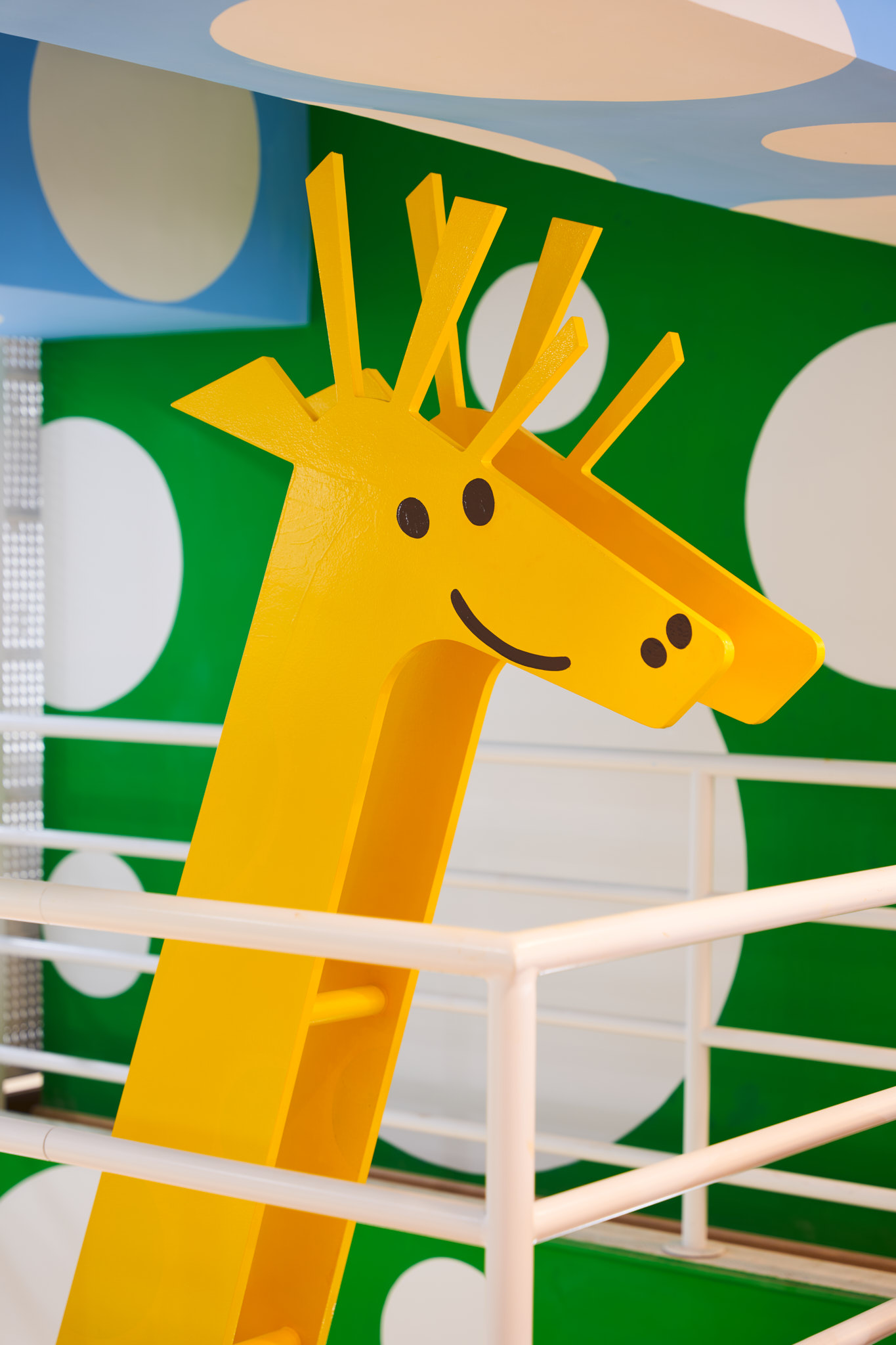
The double-height cut-out offered an idea of a tall structure that could rest on the ground and emerge through the cutout; which took the shape of a giraffe.
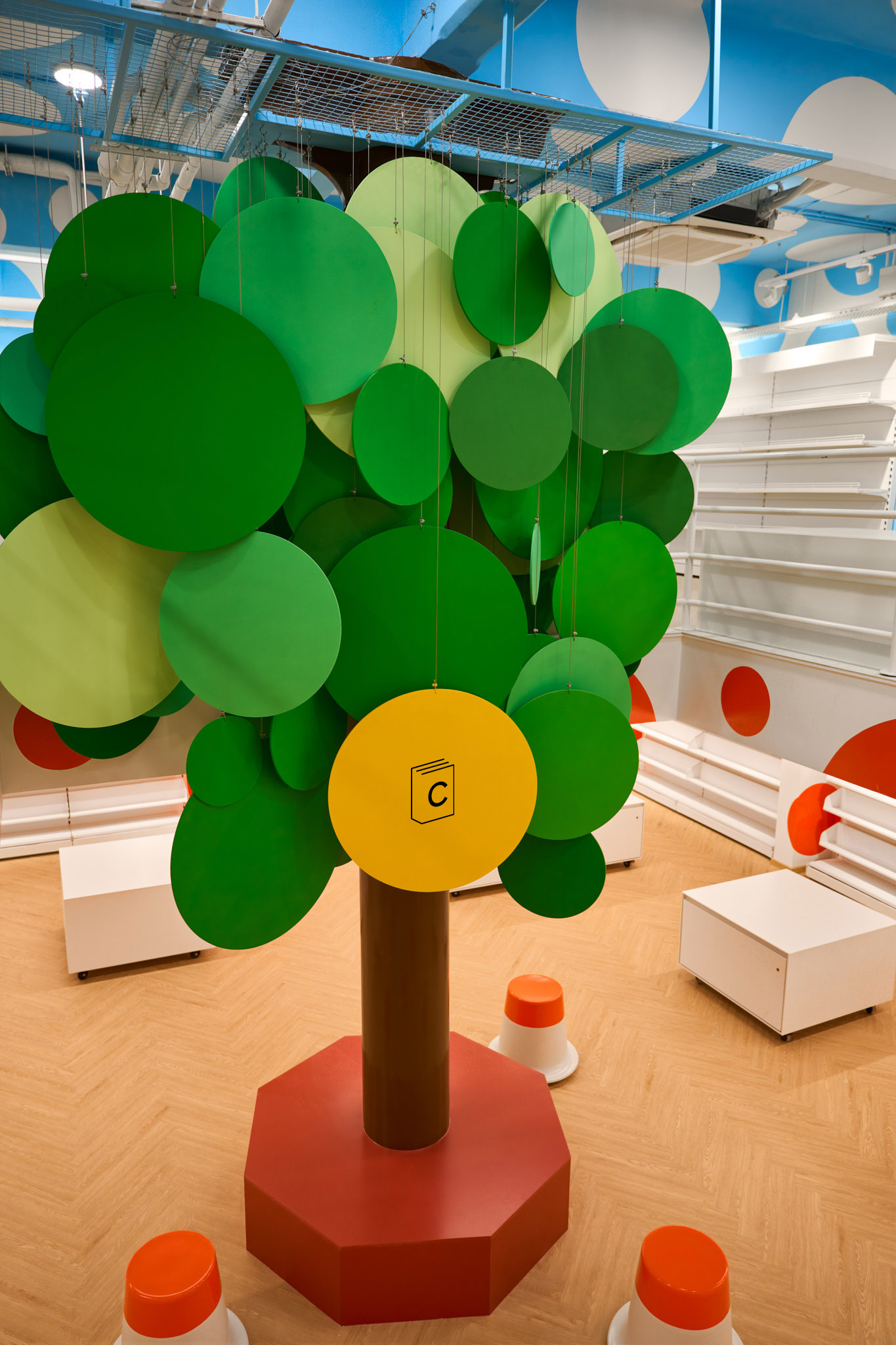
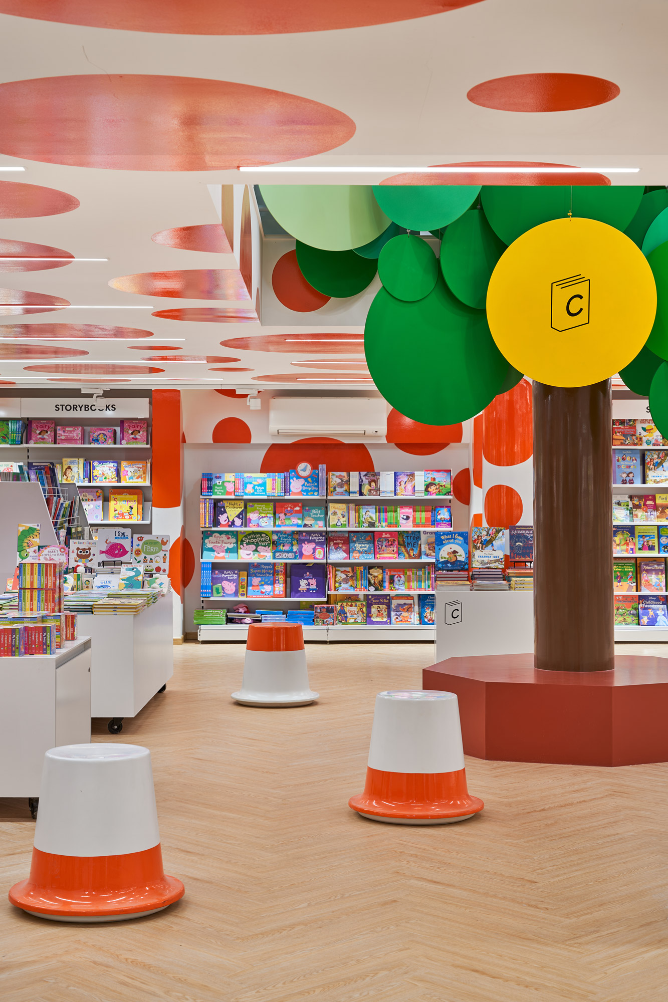
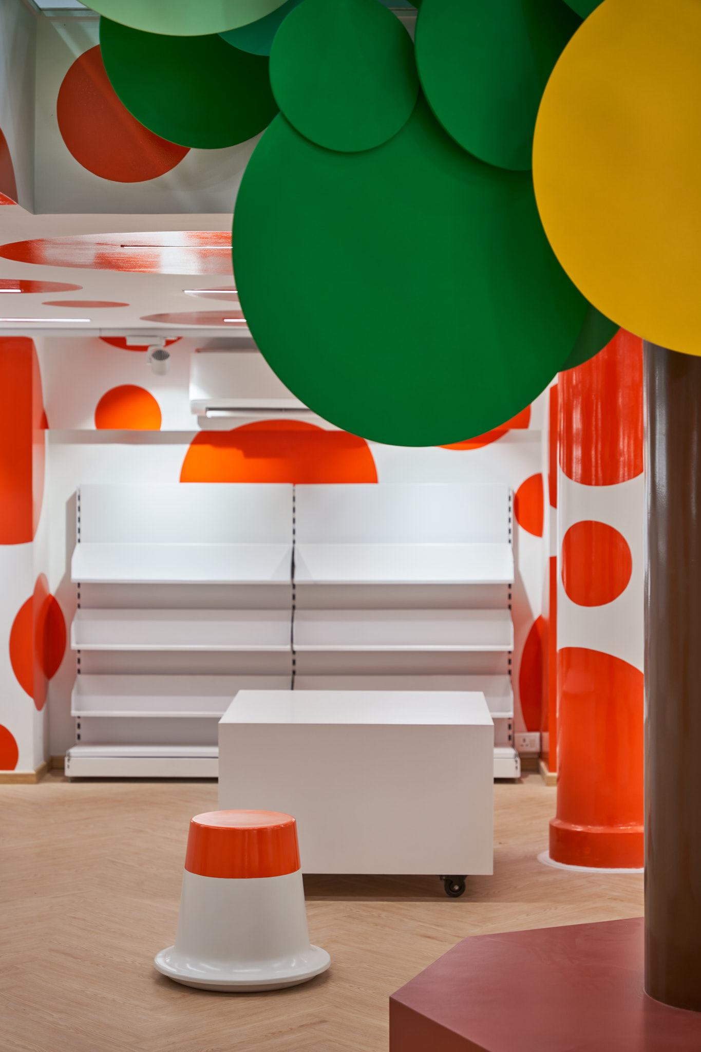
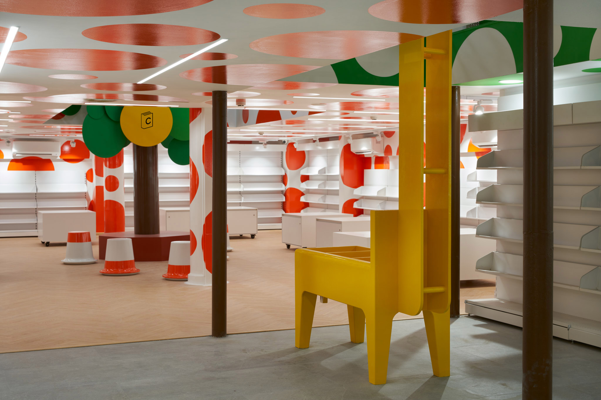
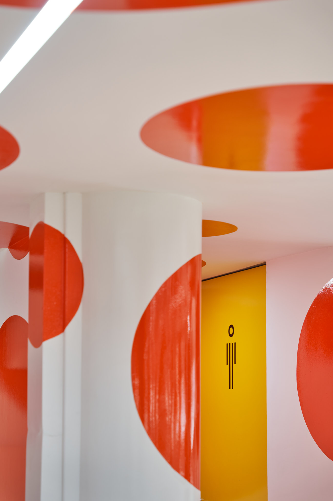
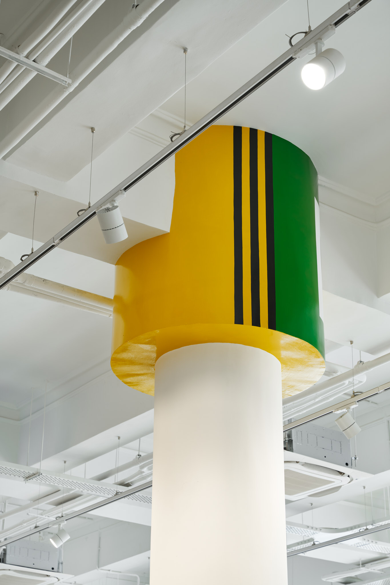
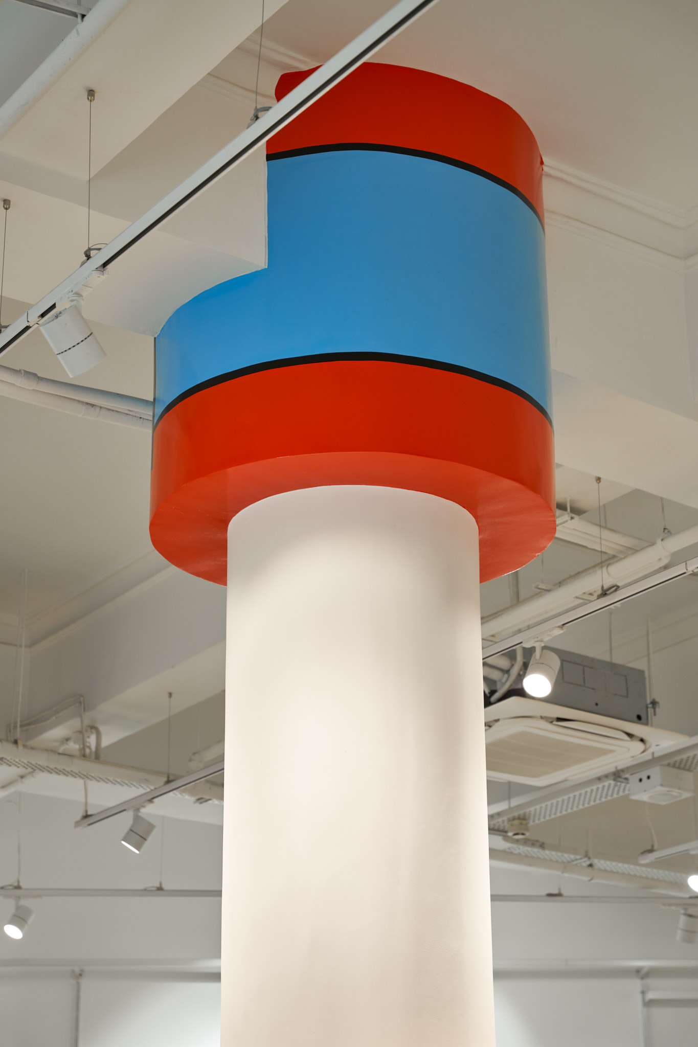
Graphics formed another layer to the shop; we took the idea of colour and pattern forward. The graphics are fresh, playful, and unrestrained. The colour combinations and the application of the graphic pattern to column tops, and display boxes compliment the overall design language and become a brand voice. Select display boxes take on text excerpts and statements from various writers such as George Simenon, Maj Sjowall, and others. The selective use of yellow colour (brand colour) across the shop, on the staircase inside, display boxes, entrance, and cash counter bind the project and provide the connection to the brand.
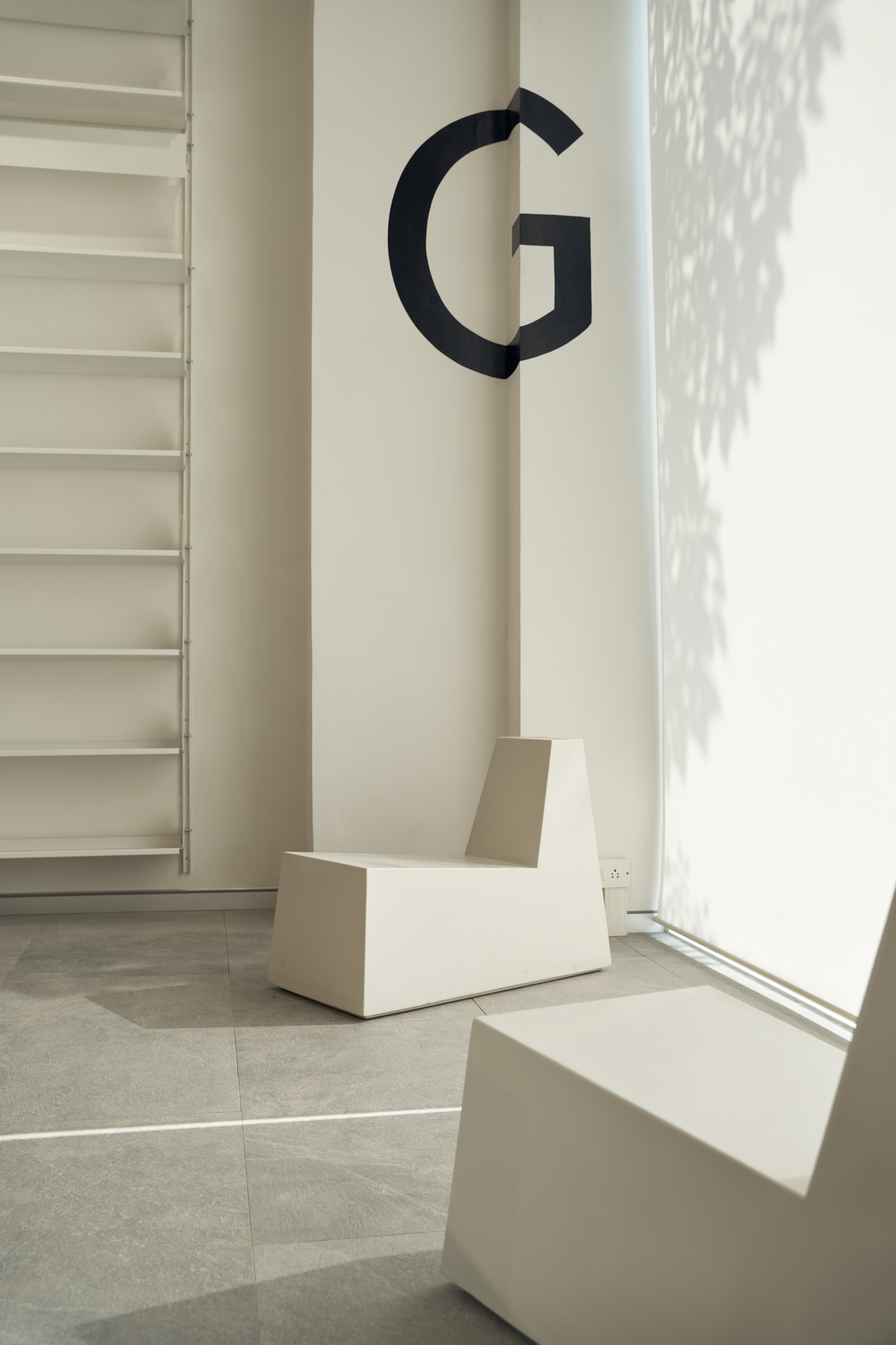
Going forward this colour will become unmistakably recognised as one which belongs to the brand. An additional concept dubbed as the ‘Runaway Letters’ features the 26 alphabets of the English language on the loose and landed onto walls, ceilings, beams, and glass panels; some hidden and some in plain sight. It’s these little details that we trust would become discoveries and surprises when spotted.
The shop uses furniture designed by me. There is the ‘Flash Table’, ‘It Looks Better in Orange’ chairs, ‘Grid seat’, ‘Summer Bench’, and the ‘Vanishing Point’.
The shop uses furniture designed by me. There is the ‘Flash Table’, ‘It Looks Better in Orange’ chairs, ‘Grid seat’, ‘Summer Bench’, and the ‘Vanishing Point’.
The design combines space, product, and graphic design seamlessly to give the brand a free-spirited, optimistic, confident, and individualistic personality.