Fortius Good Earth brand positioning, nomenclature, identity desig

Good Earth is a gated community in North Bangalore offering land parcels to build your own villa homes.
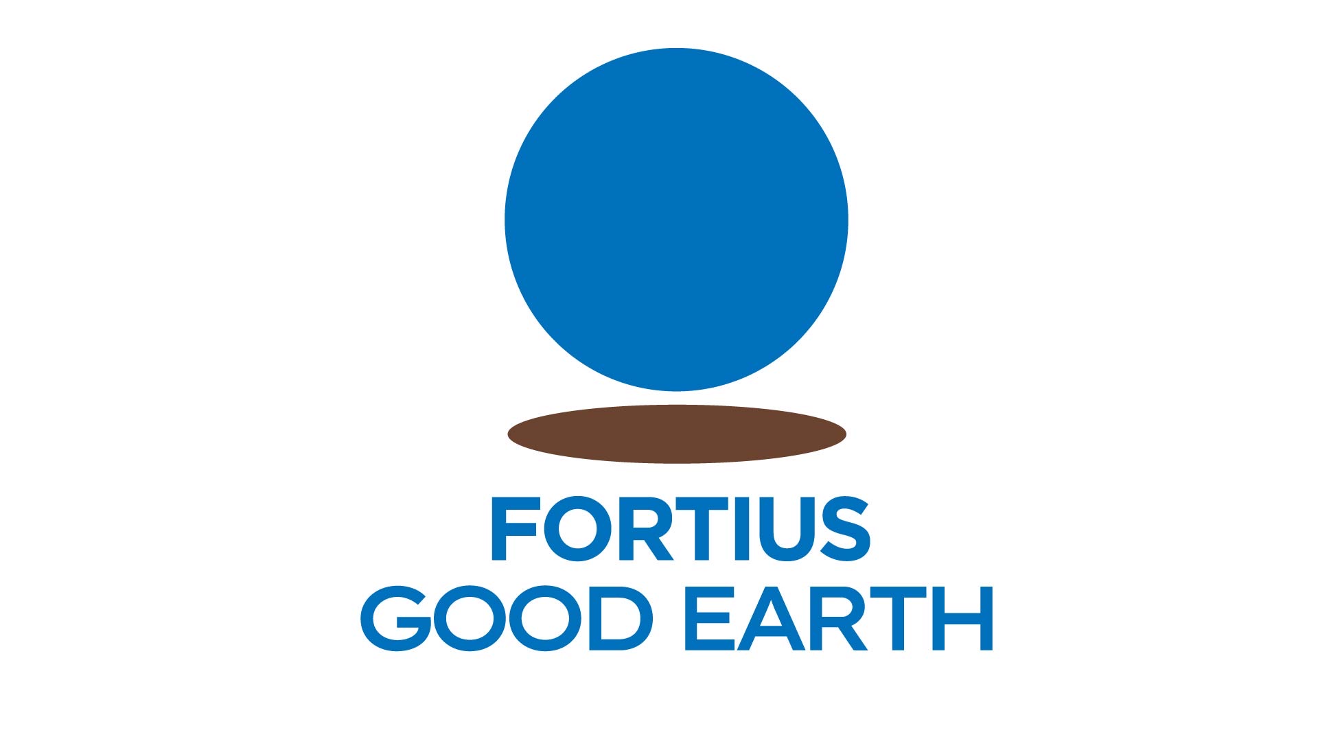
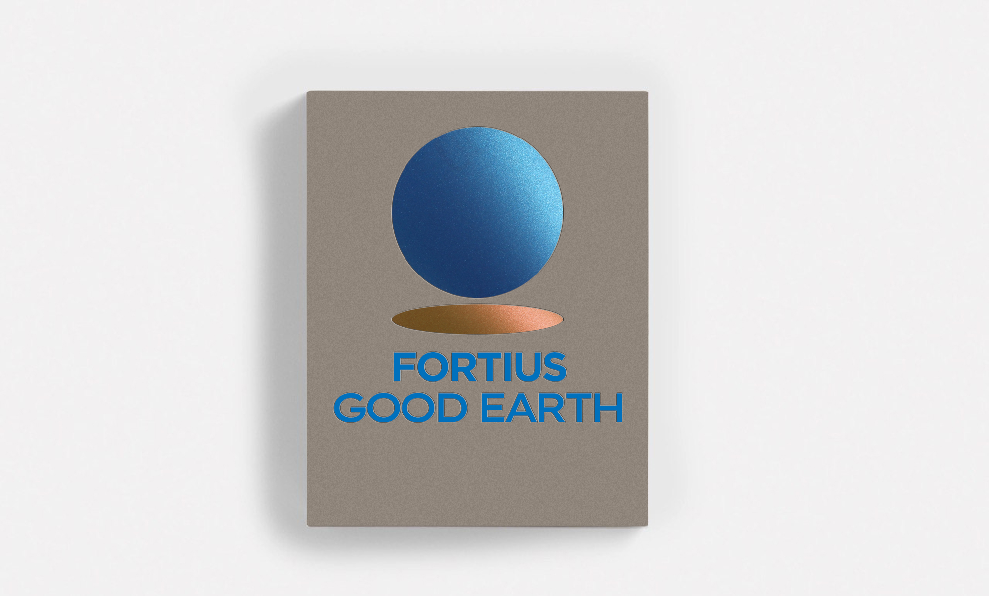
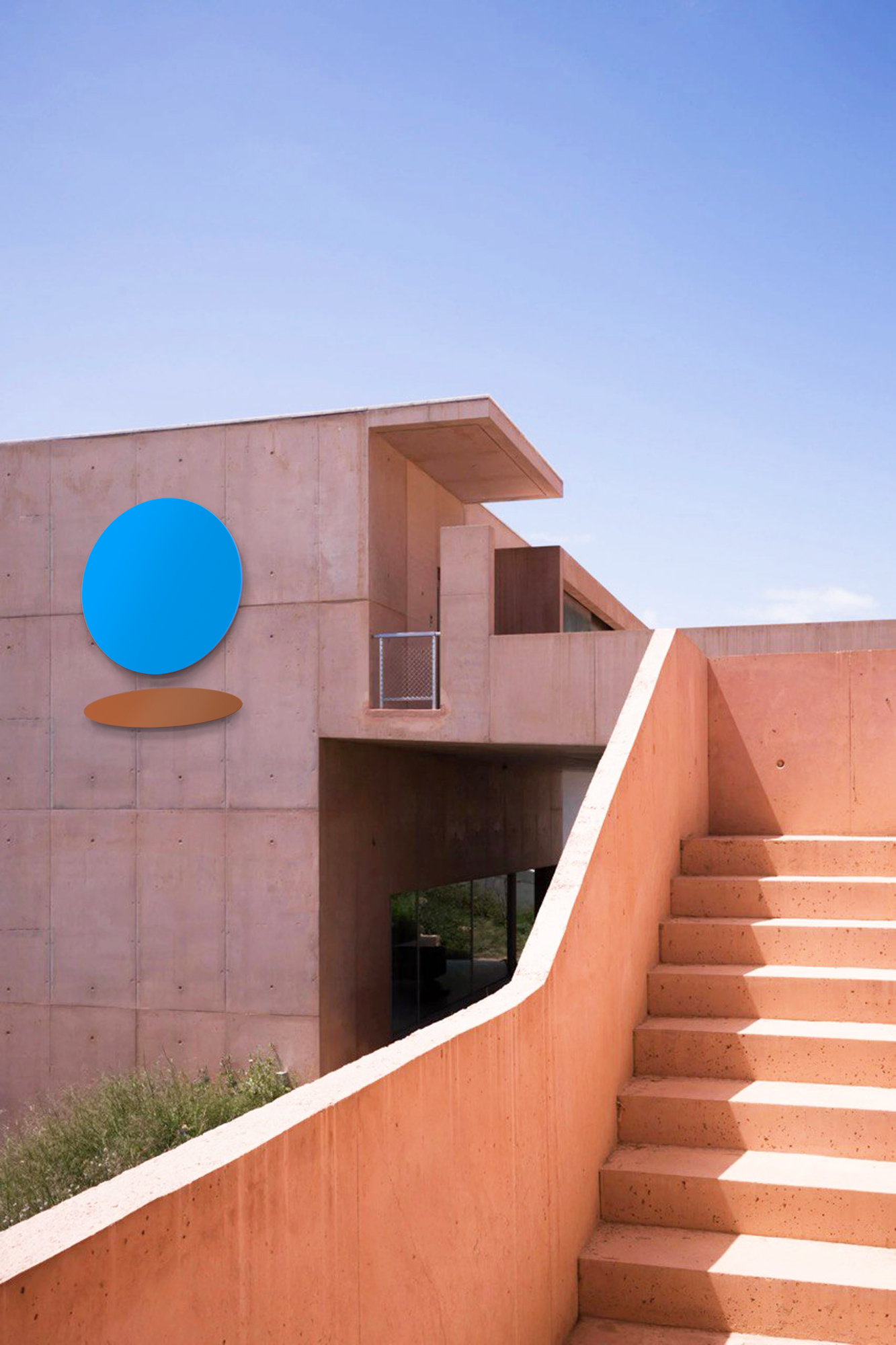
The first logo direction drew inspiration from The Pale Blue Dot — the famous photograph of Earth taken by NASA’s Voyager 1 at Carl Sagan’s request. We began with the idea of the Earth as a simple blue circle and asked: what if we added a subtle twist to it? While the Earth spins in space as a blue sphere, its shadow — when imagined up close — becomes land. The meeting of these two elements, the blue circle and its shadow, formed the basis of the first Good Earth mark.
The first logo direction drew inspiration from The Pale Blue Dot — the famous photograph of Earth taken by NASA’s Voyager 1 at Carl Sagan’s request. We began with the idea of the Earth as a simple blue circle and asked: what if we added a subtle twist to it? While the Earth spins in space as a blue sphere, its shadow — when imagined up close — becomes land. The meeting of these two elements, the blue circle and its shadow, formed the basis of the first Good Earth mark.
For the wordmark, we chose a typeface with solid weight and rounder ‘O’s to echo the form of the circle.


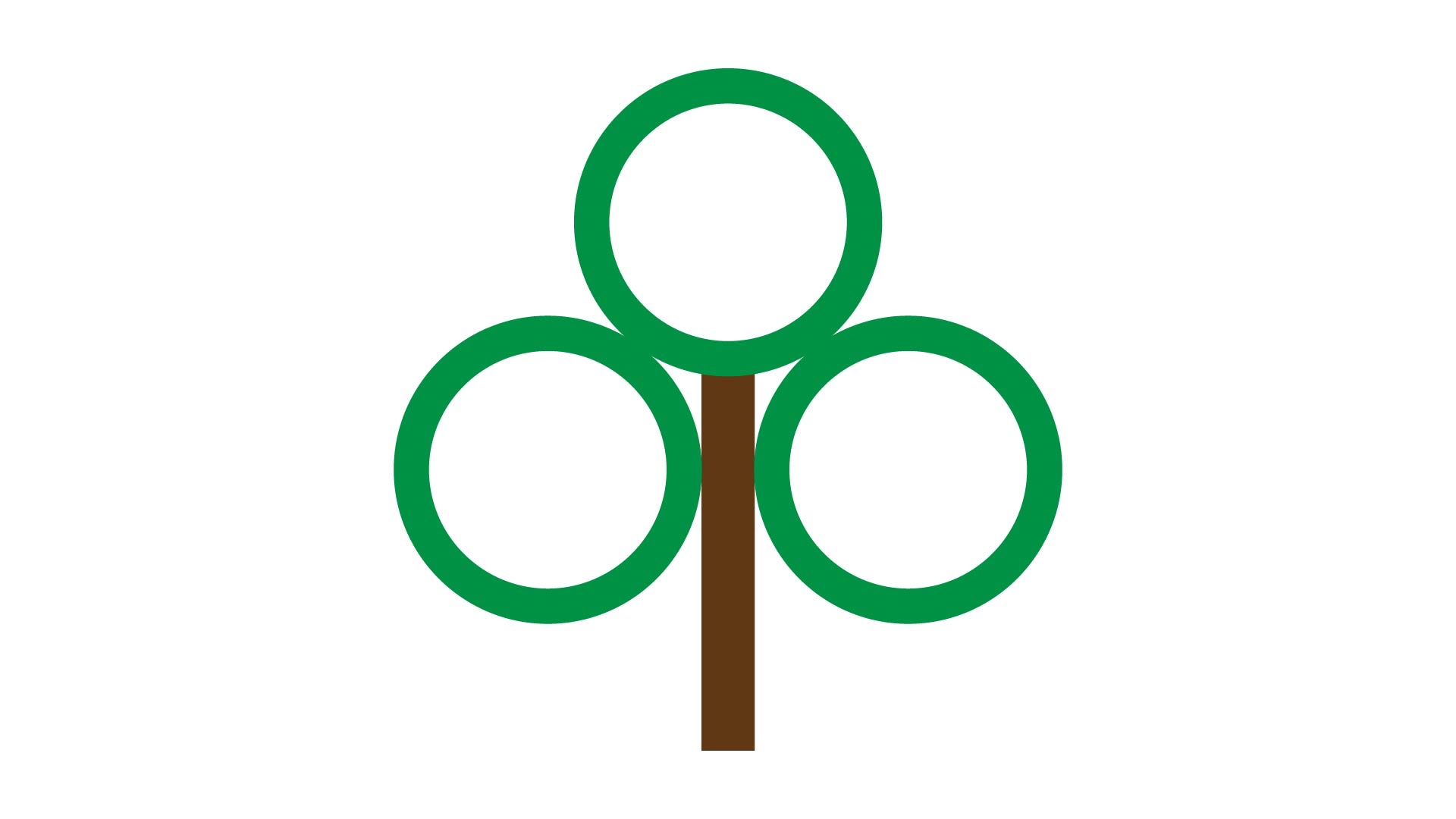
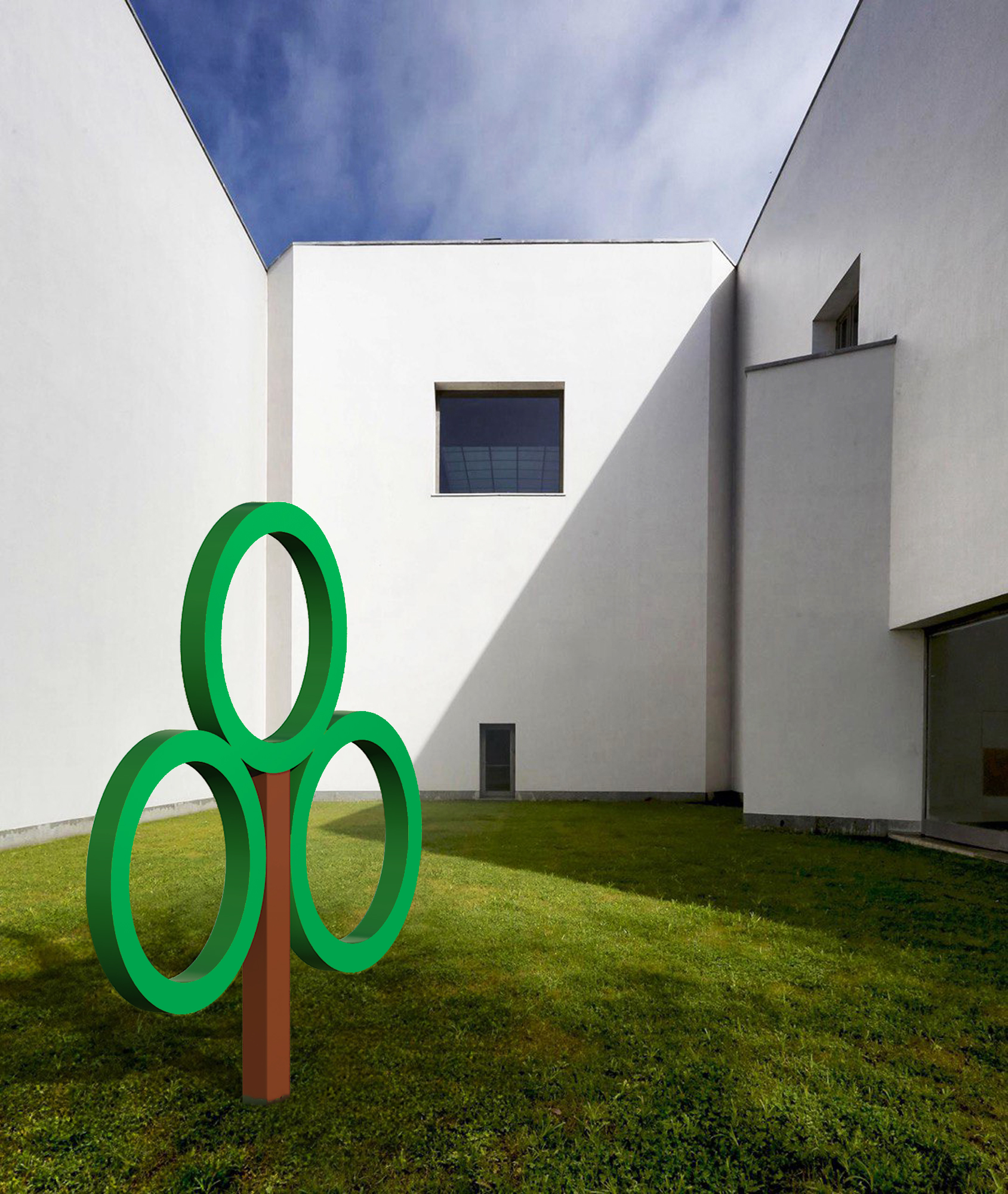
The second and final concept took a different approach. The name Good Earth evokes a sense of well-being—of land, home, and community. We translated this into three circles, symbolizing those ideas, and added a fourth element representing a tree—nature and growth. This version offered a simpler, more memorable identity that could adapt easily across applications and stay true to the brand’s spirit.