GAR Infobahn strategy, identity design
GAR is a Hyderabad-based real estate development company with over three decades of experience. As the company undertakes the development of a significant land bank under its Laxmi Infobahn division, it presented an opportunity to re-examine its corporate identity and what it stands for today.
Through a series of conversations with founders, stakeholders, partners, and employees, we helped define the brand’s positioning and identify its core archetype. In the process, we also uncovered a key challenge in the existing brand architecture, leading to the proposal of a ‘house of brands’ model for better clarity and alignment.
Through a series of conversations with founders, stakeholders, partners, and employees, we helped define the brand’s positioning and identify its core archetype. In the process, we also uncovered a key challenge in the existing brand architecture, leading to the proposal of a ‘house of brands’ model for better clarity and alignment.
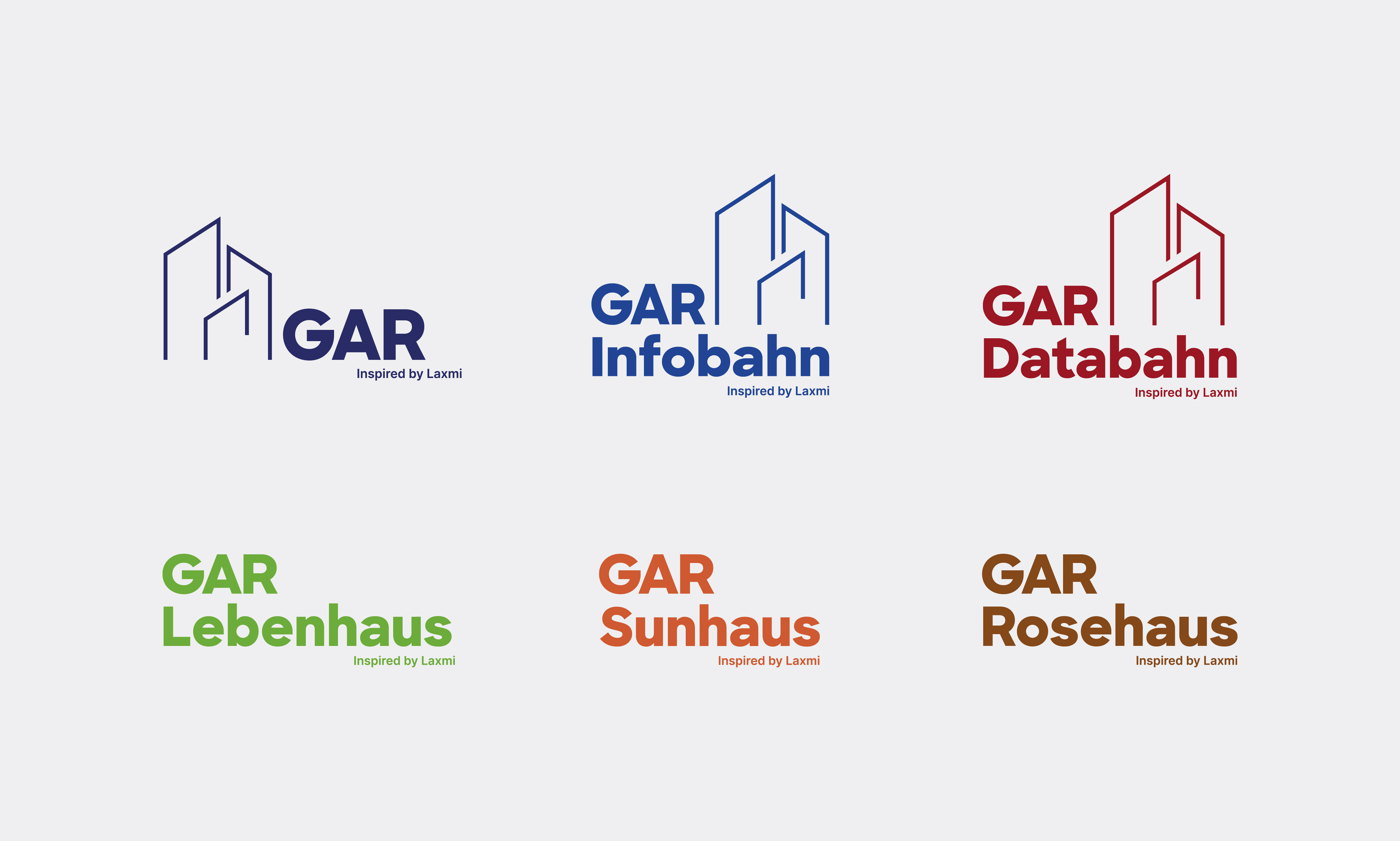
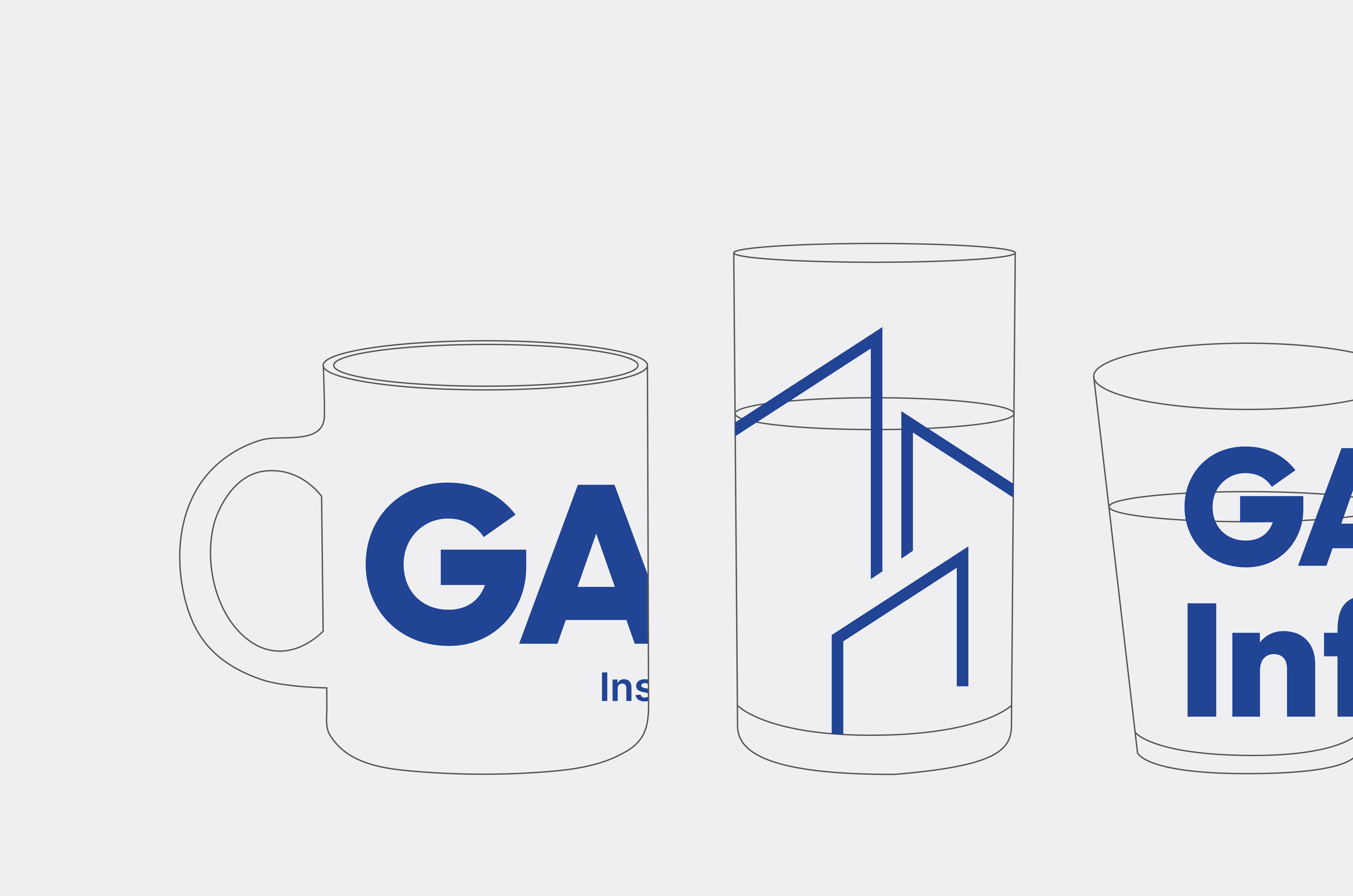
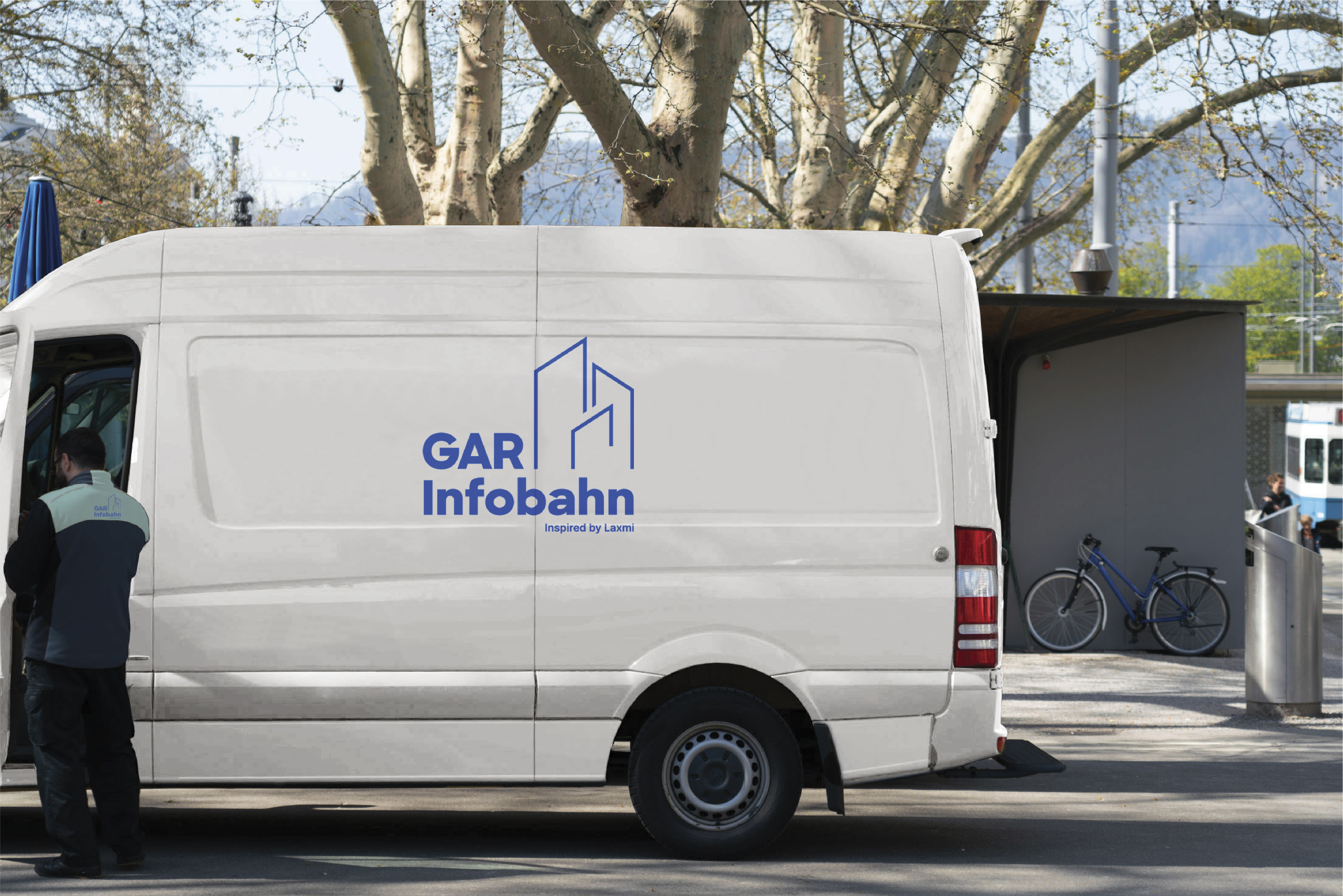
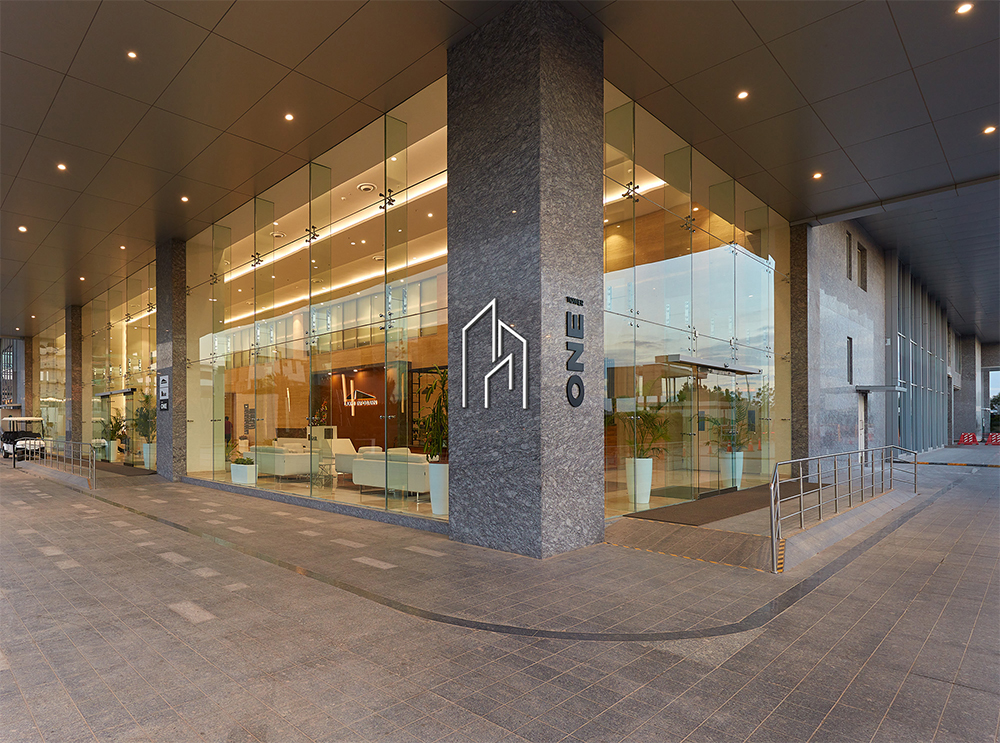
The new identity expresses the company's ambition and clarity of vision. The symbol—comprising three building forms—represents focus and purpose. The logotype uses Sharp Sans by Sharp Type, while each business vertical is distinguished by its own unique colour.
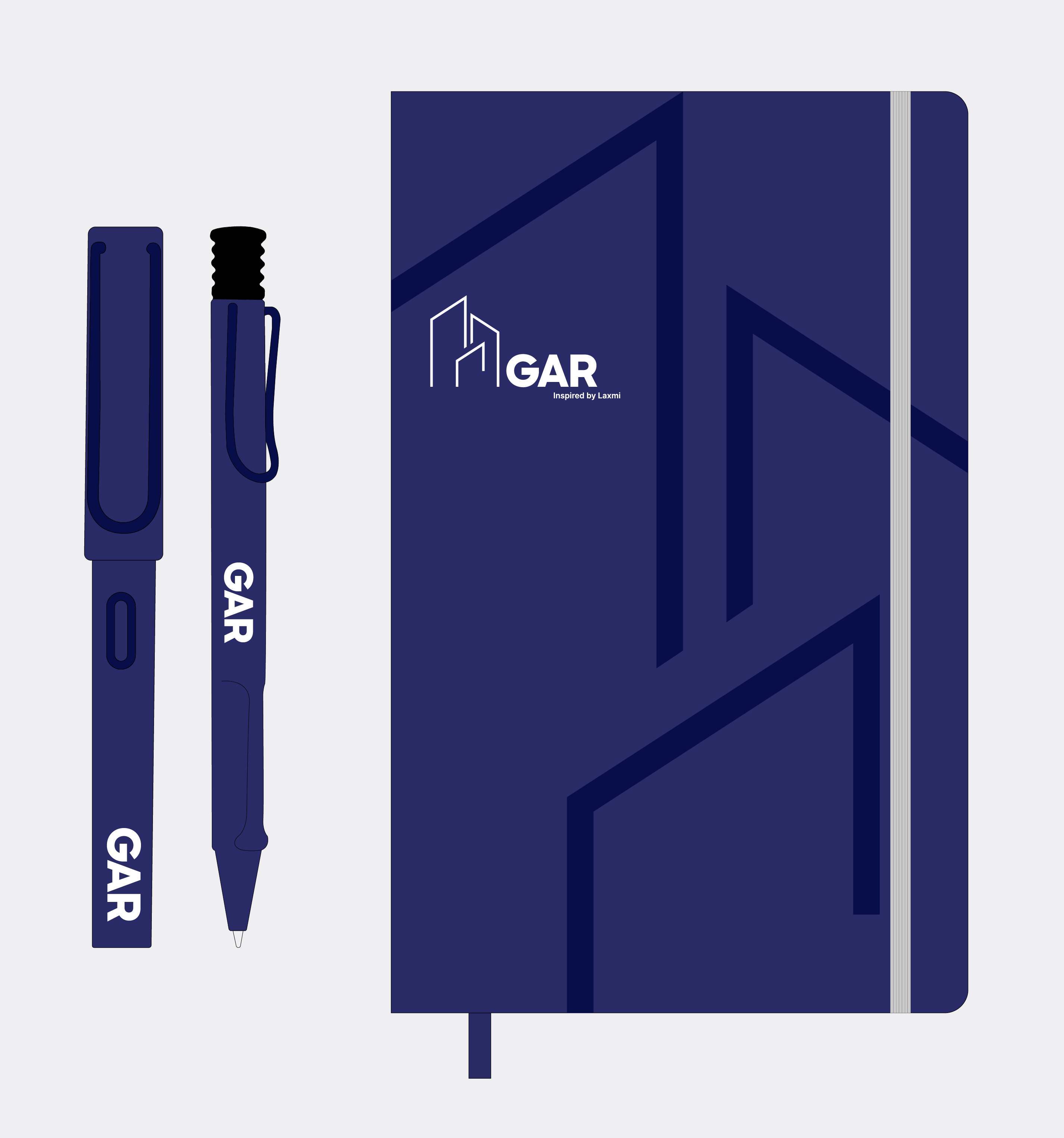
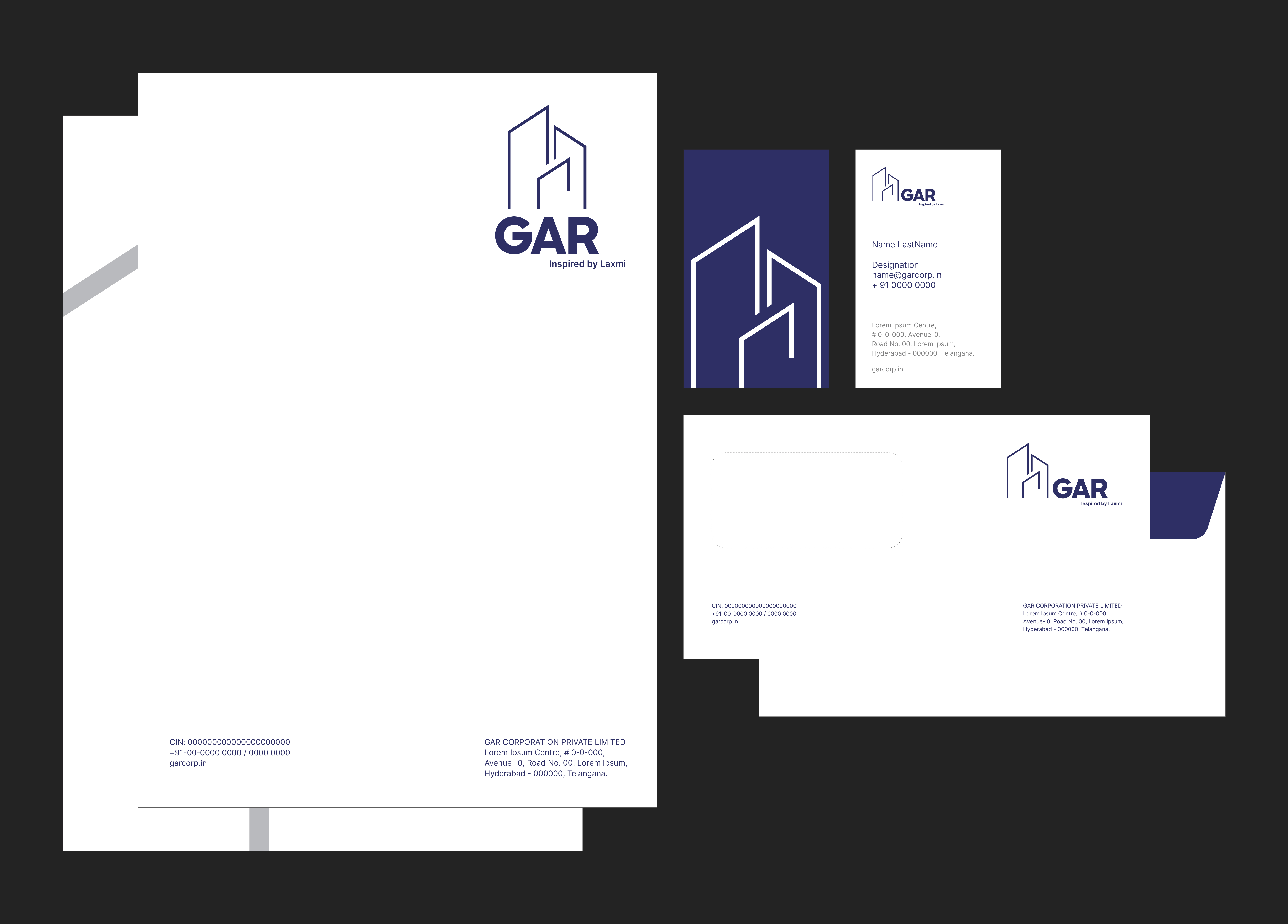
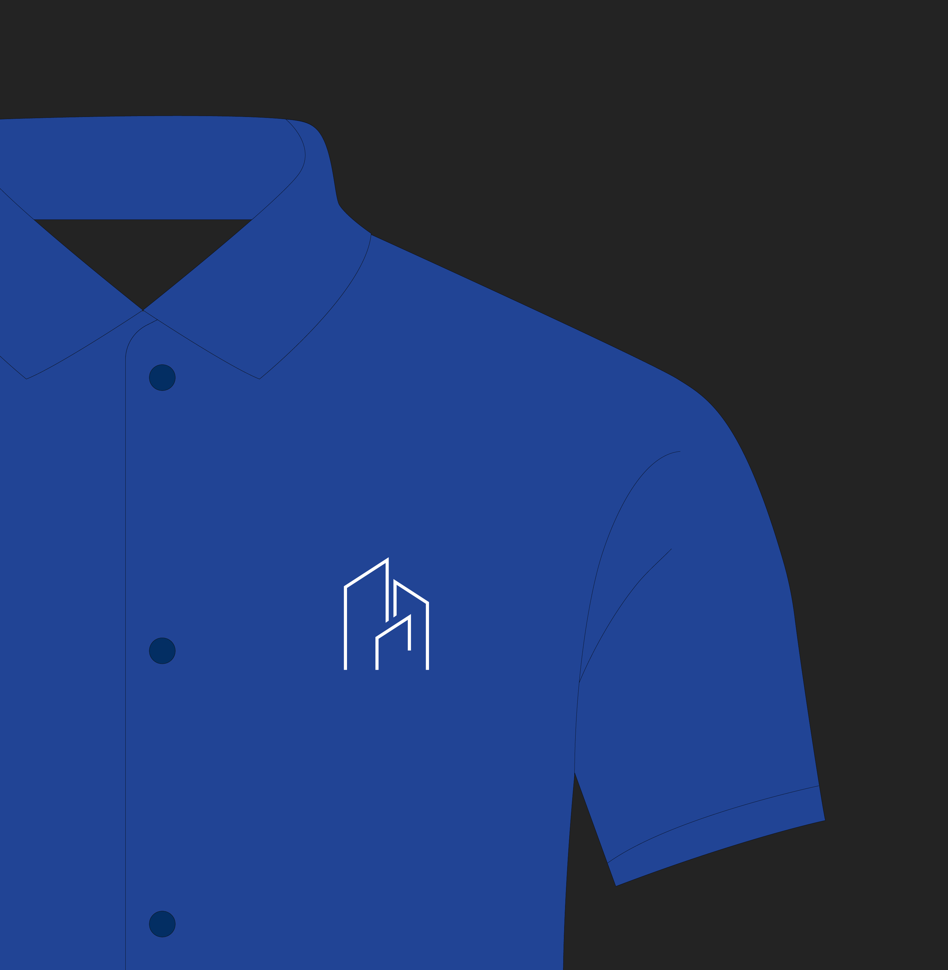
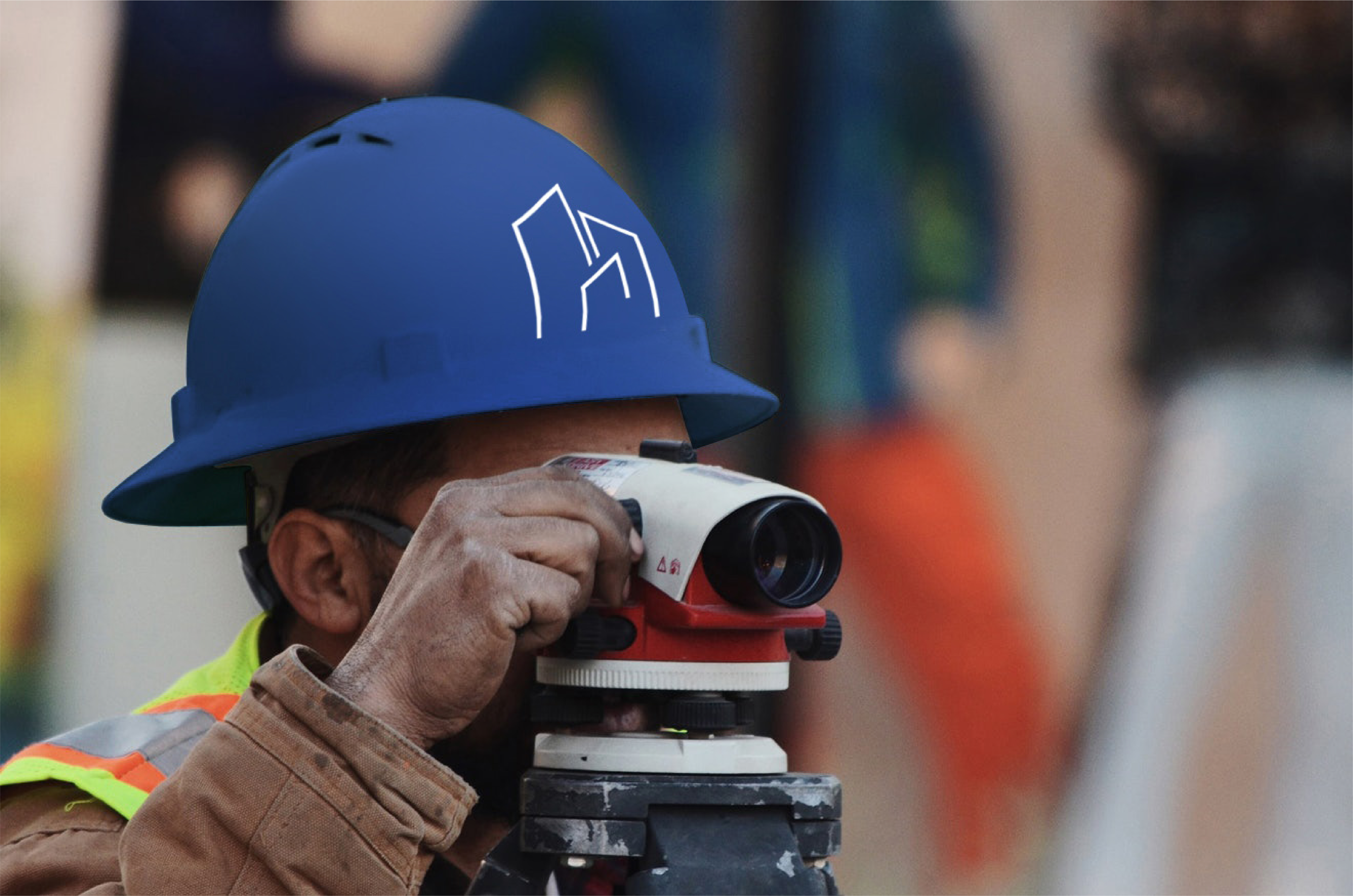
The identity system has been designed for consistent application across print, digital, and environmental touchpoints, supported by a comprehensive corporate graphic standards manual to guide the management and partners in maintaining brand integrity.
The identity system has been designed for consistent application across print, digital, and environmental touchpoints, supported by a comprehensive corporate graphic standards manual to guide the management and partners in maintaining brand integrity.
