IF.BE graphic identity
Kamal and Arjun Malik—a father-son duo—are the minds behind this initiative. Kamal Malik Architects is a well-established architectural practice, and two years ago, they acquired a disused ice factory in Ballard Estate, one of Mumbai’s historic precincts. With decades of experience in the field, they envisioned a space that could give back to the creative community—a platform to nurture and celebrate the arts. We were invited to design the visual identity for this space.
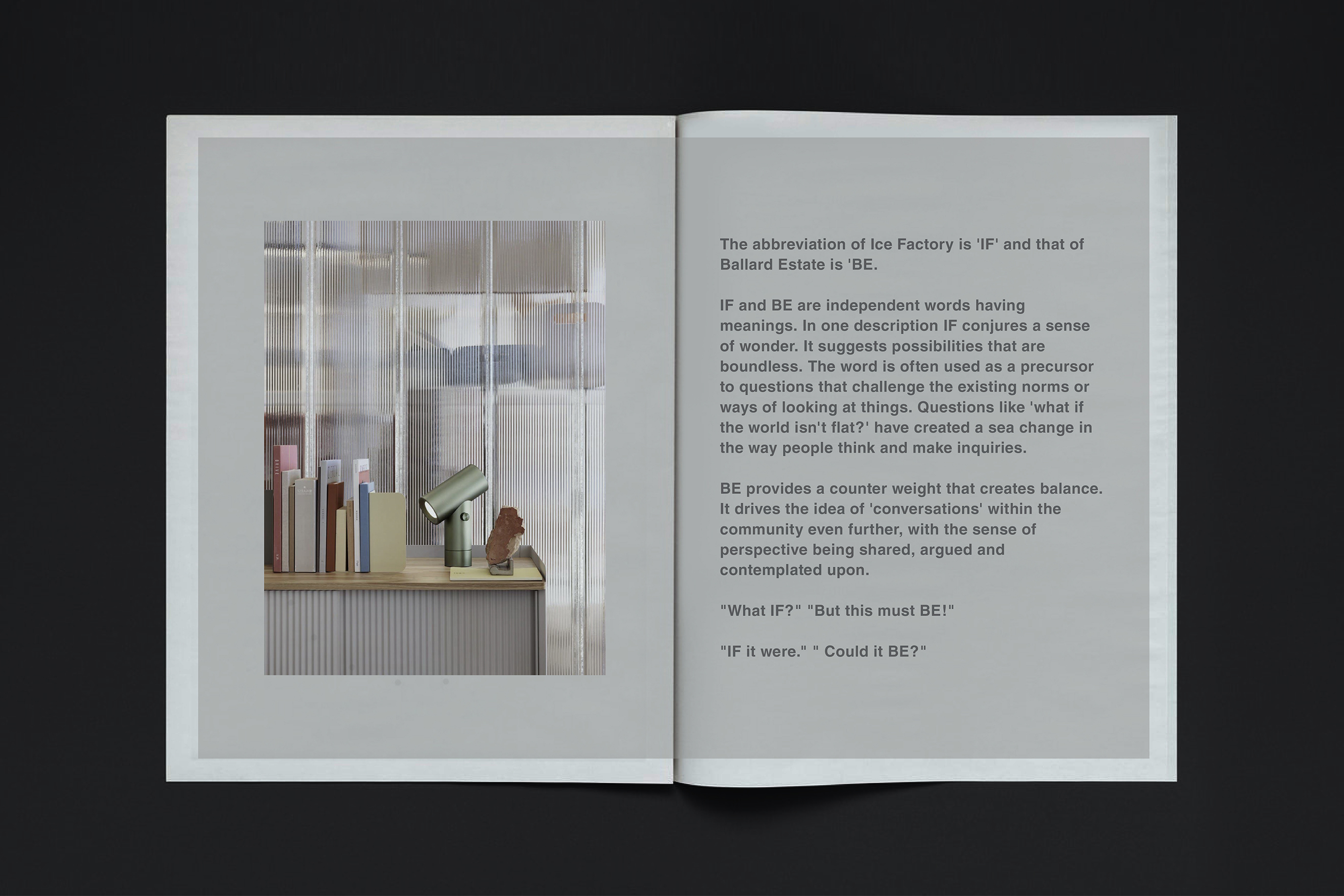
The name IF.BE draws directly from its context: IF stands for Ice Factory, and BE refers to Ballard Estate. But beyond geography, the name carries a deeper philosophical meaning.
IF represents the beginning of any creative pursuit—a space of possibility, questions, and exploration.
BE signifies resolution, presence, and becoming.
The dot between IF and BE marks the brief, reflective pause—the transition between inquiry and realisation.
In developing the visual identity, we explored various directions. Yet, no single symbol seemed capable of representing such a diverse and evolving cultural space. We arrived at the idea that there needn’t be one fixed aesthetic—only a deliberate spirit.
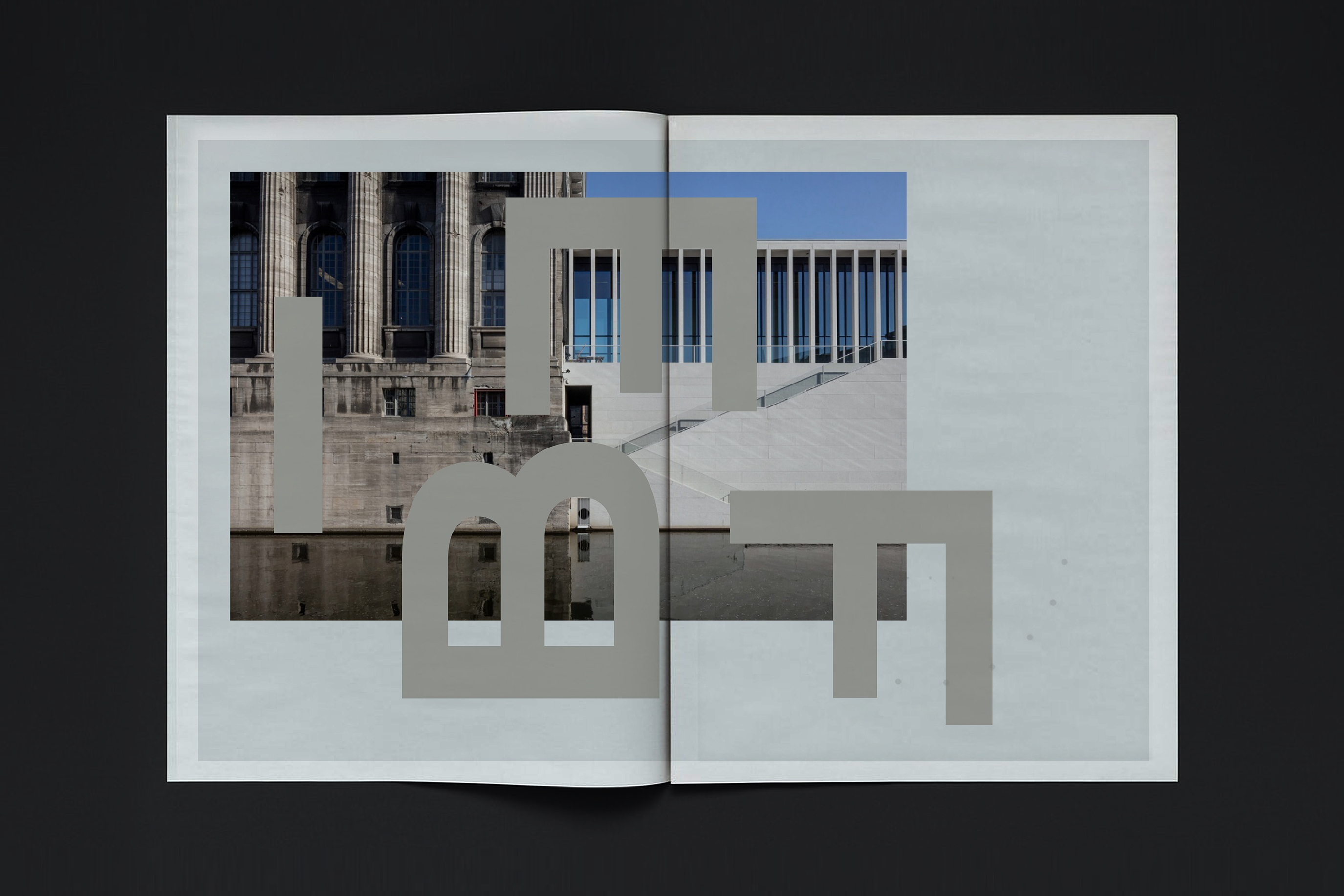
This led us to shape the identity not as a logo or emblem, but as a typographic form. IF.BE becomes a bold, self-contained unit—confident, yet open to transformation. The rearrangement of its letters reveals a dynamic visual language where letters dissolve into form—shifting in scale to become objects, micro-architectures, columns, structures, and arches.
The repetition and reorientation of the unit offer endless possibilities—whether as patterns, plans, or spatial ideas.
Much like the space itself—repurposed from an ice factory into a cultural venue—the identity of IF.BE reflects a cyclical spirit of transformation, echoing the nature of water turning into ice and back again: adaptable, fluid, and full of potential.


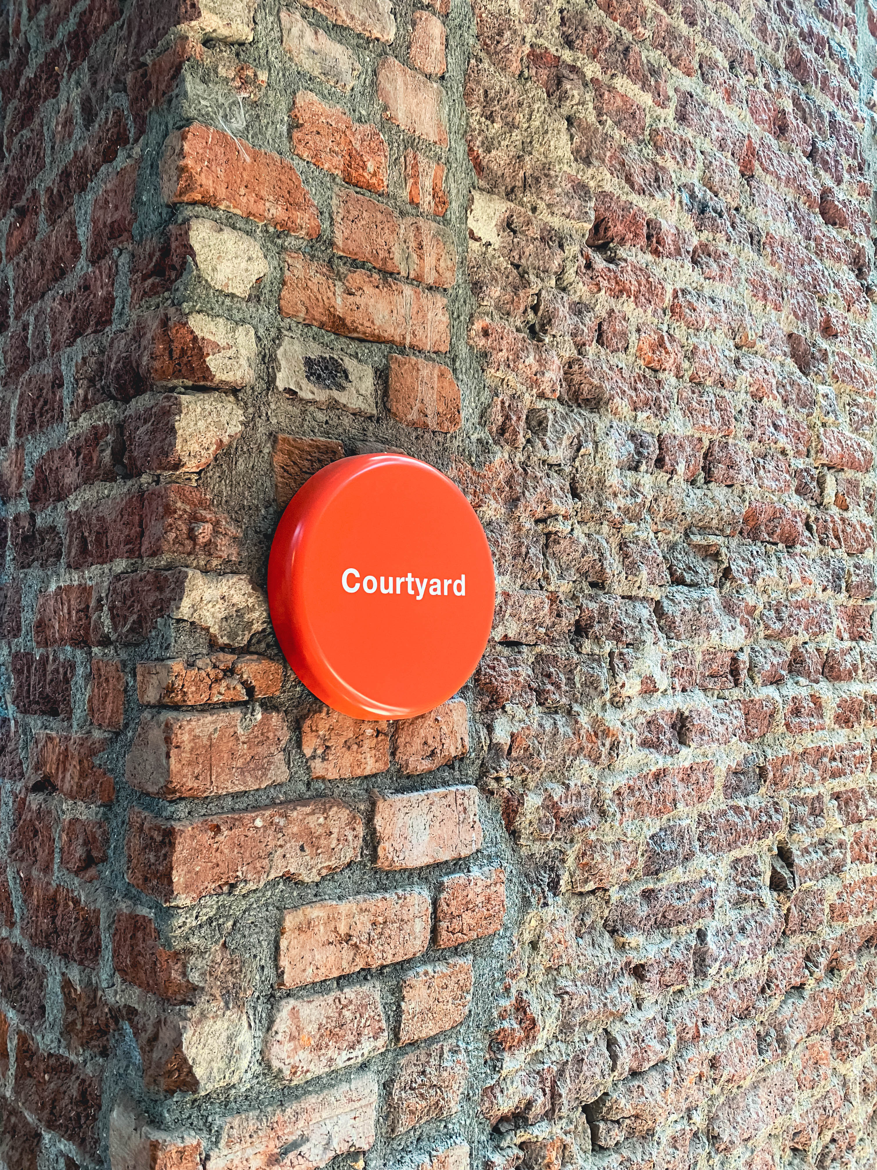
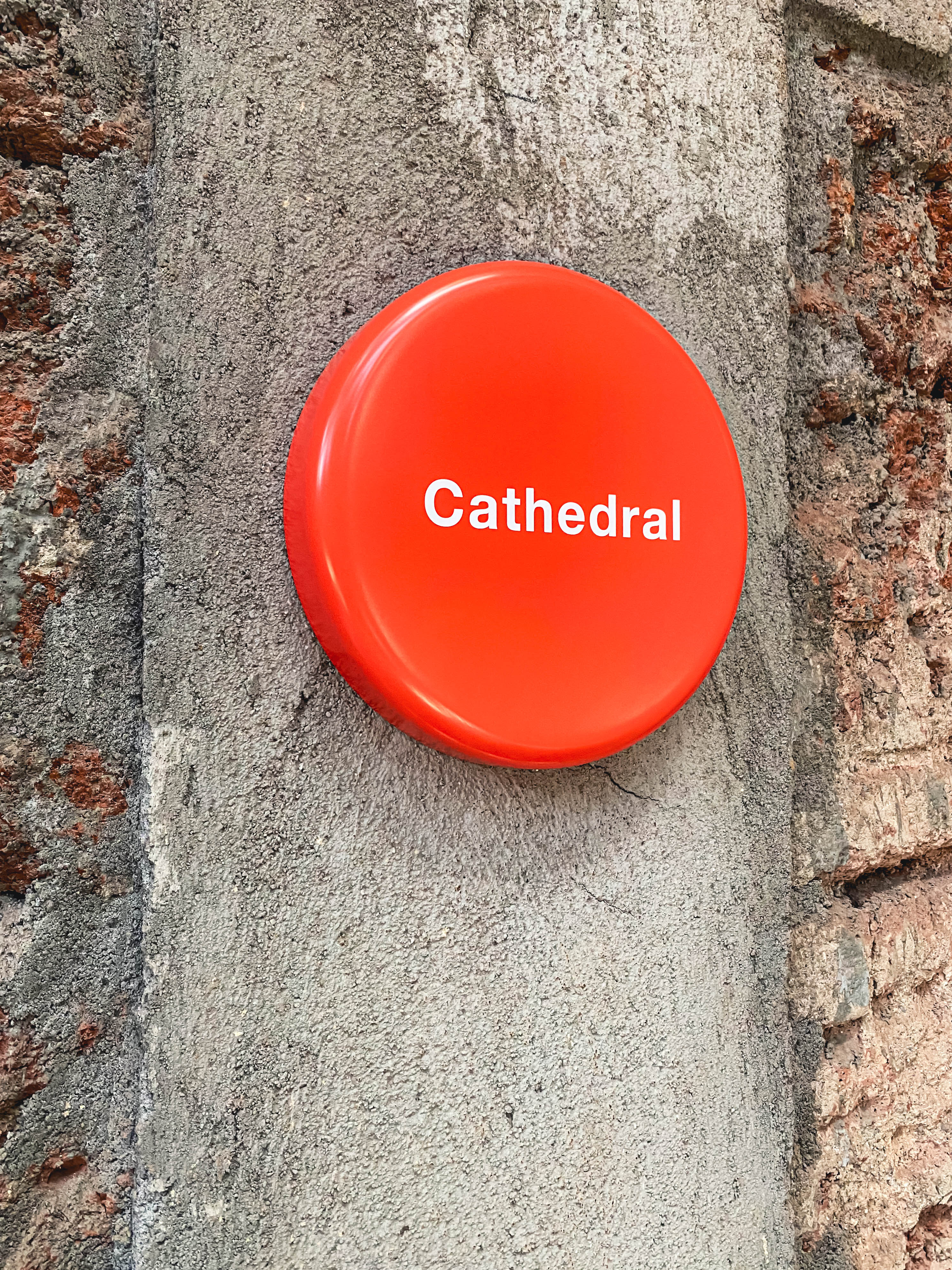
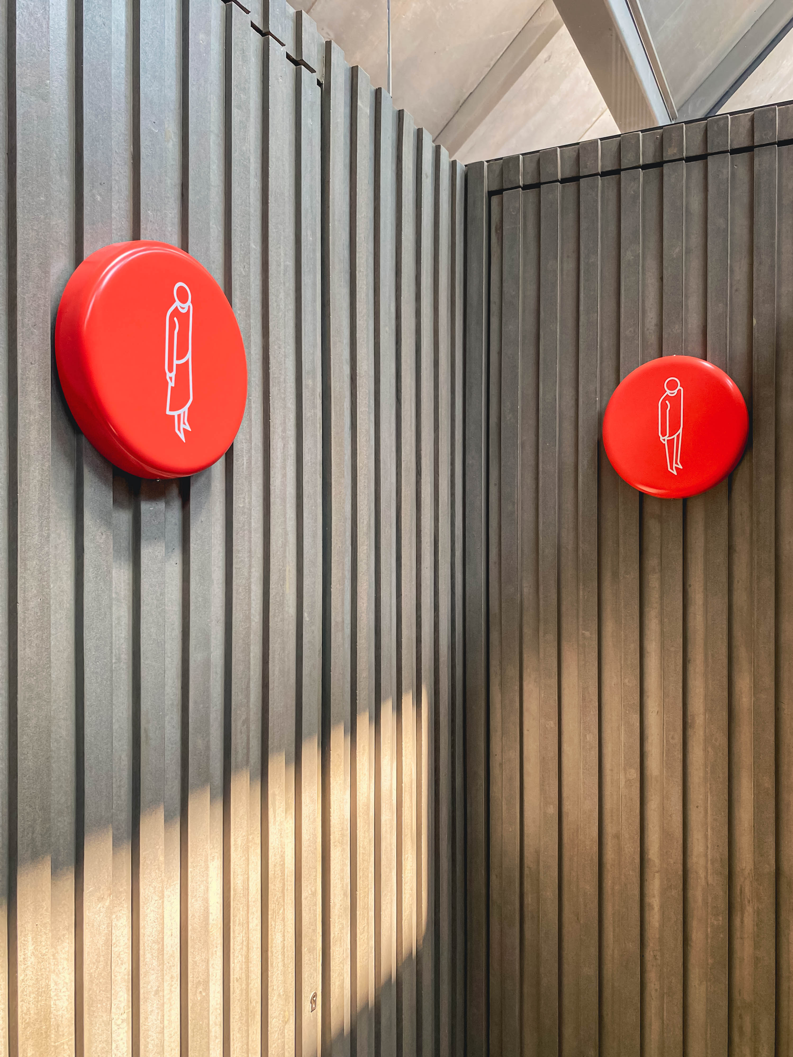
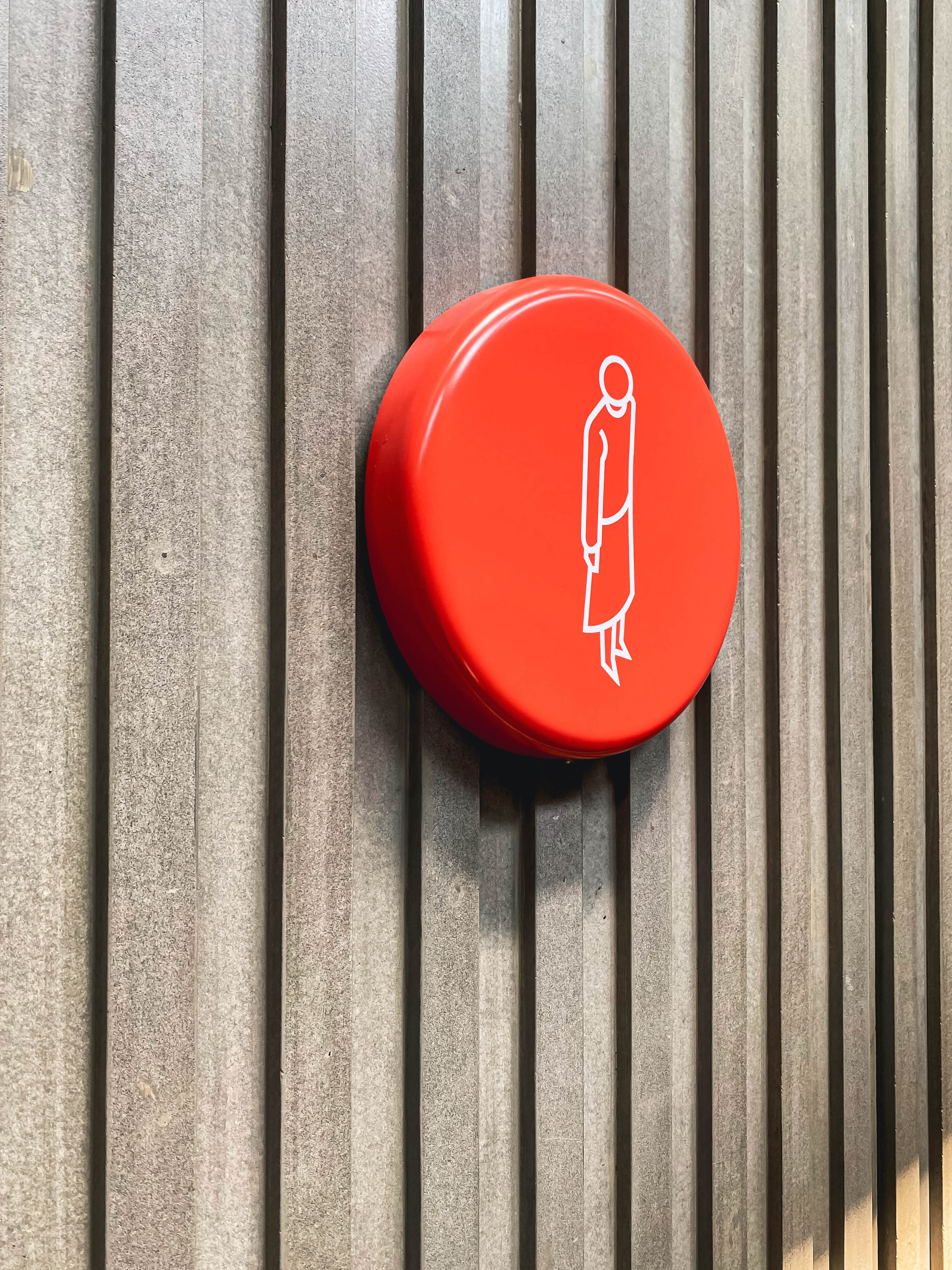
The IF.BE interior space is exposed in terms of materials to reflect the legacy of the original space. Wood beams and truss structures, brick walls, metal girders and concrete form the space look. We were asked to design signage to define each feature within this space.
The proposed design is a 10” orange tablet with a graphic icon or text appearing in a white vinyl. The tablet is reflective of the dot between the start and the end: between IF and BE.The tablet is formed in plastic and mounted directly on the wall surface.
The simple soft form, the colour and the graphic icon has presence and its own character, which in some way announces the plurality of things to come.