IF.BE graphic identity
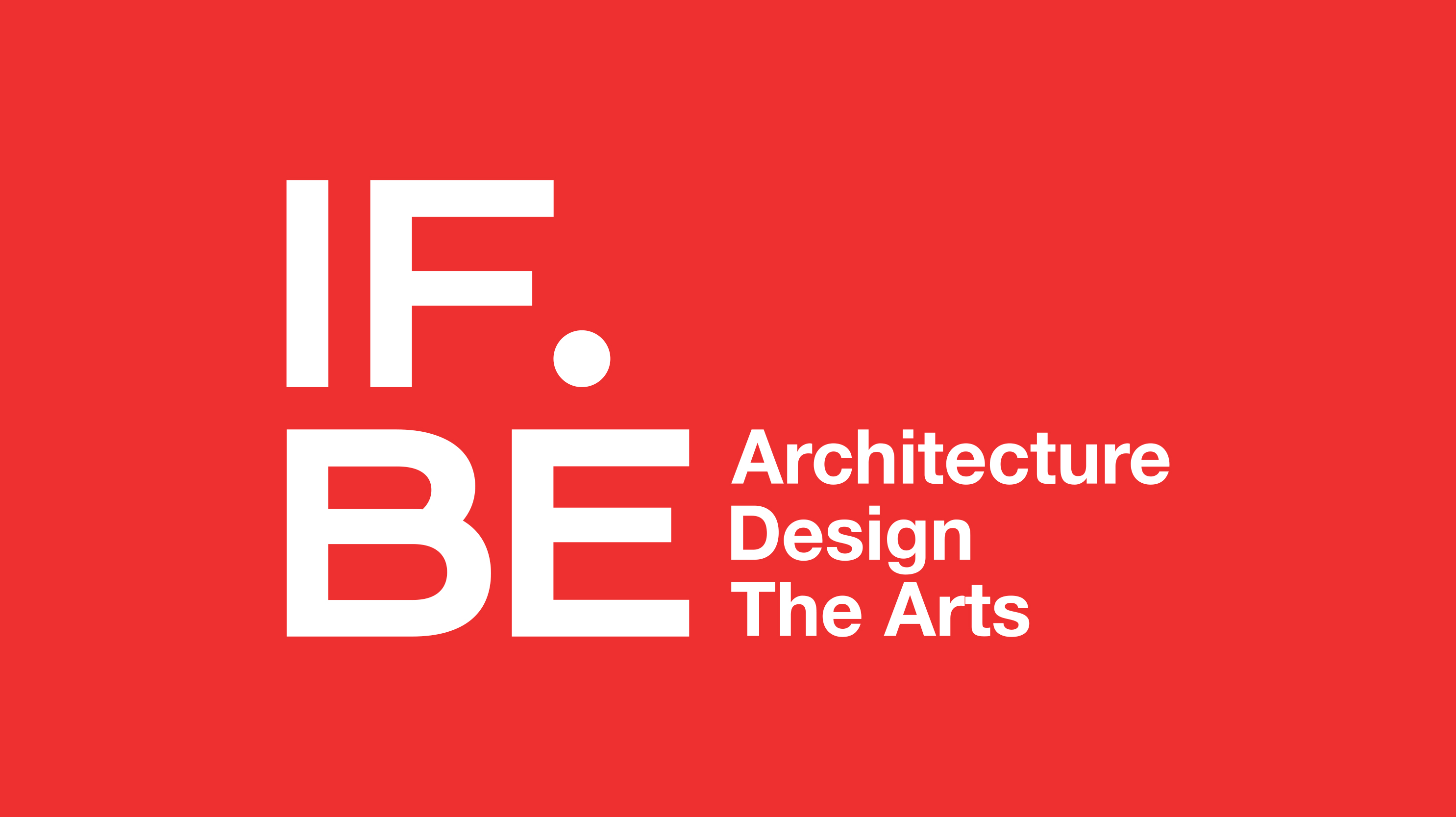
Kamal and Arjun Malik are father and son. Kamal Malik Architects is a well-established architecture design practice. 2 years ago, they acquired a derelict ice factory at Ballard Estate, which is the old part of Mumbai city. Having been in practice for many years, they wanted to give back to the field they are in, by having a space that promotes and becomes a platform for creative arts.
We were invited to design a visual identity for this space.
The name IF explains the immediate context; an Ice Factory whereas BE is the location; Ballard Estate. However IF is also the starting point for any creative exercise and BE is the point of arrival. IF is the state of doubt, questions and gazing to seek a direction. BE is a resolved state.
IF.BE; the dot in between IF and BE, is the momentary pause to reflect and consider possibilities.
When we started to think about the visual identity; we tried a number of directions, none of which led to any satisfactory factory solutions, perhaps because there is no one symbol for diverse cultural activities. We therefore concluded that it is impossible for such a space to have a symbol that is meaningful. Perhaps `no one consistent aesthetic’ would be appropriate, instead only `a deliberate spirit’.
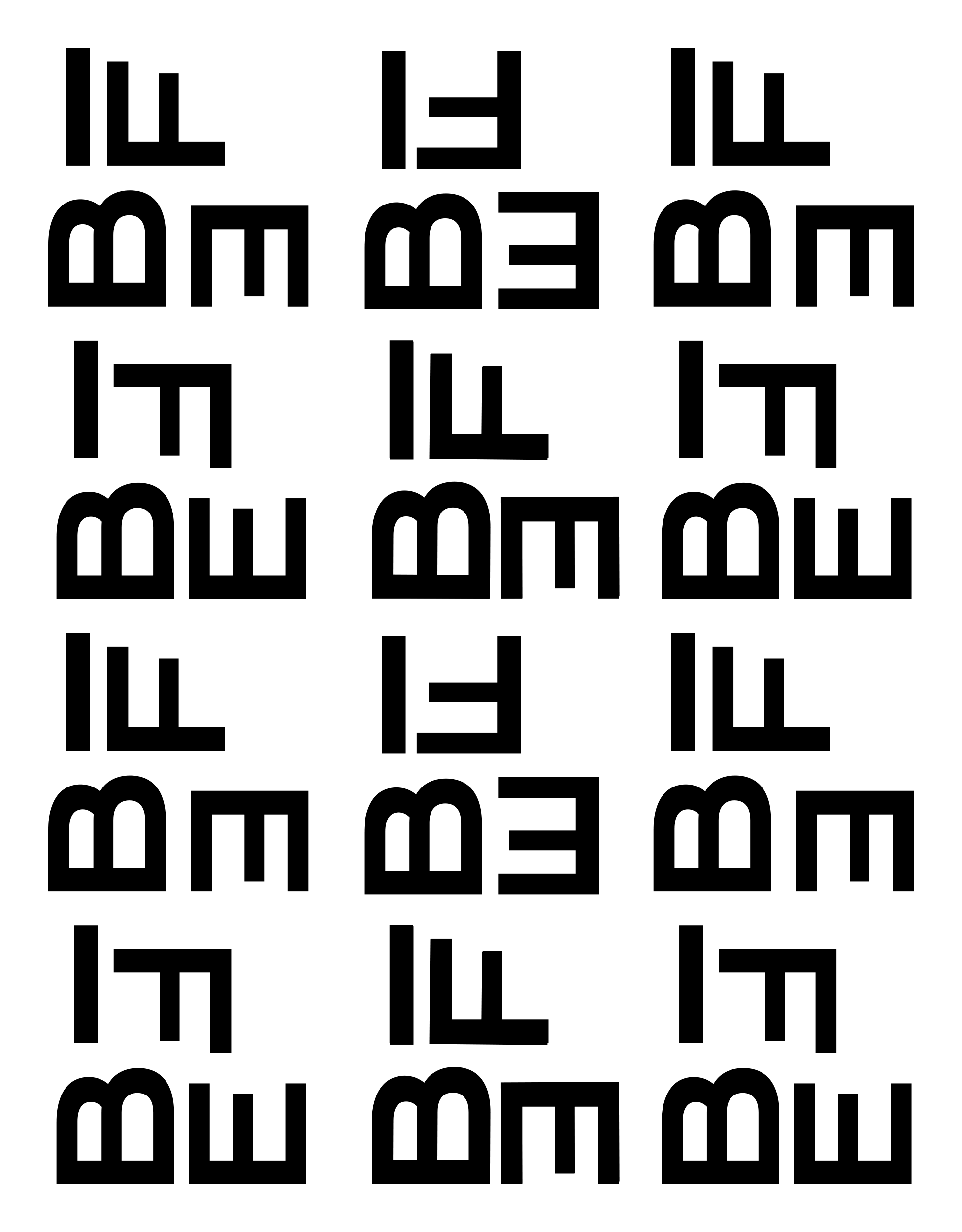
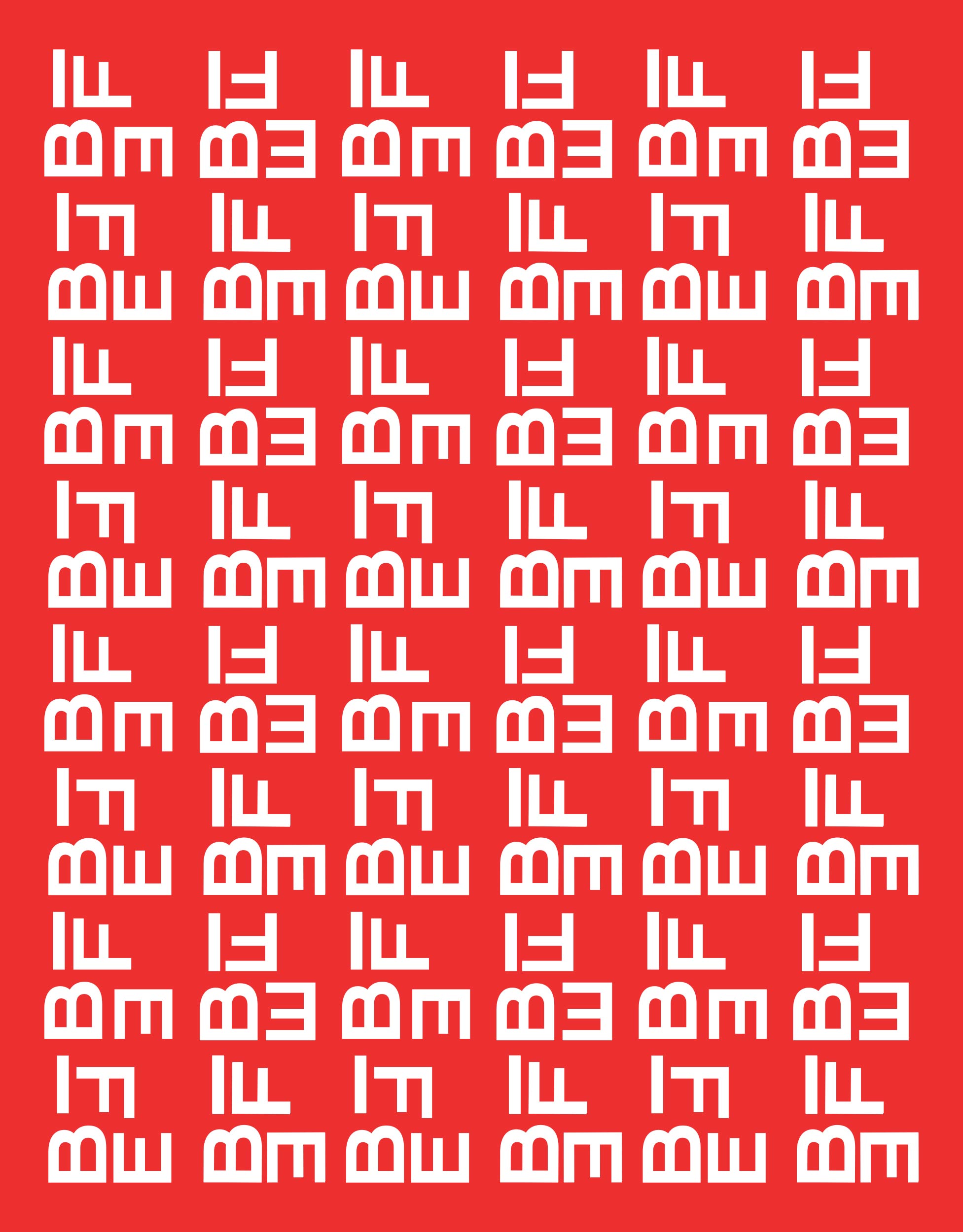
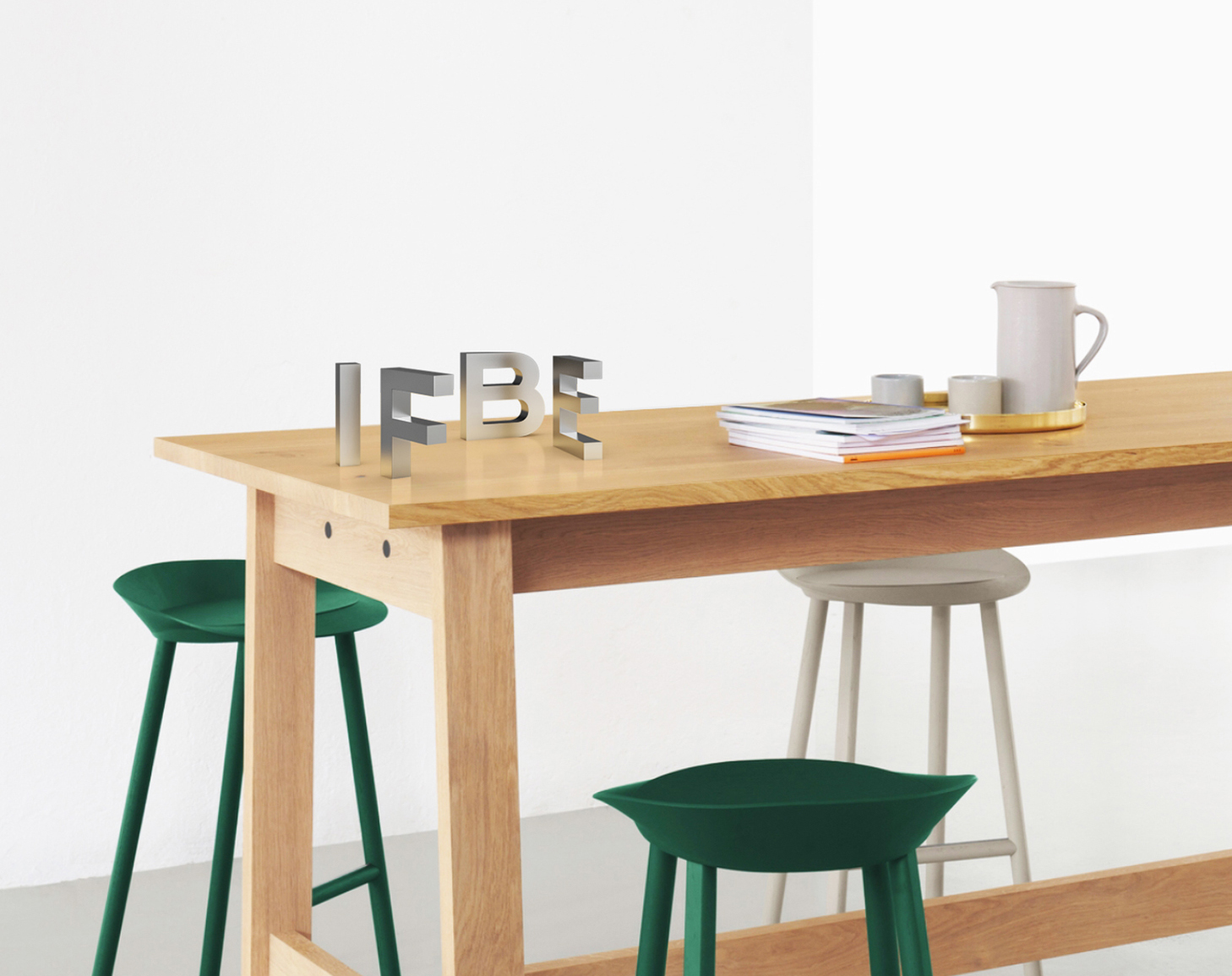
This led us to design the identity of IF.BE less as a symbol, but more as a form coming together by the letters. The unit of IF.BE is bold and contained. The appearance of the identity proposes an image that is confident in its own presence and yet willing to be more.
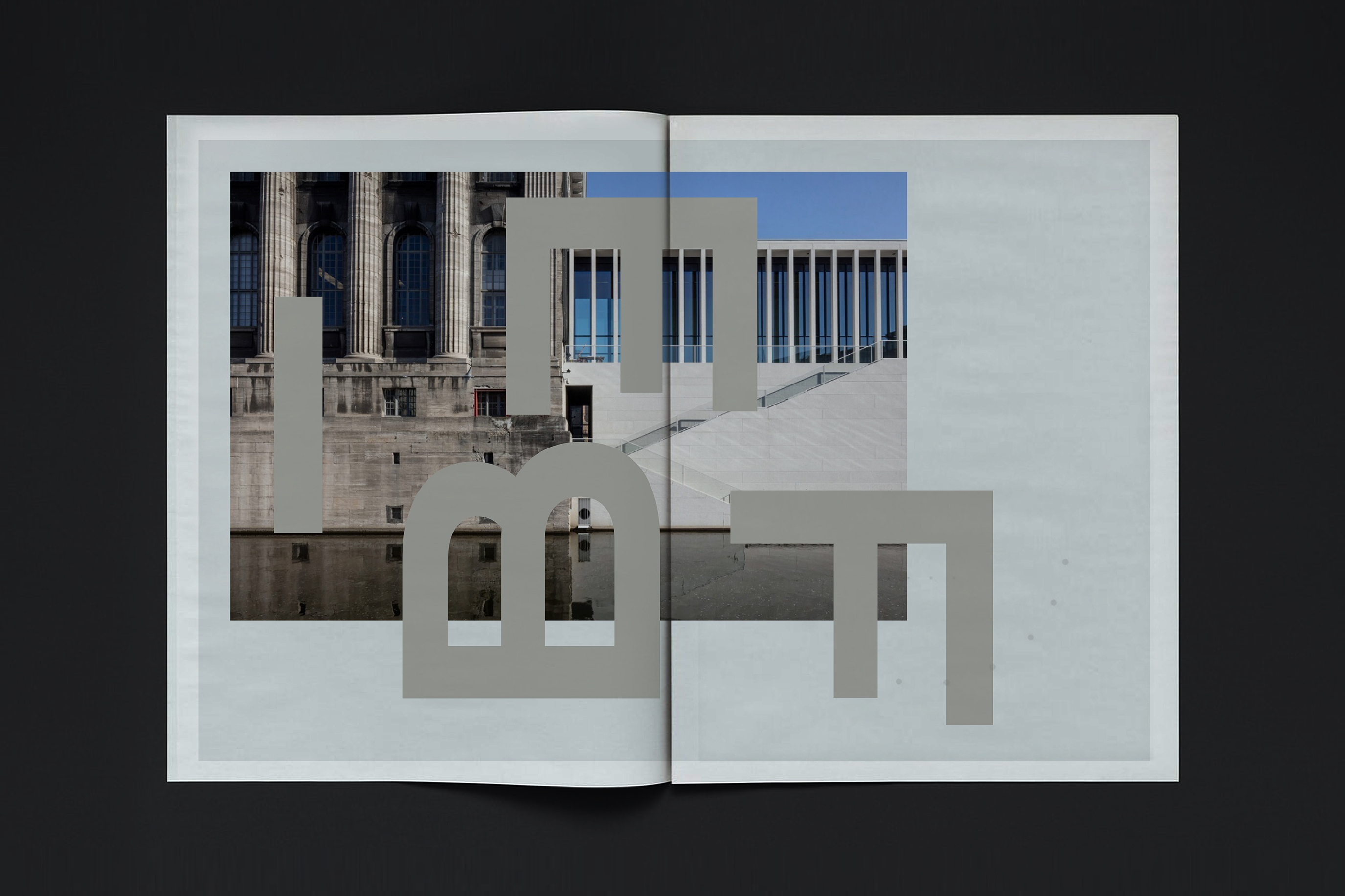
The playful reorganisation of the letters reveals a new language where the letters disappear and forms emerge. The new orientations in different scales become objects and micro-architectures forming columns, structures and arches. The multiplication of the unit can easily be a plan, a pattern or a new language.
The IF.BE space has a quality that reflects the previous; repurposing it for a new use-just like water-forming ice and yet willing to return back to its original form.
The IF.BE space has a quality that reflects the previous; repurposing it for a new use-just like water-forming ice and yet willing to return back to its original form.


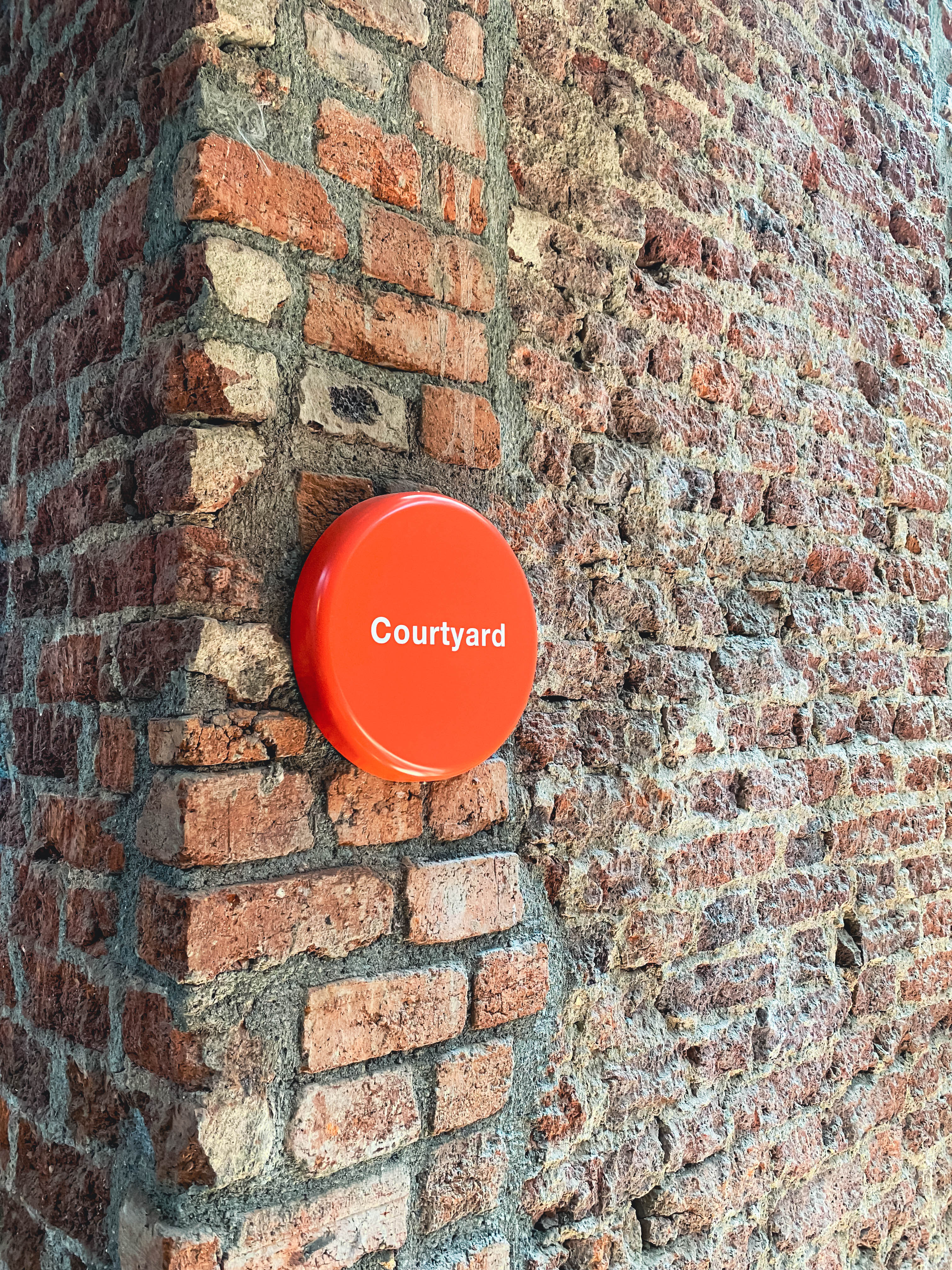
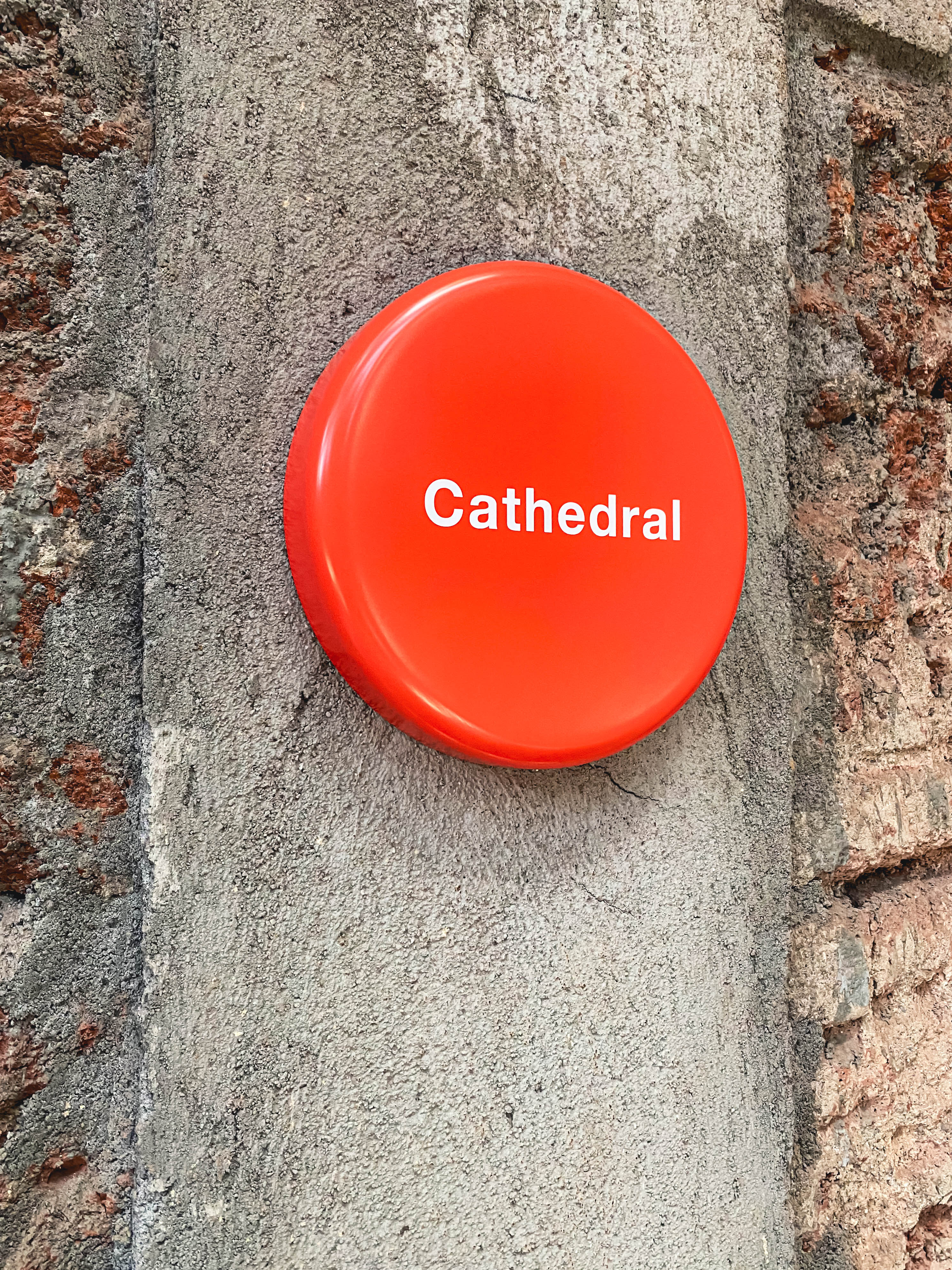
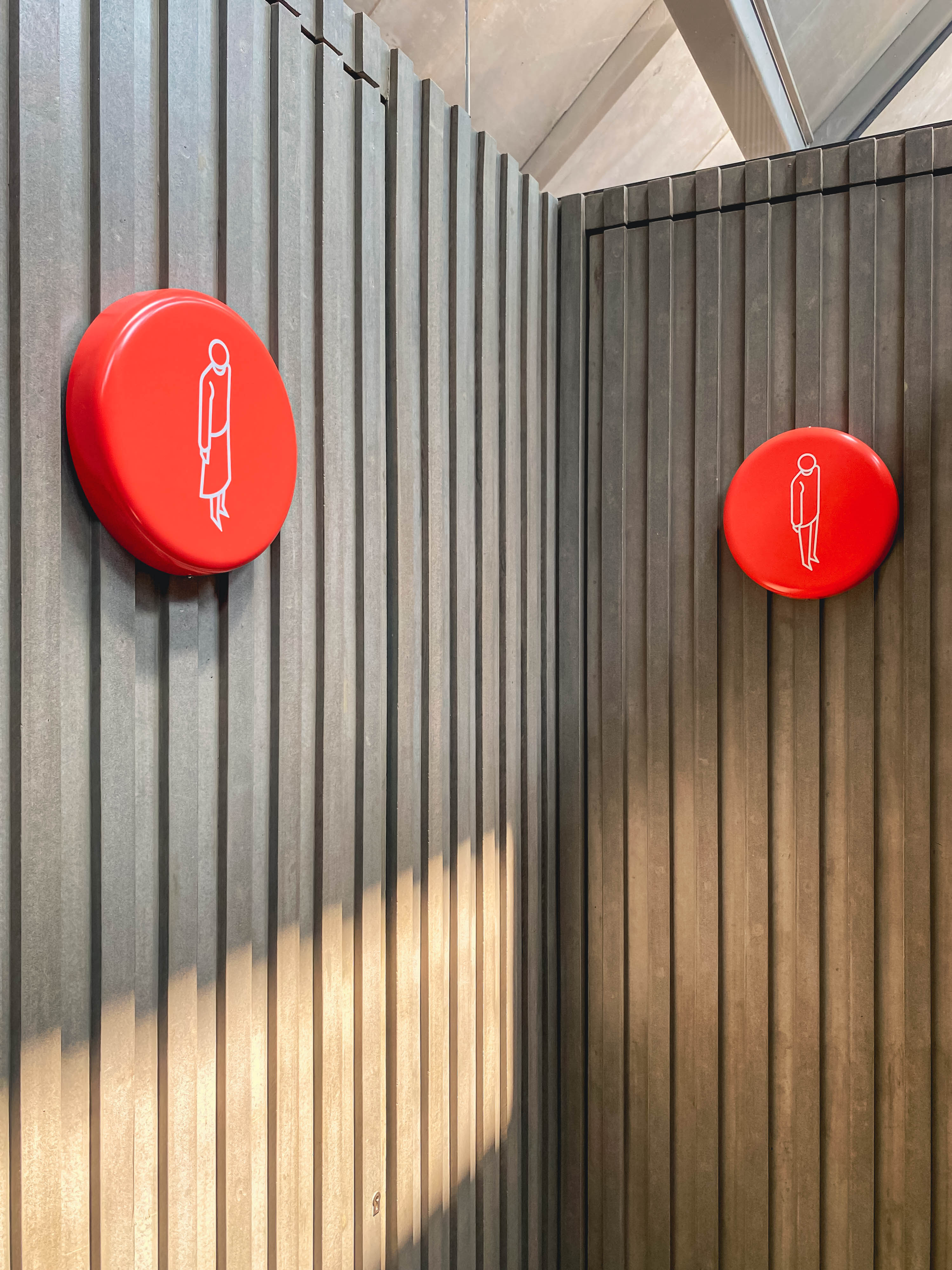
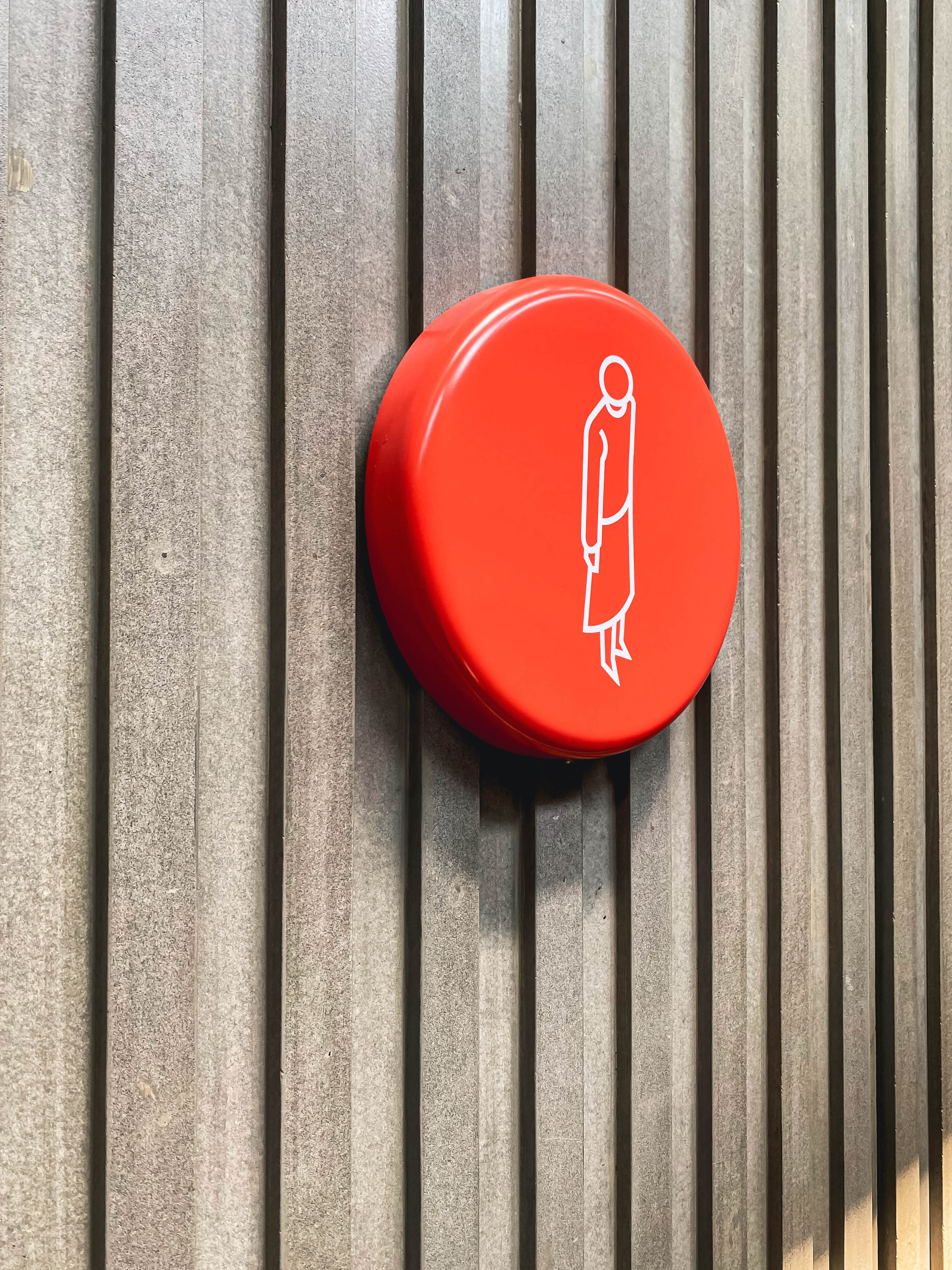
The IF.BE interior space is exposed in terms of materials to reflect the legacy of the original space. Wood beams and truss structures, brick walls, metal girders and concrete form the space look. We were asked to design signage to define each feature within this space.
The proposed design is a 10” orange tablet with a graphic icon or text appearing in a white vinyl. The tablet is reflective of the dot between the start and the end: between IF and BE.The tablet is formed in plastic and mounted directly on the wall surface.
The simple soft form, the colour and the graphic icon has presence and its own character, which in some way announces the plurality of things to come.
