Kala Ghoda Cafe graphic design
Kala Ghoda is Mumbai’s original downtown precinct, a neighbourhood that has gradually transformed through the presence of independent cafés and boutique retail. The area also hosts an annual street festival celebrating culture, design, and the arts through talks and pop-up events.
Tucked within this vibrant district is Kala Ghoda Cafe, often referred to simply as KGC. As one of the early cafés to define the area’s culinary landscape, it built a strong reputation for its coffee and food.
During the pandemic, the café recognised the growing importance of food delivery. Staying true to their design-forward ethos, the founders wanted to create thoughtful, well-designed takeaway packaging. The brief was straightforward: make it cost-effective, practical, sustainable, and without pretension.
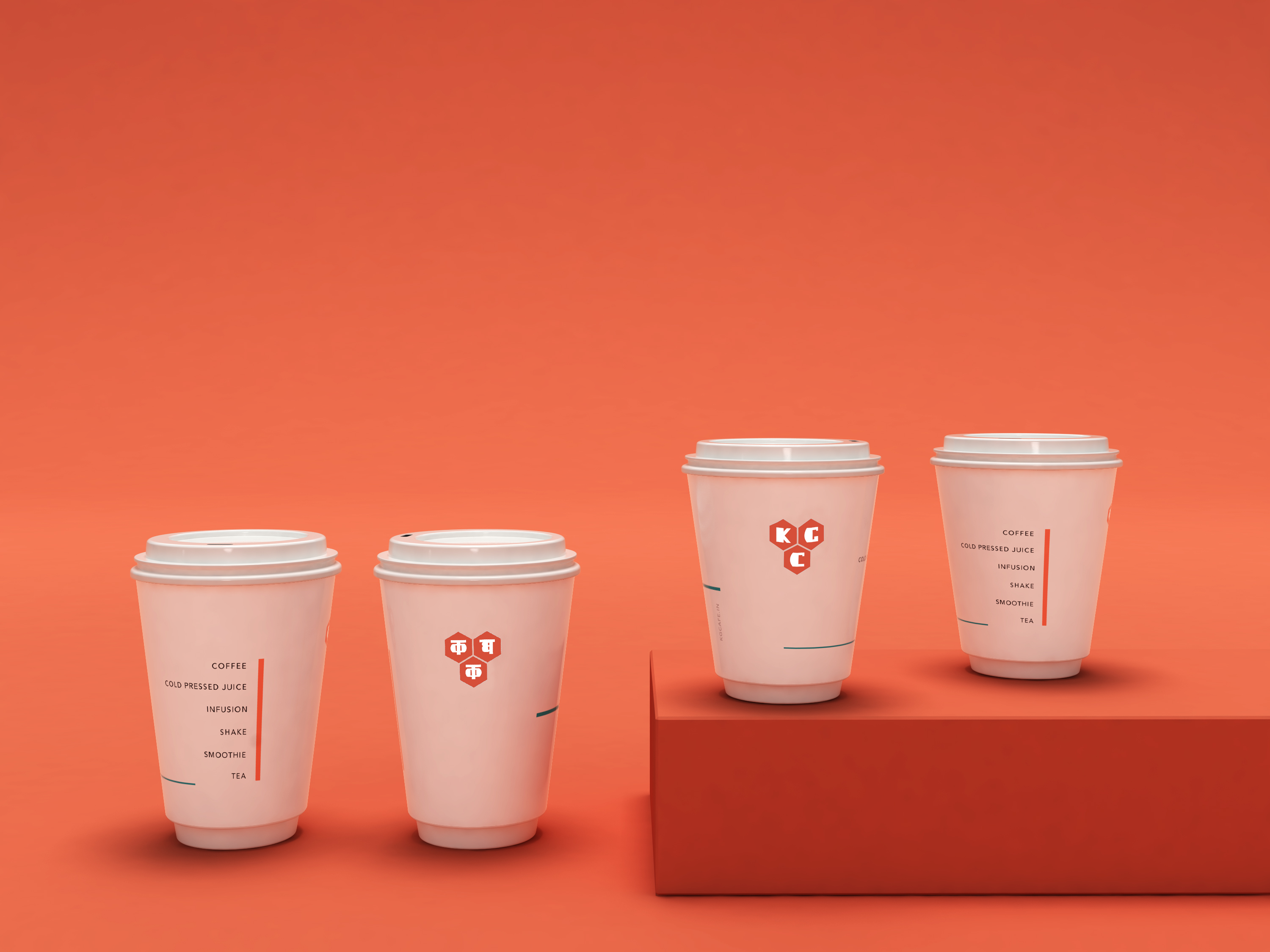
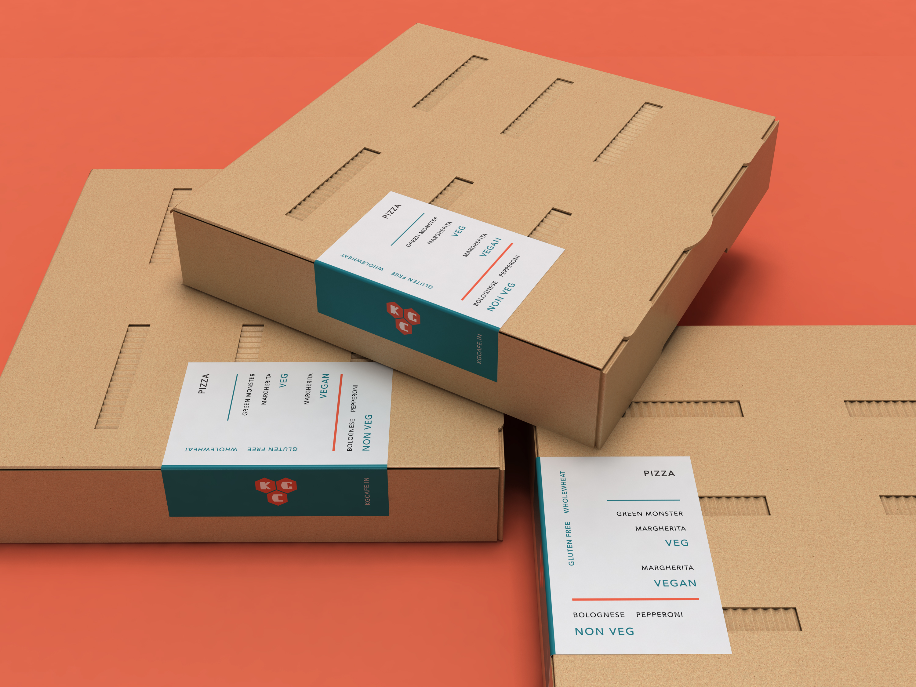
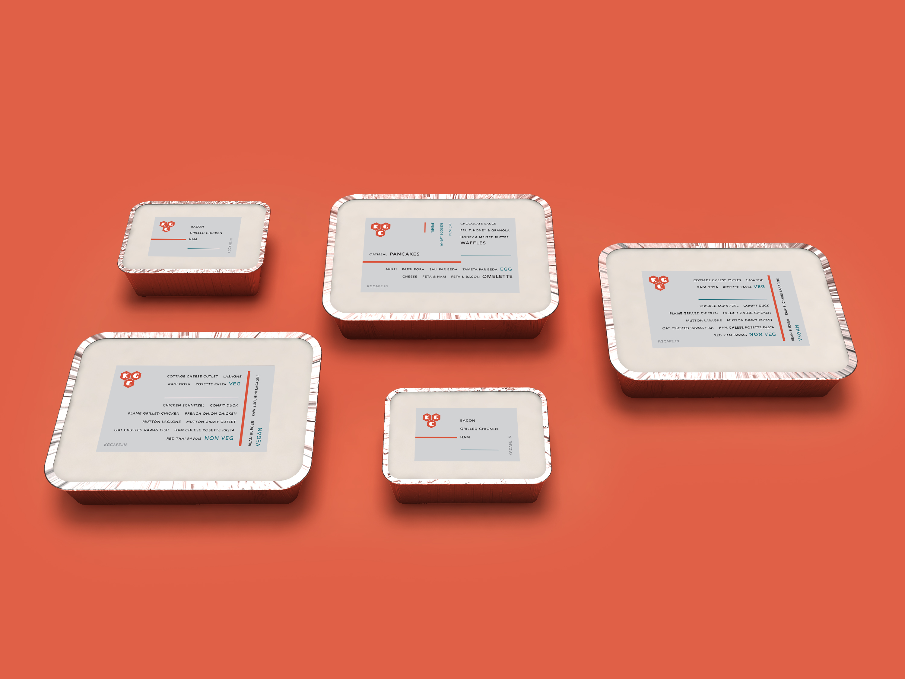
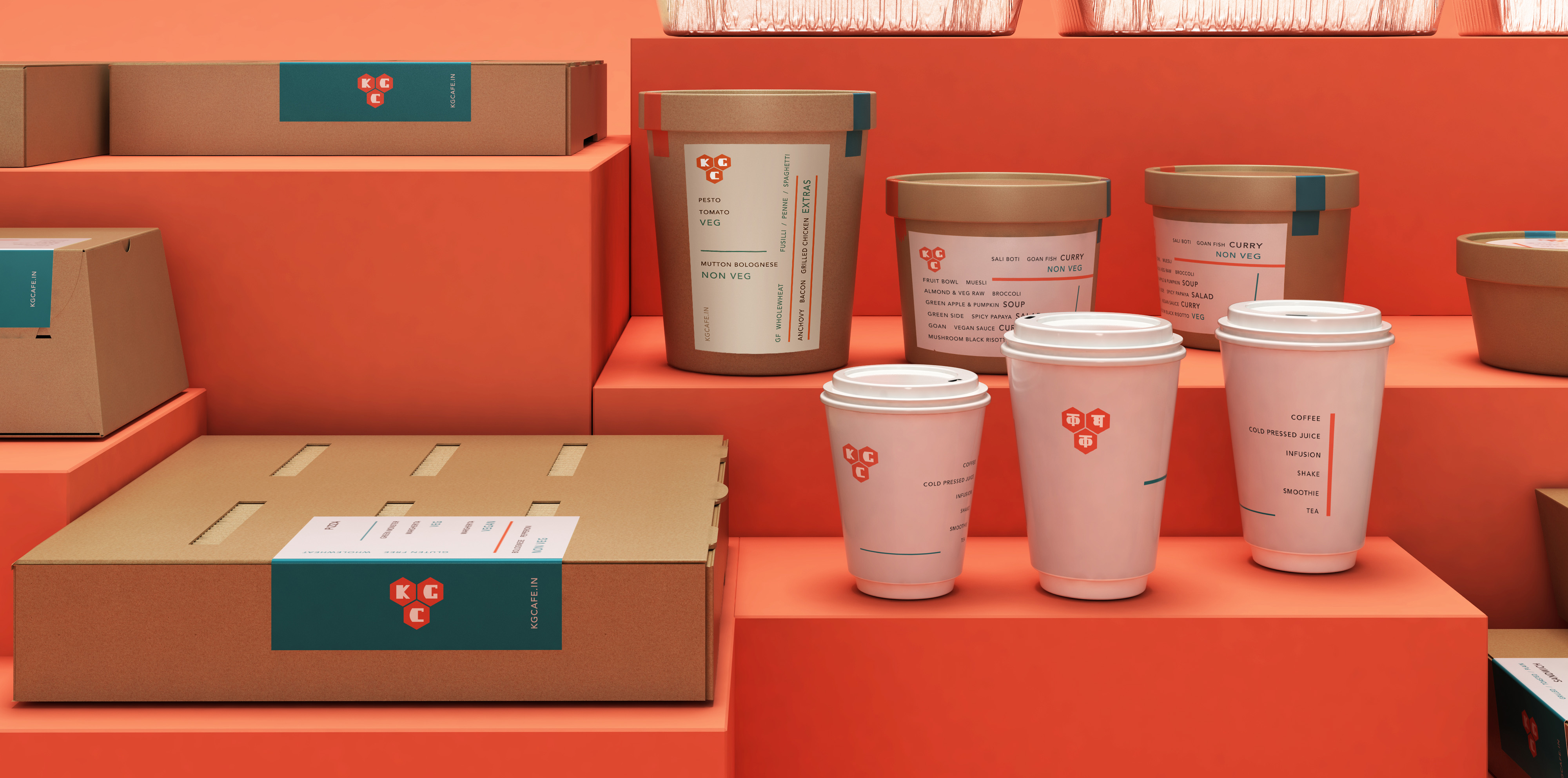
Rather than redesigning the packaging itself, we focused on the label. The label is designed to communicate clearly and graphically, listing the various cuisines the café offers. When packing food, staff can highlight the relevant item directly on the label—making the system efficient and intuitive.
The labels feature deep red and cyan, two of the café’s brand colours. Designed to fold and seal the package, the labels also include a subtle perforation for easy opening.
Visually, the design draws inspiration from the typographic compositions of Dutch designer Piet Zwart.
This project was a design collaboration with Naomi Shah .