Moonshine Meadery identity and package design
With the ambition of becoming Asia’s first meadery, Moonshine needed a brand identity that was both distinctive and versatile—one that could scale seamlessly across different geographies.
The inspiration for the visual identity came from alphabet charts used in early learning—where associations like “A for Apple” or “B for Ball” are first introduced. This concept taps into the fundamental nature of language and discovery, echoing Moonshine Meadery’s pioneering spirit as the first of its kind in the region.
The inspiration for the visual identity came from alphabet charts used in early learning—where associations like “A for Apple” or “B for Ball” are first introduced. This concept taps into the fundamental nature of language and discovery, echoing Moonshine Meadery’s pioneering spirit as the first of its kind in the region.
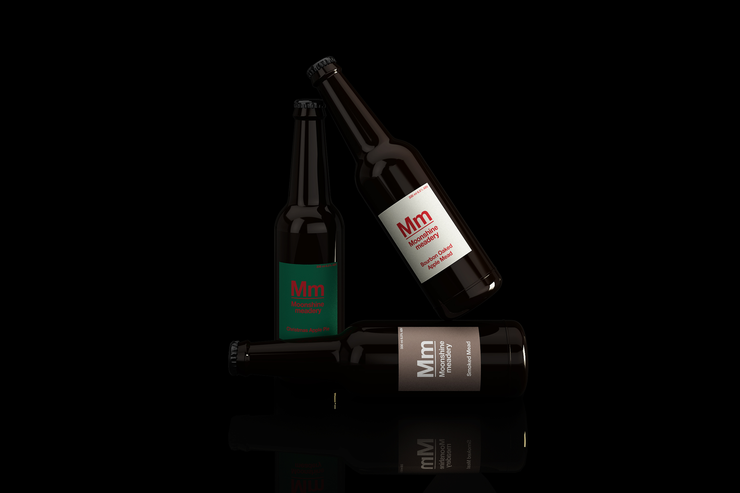
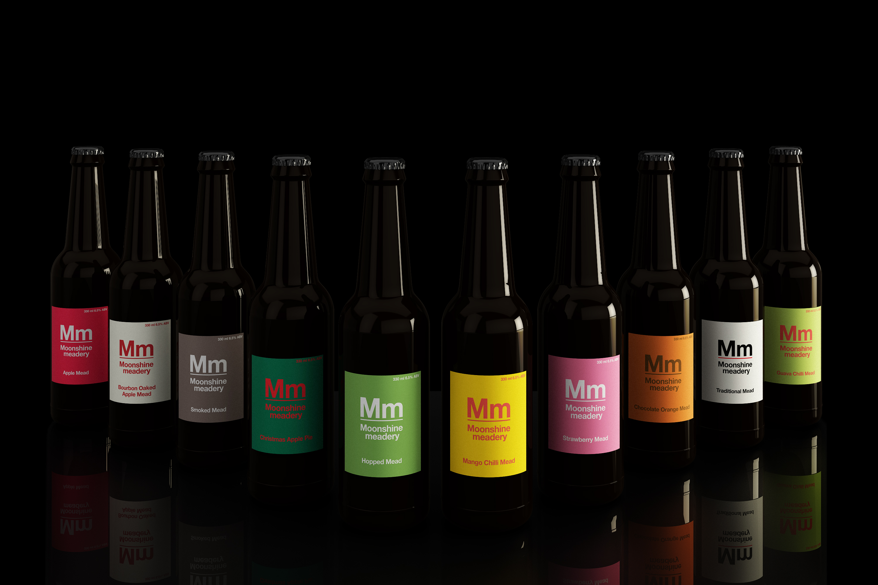
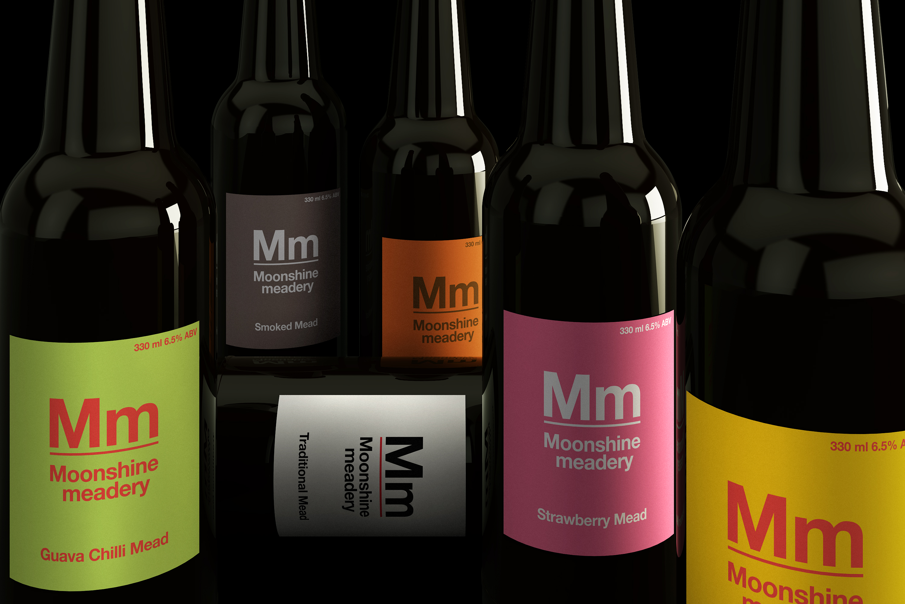
While solid colours were used to distinguish between flavour profiles, the identity is firmly type-led in its design approach. A subtle yet consistent detail—the use of a red line in the primary logo—was carried across various brand communication materials to maintain visual coherence.
Although the Mm identity was later evolved by another design studio, we were invited back to create a special Christmas edition for our friends at Moonshine—adding a festive layer to a brand we were proud to help launch.
Although the Mm identity was later evolved by another design studio, we were invited back to create a special Christmas edition for our friends at Moonshine—adding a festive layer to a brand we were proud to help launch.