Naya Studio identity design
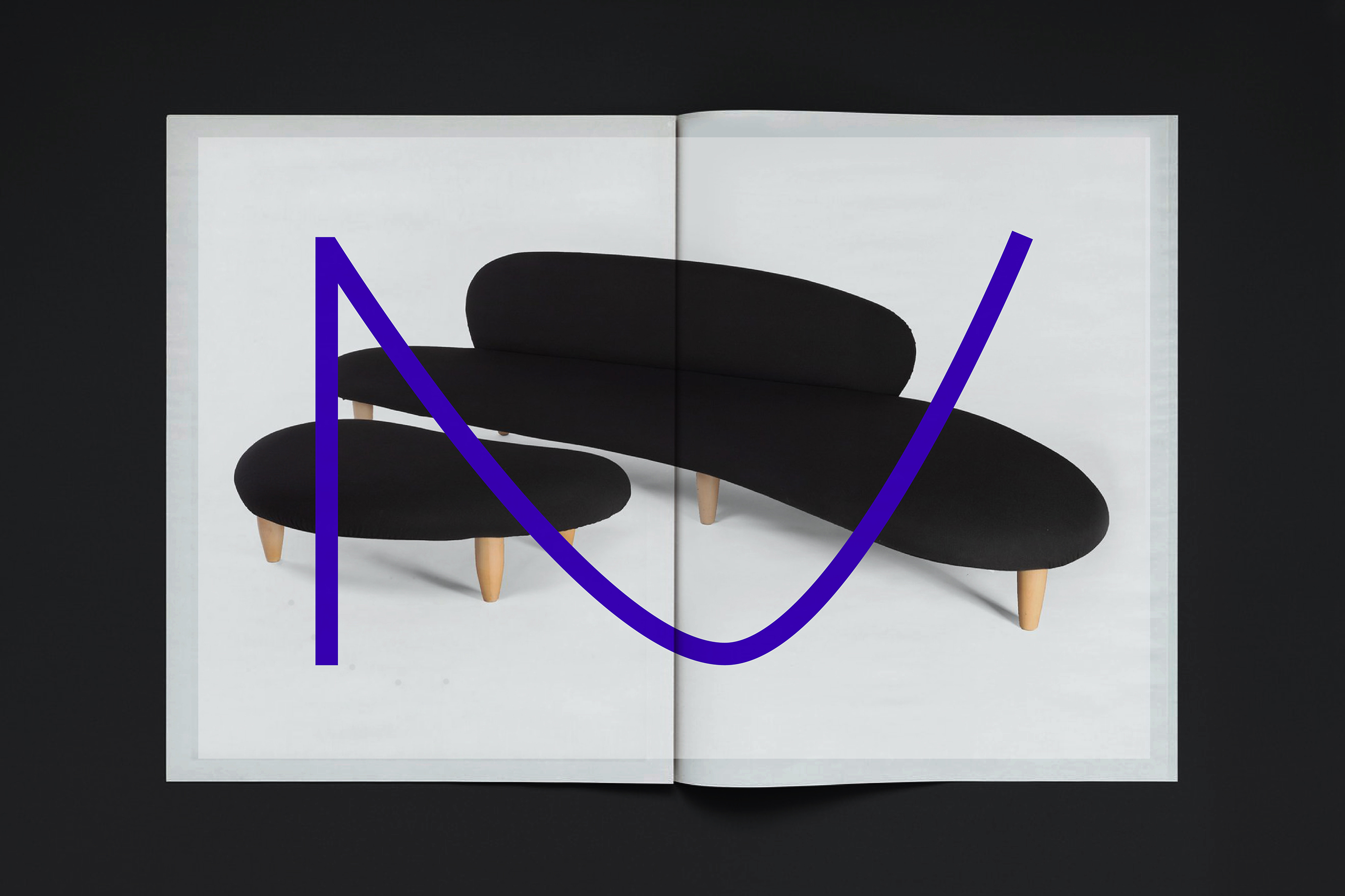
Naya is a platform that enables creation through a distributed network of designers and makers. It offers design development and oversees serial production for anyone interested in bringing their own furniture ideas to life. Built on a democratic model, Naya encourages collaboration between individuals, professionals, and enterprises alike. Though powered by technology, its core lies in the physical world. Unbound by geography, Naya connects customers, designers, and manufacturers across the globe.
To express its ideology and unique business model, Naya required a compelling visual identity—one that could speak to both stakeholders and end users.
To express its ideology and unique business model, Naya required a compelling visual identity—one that could speak to both stakeholders and end users.
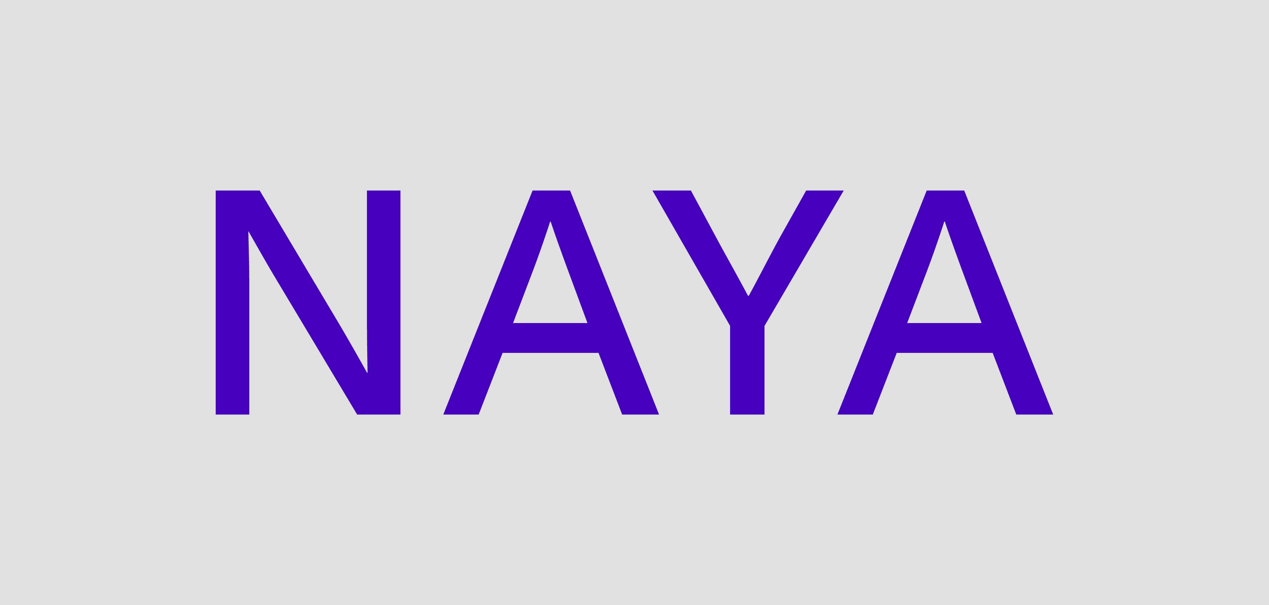
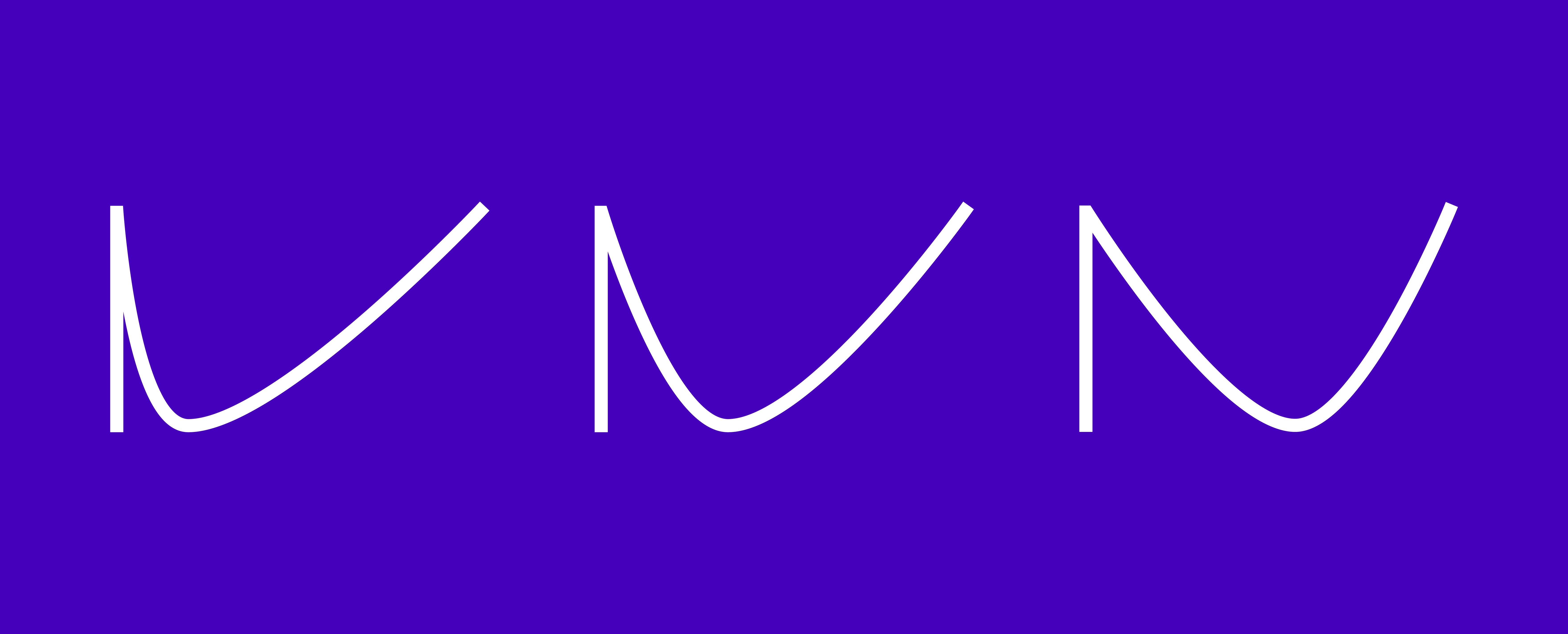
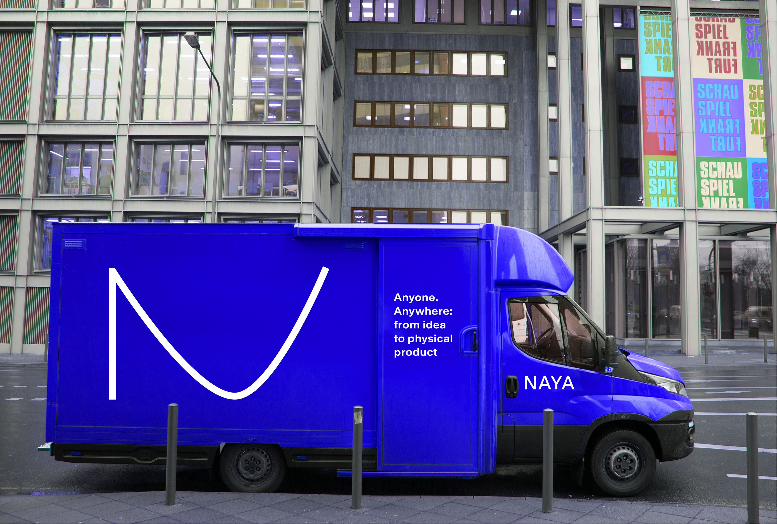
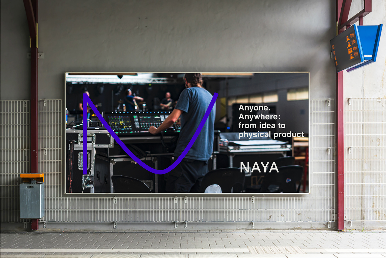
The identity draws inspiration from Naya’s three-step process of engagement, shaping a symbolic and memorable mark for the brand. The proposed typeface, Rand (by Optimo), pays homage to the influential graphic designer Paul Rand, while the specific shade of blue references the spirit of 21st-century technology.
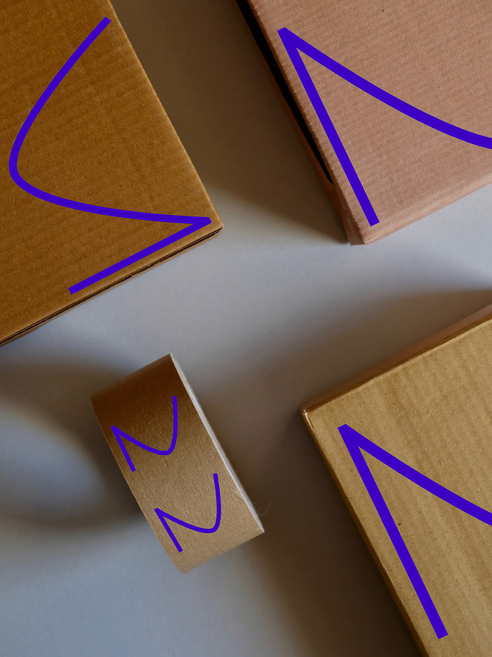
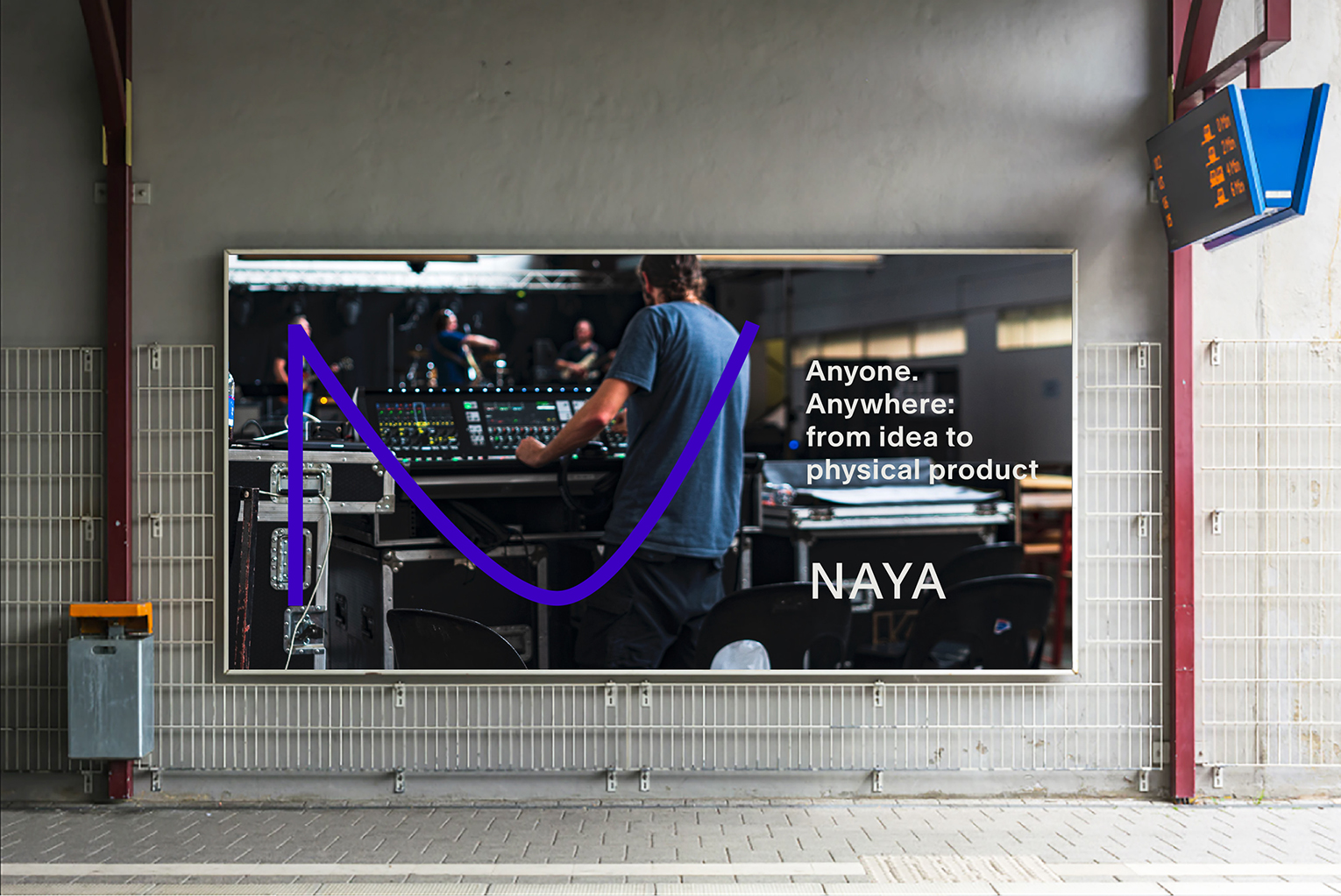
A strong use of the letter ‘N’ across various brand applications reinforces a distinctive and recognisable identity.
This was a design collaboration with Naomi Shah.
Read more.
A strong use of the letter ‘N’ across various brand applications reinforces a distinctive and recognisable identity.
This was a design collaboration with Naomi Shah.
Read more.
