Phoenix Group strategy, identity design

We led the rebranding of one of Hyderabad’s largest commercial real estate developers. Through extensive conversations and collaborative workshops with the client team, we arrived at a clear brand manifesto that redefined the company’s values and ethos.
This new spirit was distilled into a single, powerful word: Let’s.
Versatile and action-oriented, Let’s became the foundation for a series of brand expressions—capturing the company's ambition, inclusivity, and forward-thinking mindset.
This new spirit was distilled into a single, powerful word: Let’s.
Versatile and action-oriented, Let’s became the foundation for a series of brand expressions—capturing the company's ambition, inclusivity, and forward-thinking mindset.
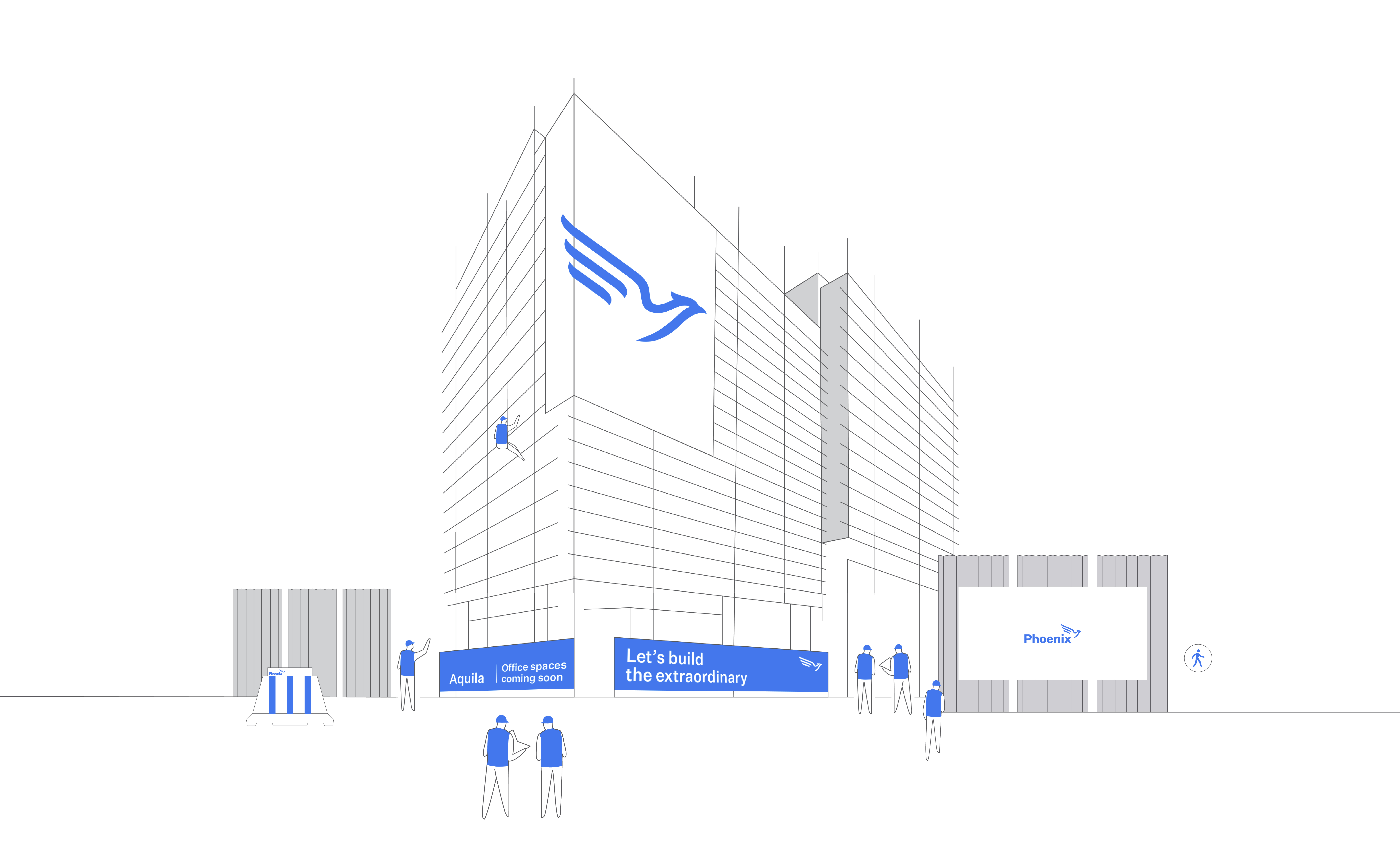
A refreshed design language was developed to align with this positioning. The company’s iconic Phoenix symbol was thoughtfully reinterpreted, and comprehensive design guidelines were created for use across all brand touchpoints.
Together, these elements present a brand that is energised, optimistic, and ready to soar.
Together, these elements present a brand that is energised, optimistic, and ready to soar.


