Under the Sun environmental graphics

A few years ago, we designed the graphic identity for a villa project titled Under the Sun.
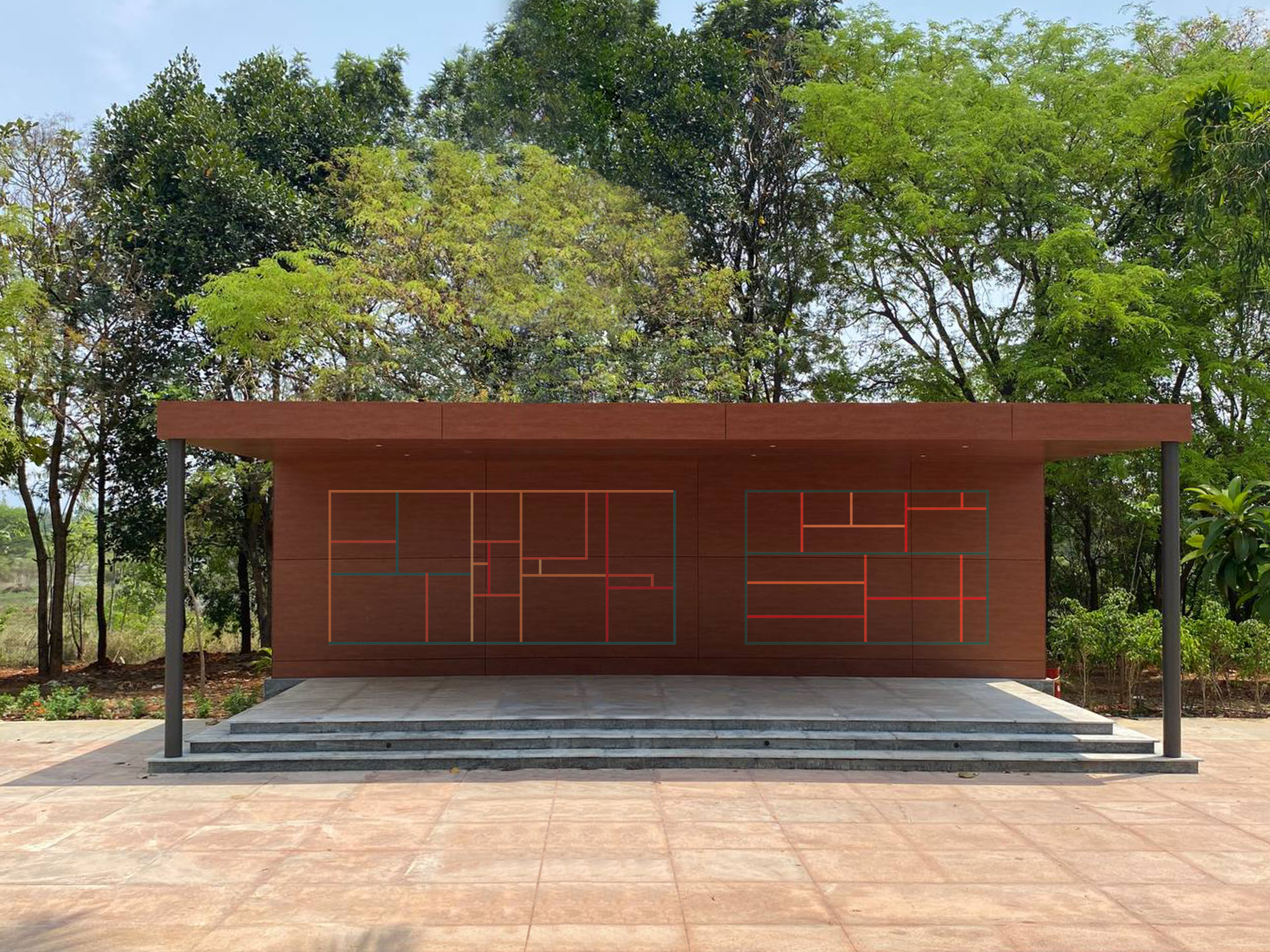
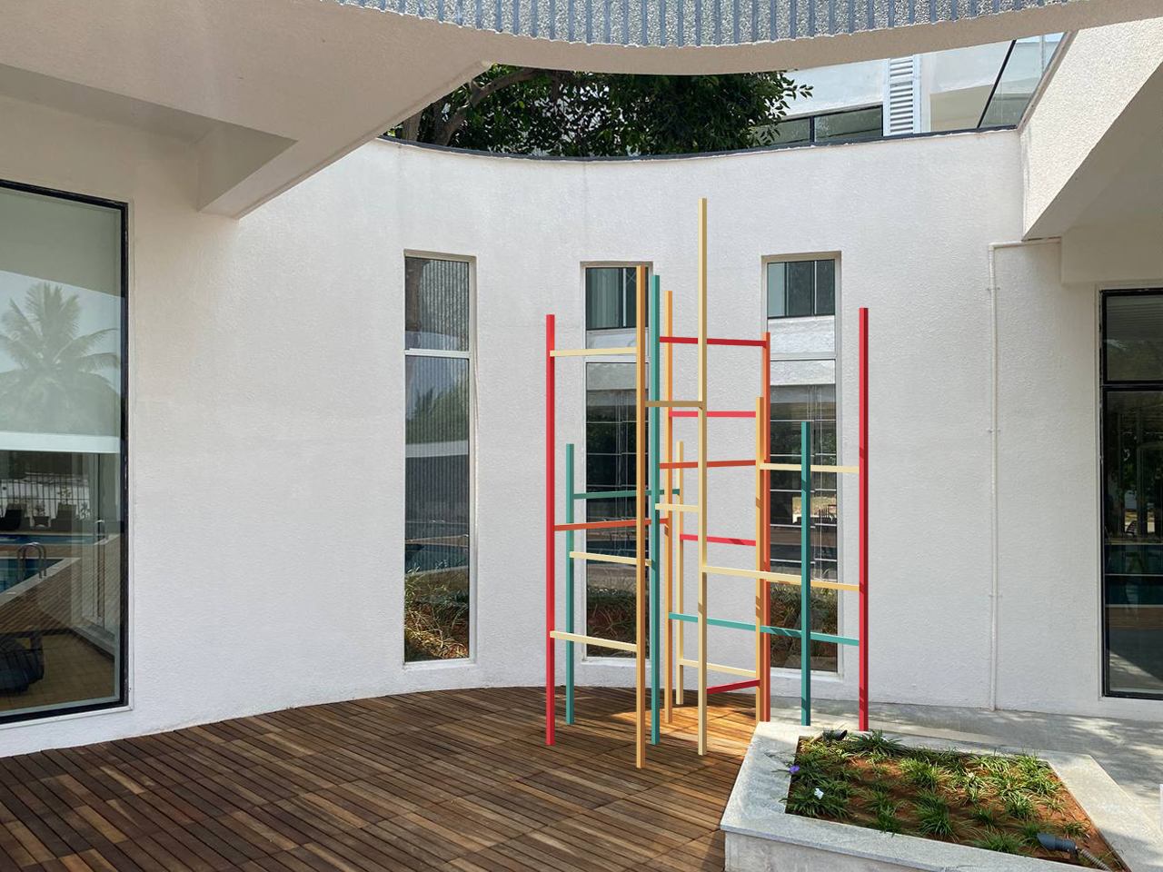
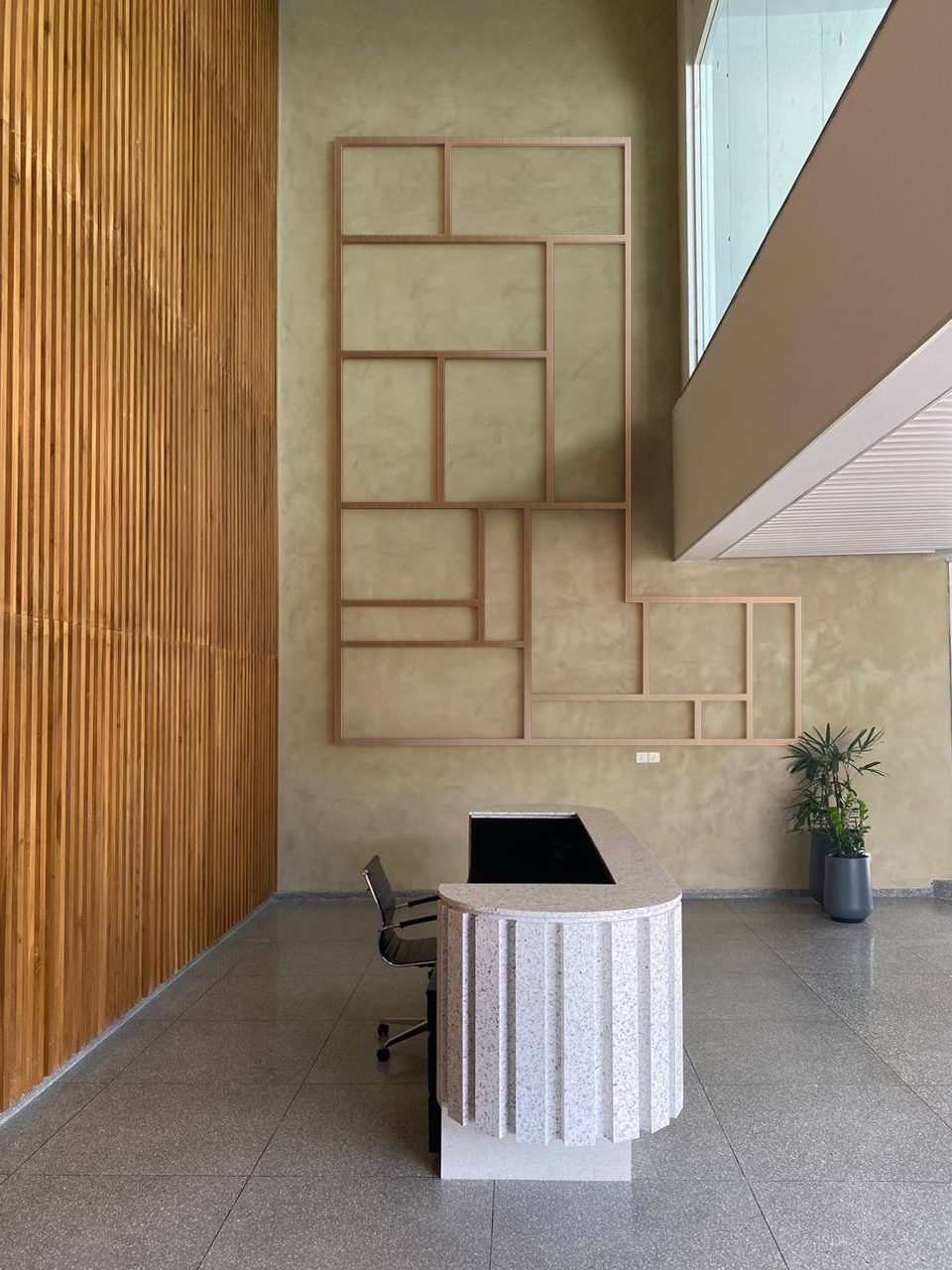
Following the project's completion, we were invited to create a graphic intervention within its Club House. The architecture of the Club House is straightforward and minimal in character, which gave us an open canvas to introduce a distinct visual language.
We turned to the work of Piet Mondrian for inspiration. A key figure in the De Stijl movement, Mondrian sought to express what he called “universal beauty” through a reduced formal language—working exclusively with the three primary colours (red, blue, yellow), the three fundamental values (black, white, grey), and two basic directions (horizontal and vertical). As design historian Stephen Bayley once said, “Mondrian has come to mean Modernism.”
Drawing from this philosophy, our graphic intervention extends across wall surfaces and takes shape in freestanding elements within the space—translating Mondrian’s abstract vocabulary into a spatial, immersive experience.


