Vensa Breeze nomenclature, brand identity

Vensa Breeze is a villa development project located in Hyderabad, India.
Building on the visual identity of its parent company, Vensa—which is rooted in the concept of the Cartesian plane—we extended this graphic language to the branding of Vensa’s individual real estate projects.
Building on the visual identity of its parent company, Vensa—which is rooted in the concept of the Cartesian plane—we extended this graphic language to the branding of Vensa’s individual real estate projects.
For Vensa Breeze, we embedded the symbol within the letter B, suggesting a sense of space and dimensionality—echoing the relationship between the project’s indoor and outdoor environments.
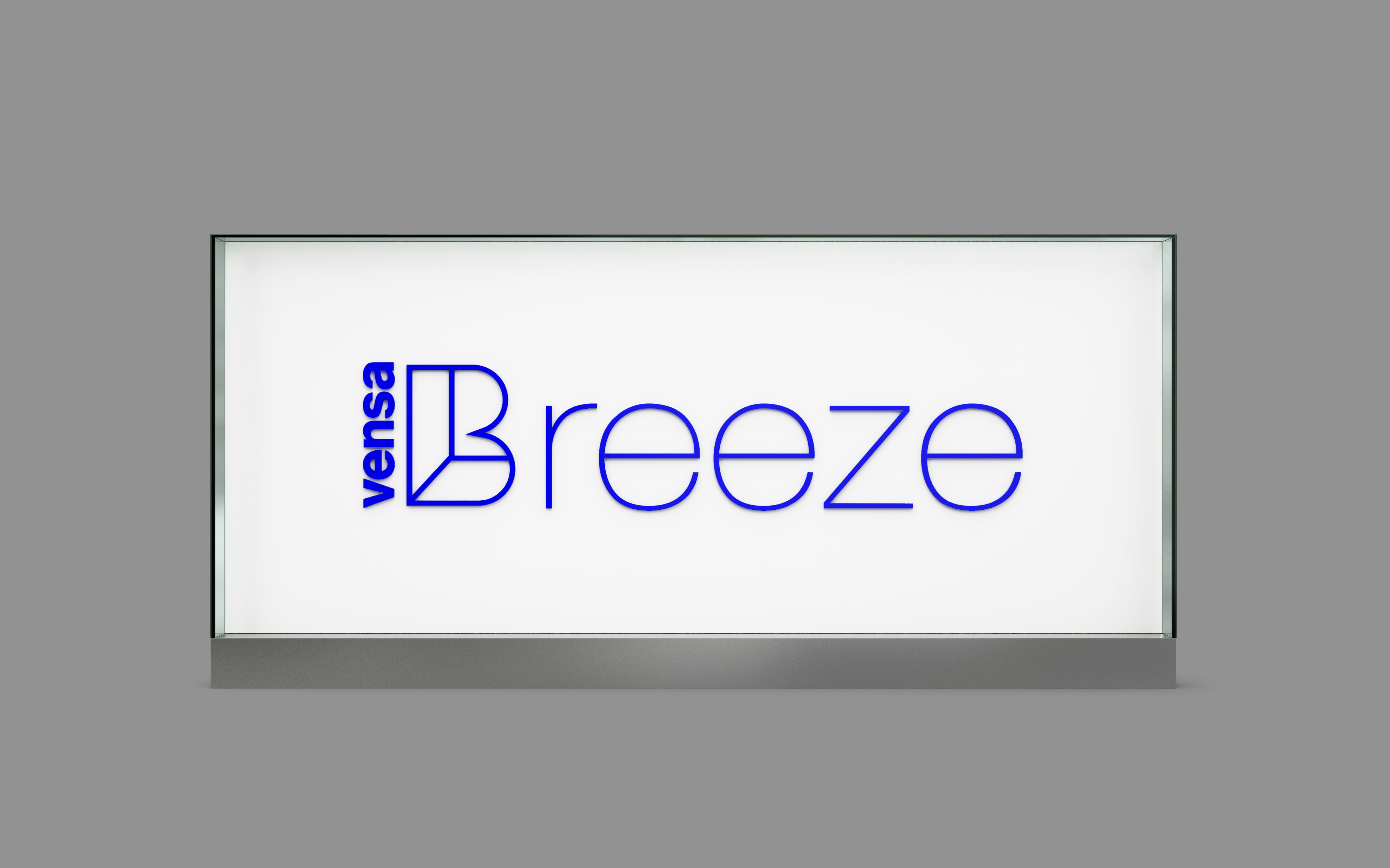
This identity carries through various touchpoints across the project, including the project logo, signage, and other key visual elements.
This identity carries through various touchpoints across the project, including the project logo, signage, and other key visual elements.
