Vensa One nomenclature, branding
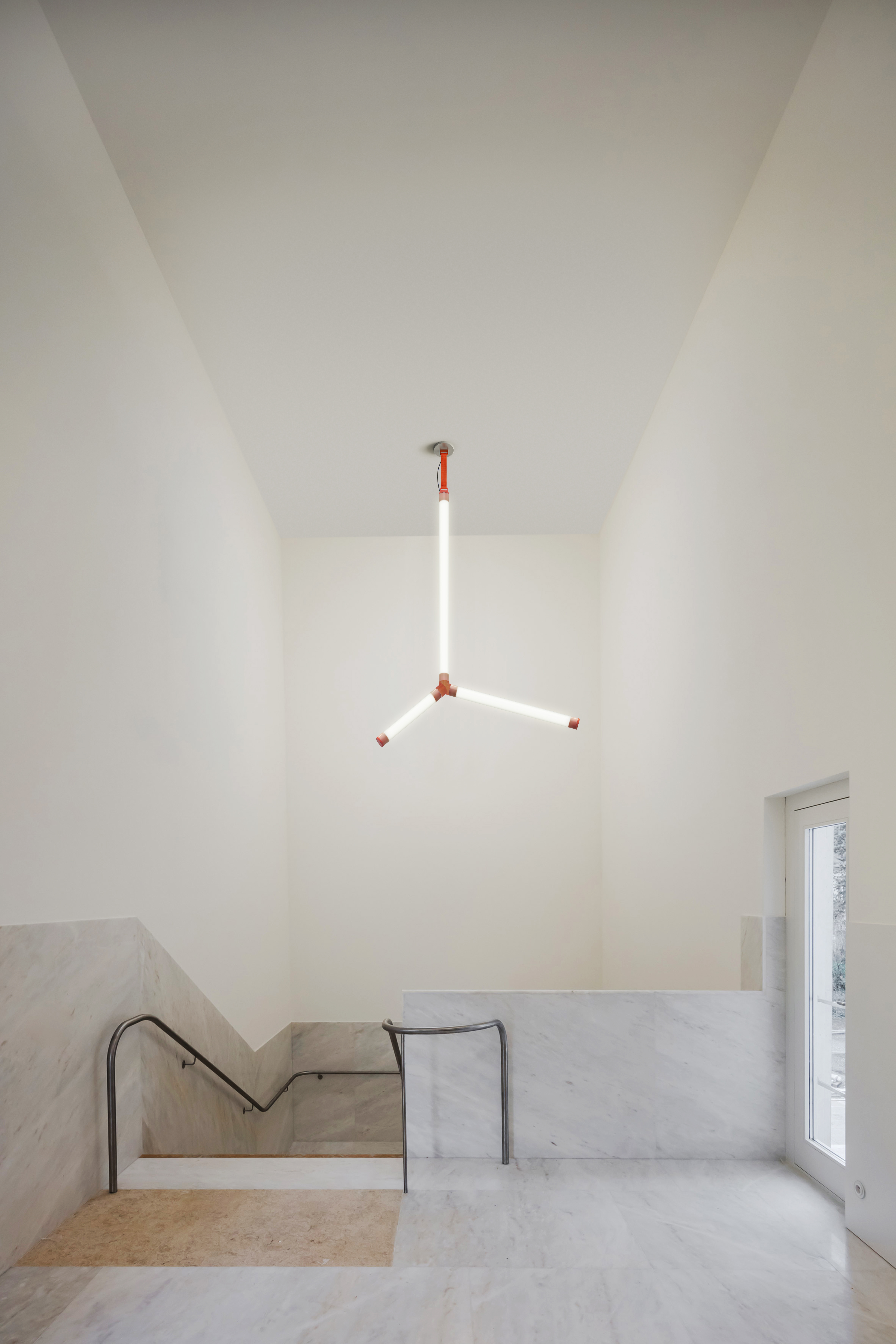
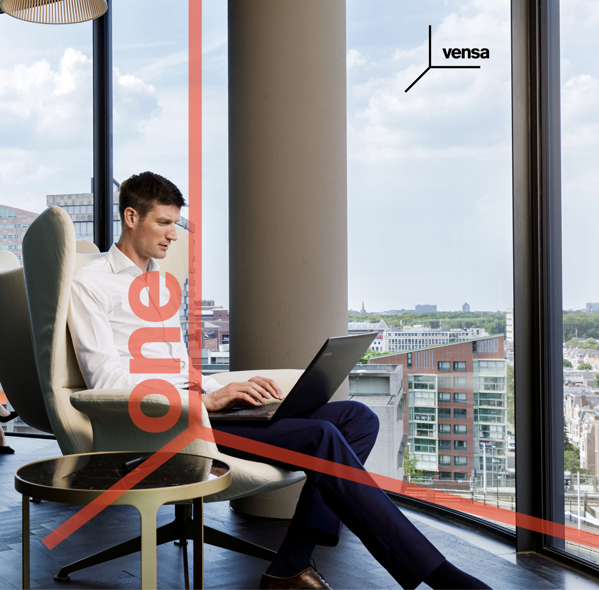
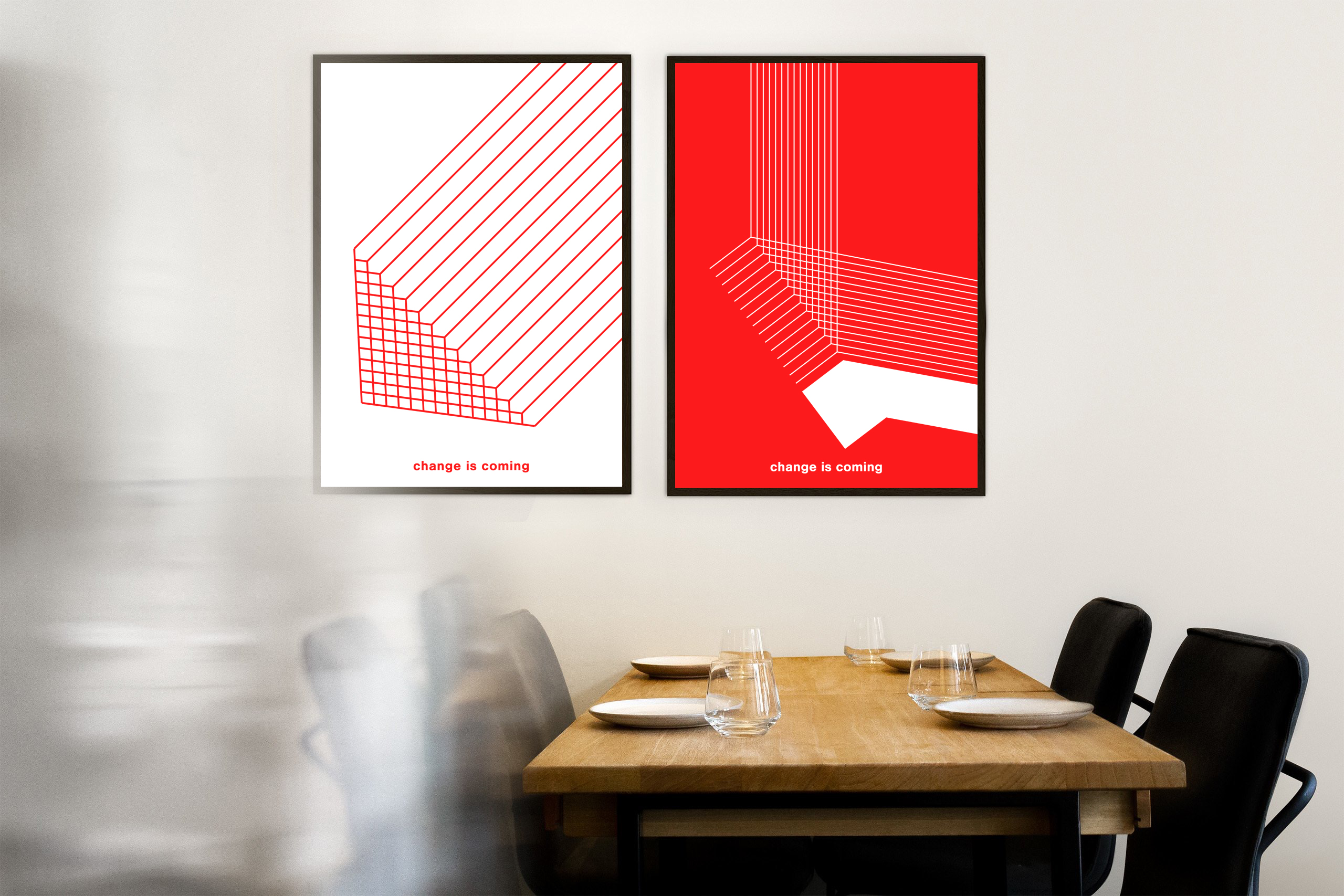
Vensa One is a boutique office tower located in Hyderabad. Its visual identity draws inspiration from the Cartesian plane—also known as the coordinate or xy-plane—where the horizontal (x) and vertical (y) axes intersect at the origin. This conceptual framework allows for the precise positioning of any point, making it a fitting metaphor for a contemporary office landmark.
The identity for Vensa One distills this idea into a vertically oriented symbol, echoing the tower’s height and presence. Paired with a custom wordmark, the symbol forms the core of the brand identity.
The identity for Vensa One distills this idea into a vertically oriented symbol, echoing the tower’s height and presence. Paired with a custom wordmark, the symbol forms the core of the brand identity.
Through inventive applications of this form and typography, the identity extends fluidly across various brand touchpoints—creating a cohesive visual language that reflects the brand’s values and forward-looking vision.