Industrial Playground was founded by Ajay Shah in 2008 as a way to design and create furniture that expresses his personal style. What started out as a personal exploration resulted in a collection of furniture characterised by graphic forms, material construct, and bold colours.
Each piece expresses his natural desire to break away from monotony and expected outcomes.
Industrial Playground is a furniture design practice based in Mumbai. Its work finds application in homes, leisure, retail, hospitality, institutions, and work spaces.
We work closely with architects, designers, and clients to propose our collection, as well as custom design for specific projects.
Contact us to discuss your project requirements.
We work closely with architects, designers, and clients to propose our collection, as well as custom design for specific projects.
Contact us to discuss your project requirements.
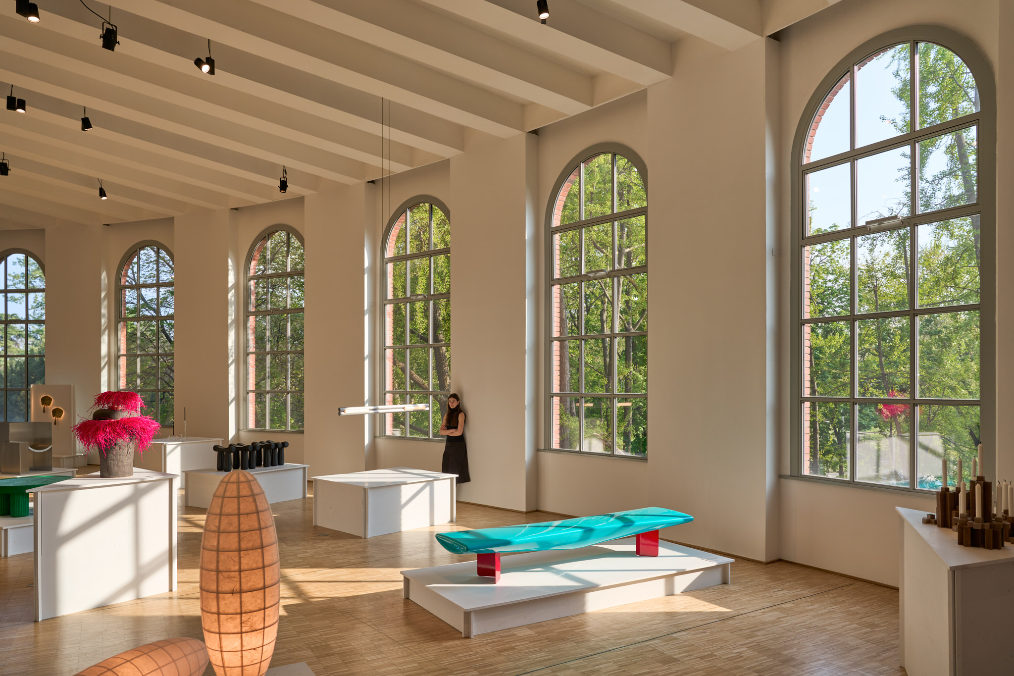
SIT bench at Triennale di Milano for Milan Design Week
Ajay was selected as part of Material Alchemists, Wallpaper* Class of ‘25—a showcase of 20 designers from around the world pushing the boundaries of material and form.
SIT bench was on view at the Curva space in the Triennale di Milano for Milan Design Week 2025.

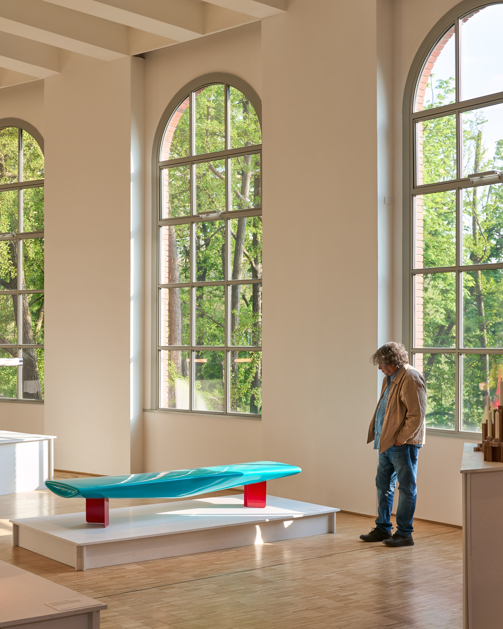
Wave Bench furniture design

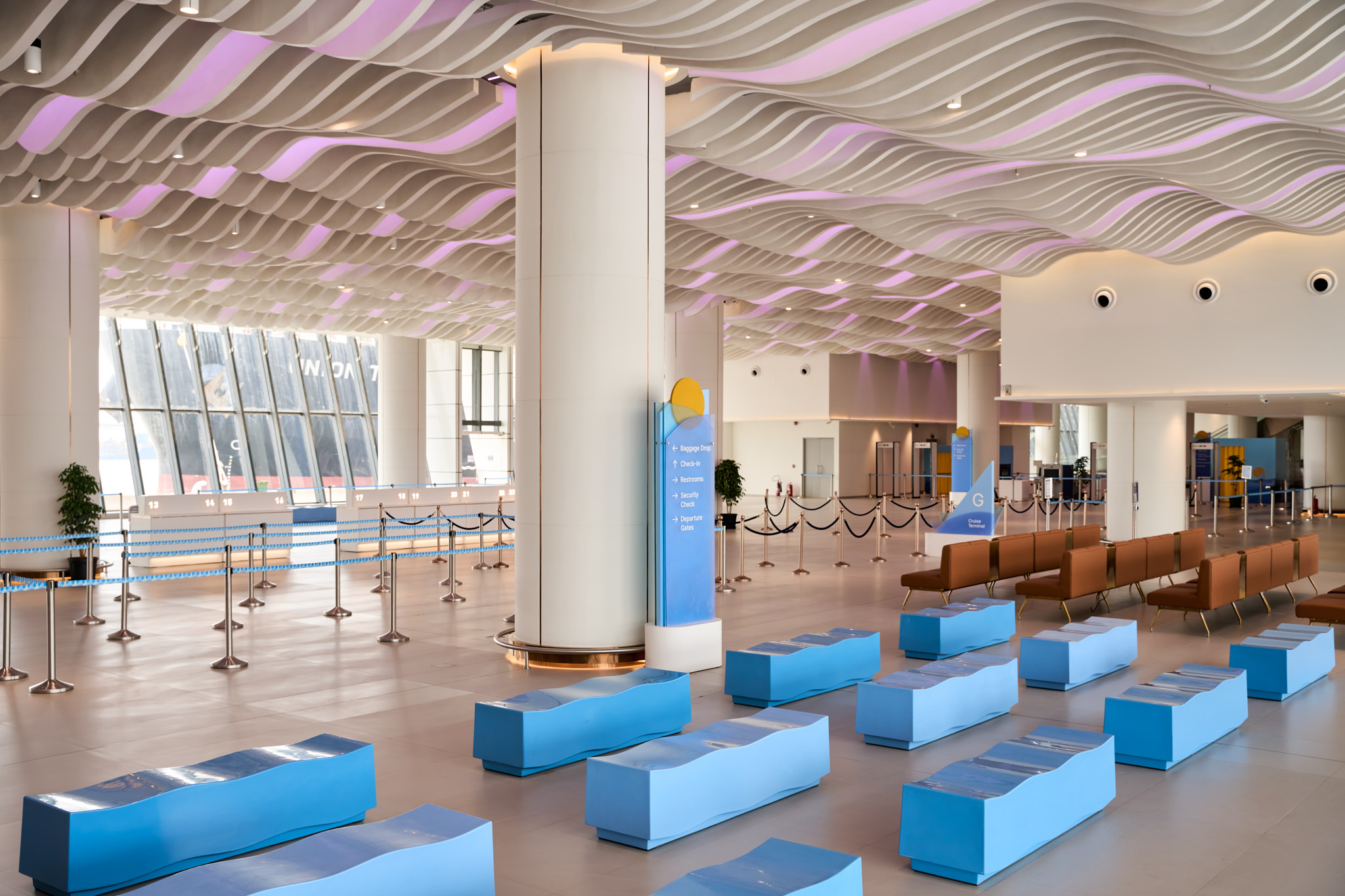
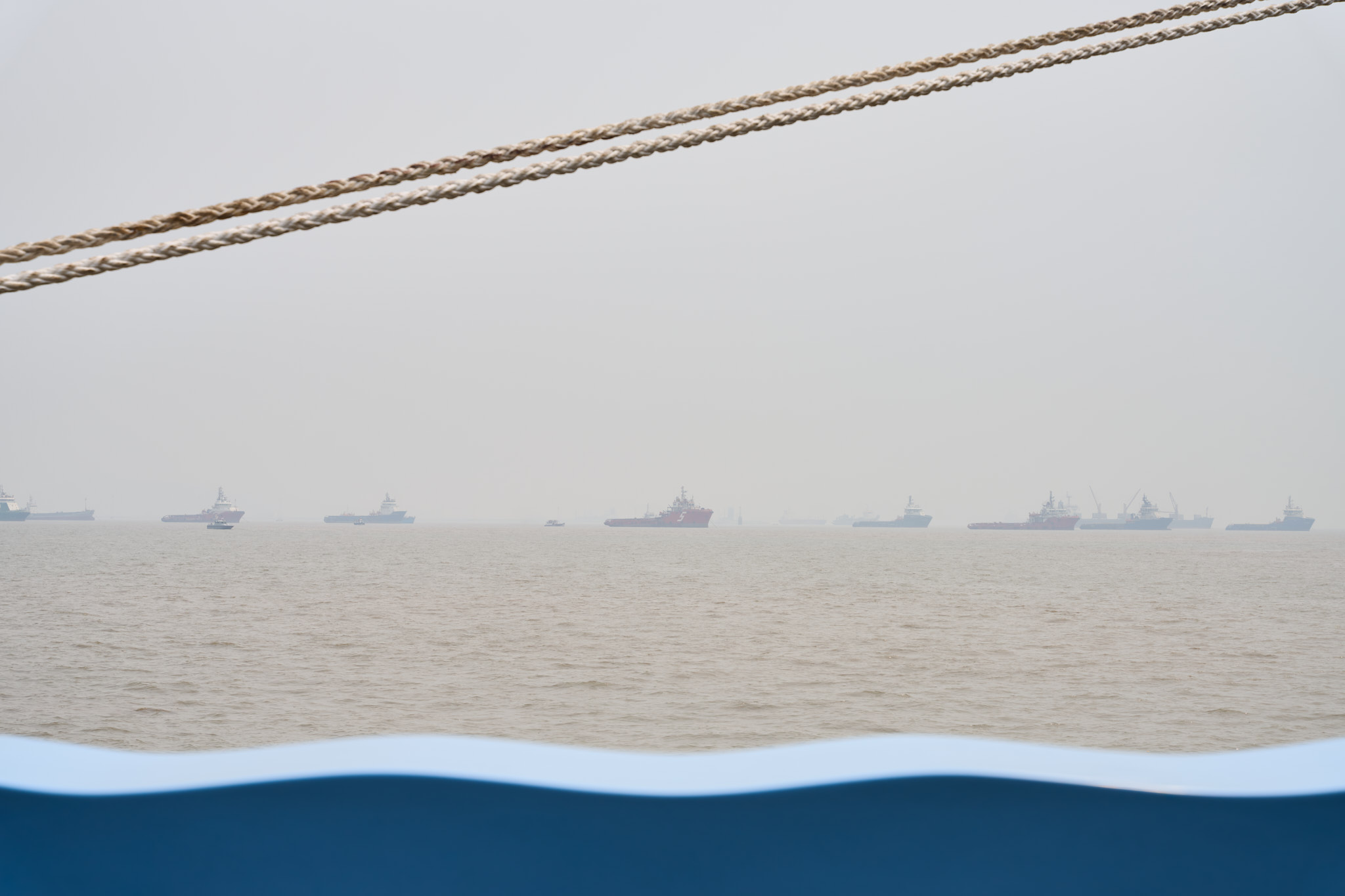
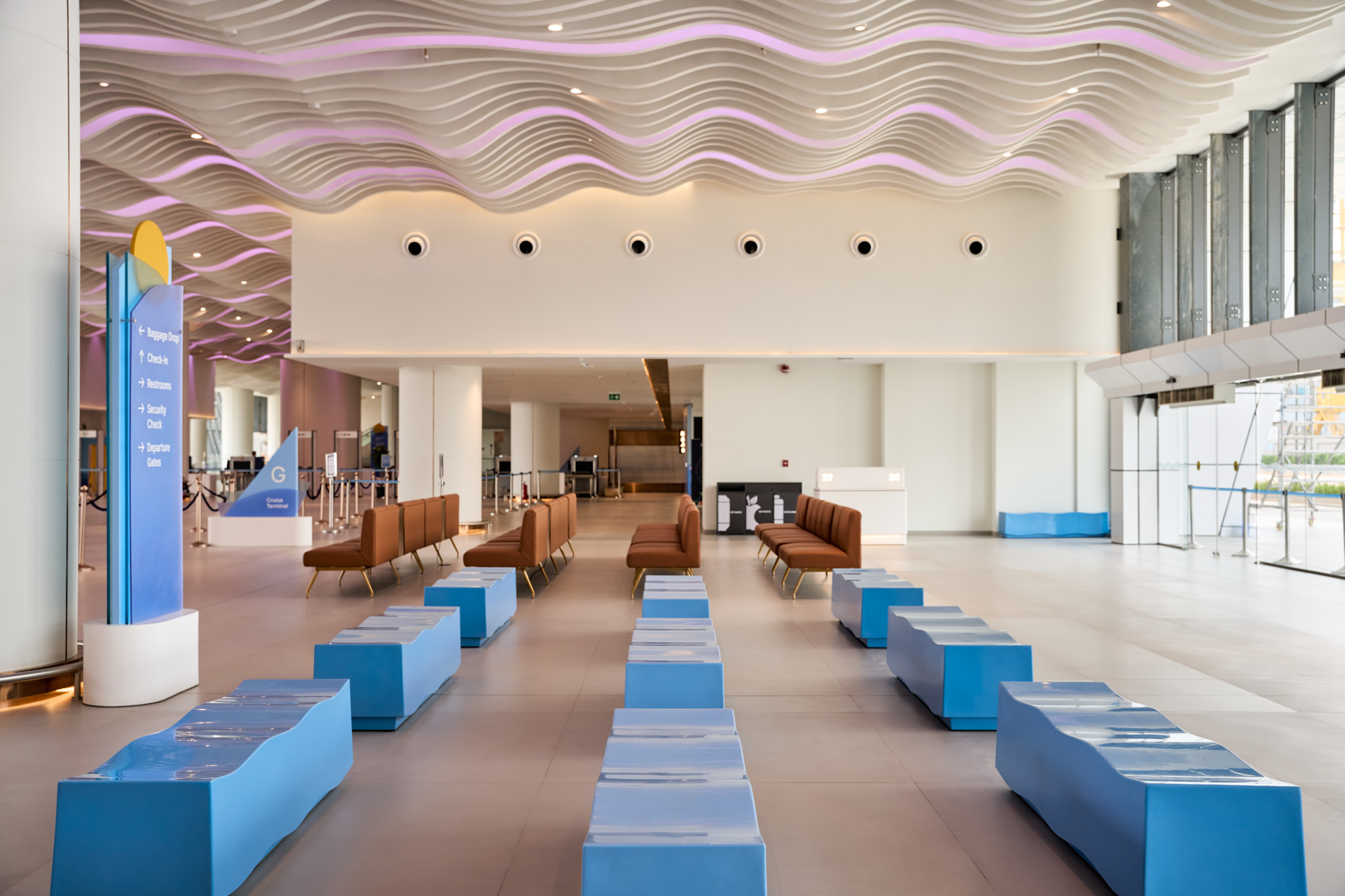
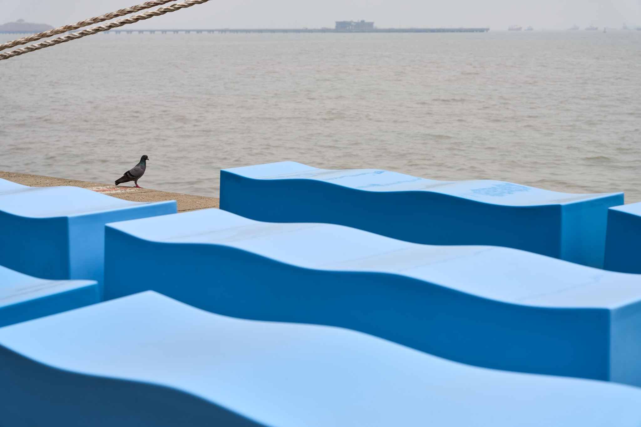
The Ballard Pier Cruise Terminal is Mumbai’s first international cruise terminal. Located in Ballard Pier—the city’s original downtown—it sits close to the Gateway of India and the shipping docks.
The terminal serves as the boarding point for cruise passengers and is part of a broader plan to revitalize the area, with future additions like restaurants and cafés expected to bring new energy to this part of the city.
The terminal serves as the boarding point for cruise passengers and is part of a broader plan to revitalize the area, with future additions like restaurants and cafés expected to bring new energy to this part of the city.
We were approached by creative consultant Neysa Mendes of A Good Slice. She is the Creative Director for The Ballard Pier project, providing overall creative direction for the architecture, interior design, branding, and wayfinding signage.
Neysa approached us to design seating for the departure and arrival lobbies. She had already identified the seating typology as a bench. Linking the graphic identity of The Ballard Pier, she had a clear notion of incorporating the wave graphic asset that forms part of the identity into the bench. This clarity resulted in the final design.
Neysa approached us to design seating for the departure and arrival lobbies. She had already identified the seating typology as a bench. Linking the graphic identity of The Ballard Pier, she had a clear notion of incorporating the wave graphic asset that forms part of the identity into the bench. This clarity resulted in the final design.
Dubbed the Wave Bench, it references the graphic asset and offers a finely tuned, undulating form that is comfortable for sitting.
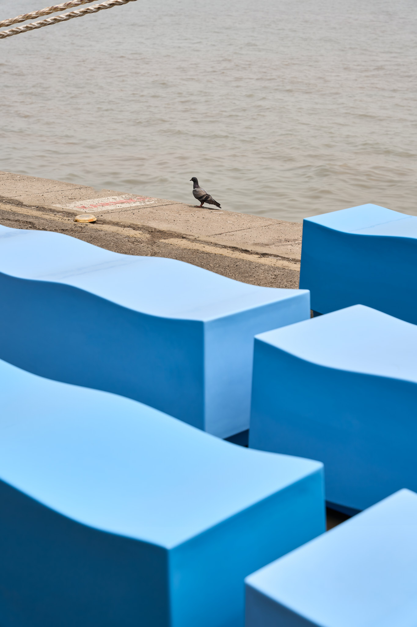
The Wave Bench was developed in fibreglass for ease of maintenance. A batch of 30 benches was produced by Exemplar Systems Private Limited. Two specific blue RAL shades were chosen by Neysa, based on the graphic assets and colour specifications used across branding and signage.
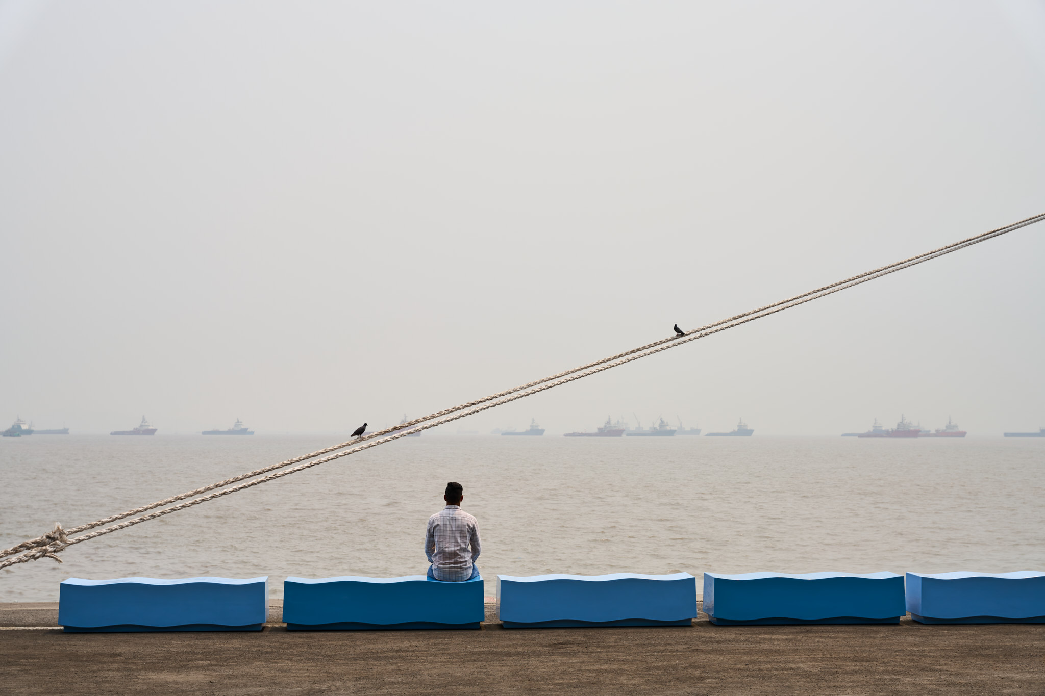
The benches placed across the terminal—in two shades of blue—reflect the sea just beyond.
The Wave Bench was developed in fibreglass for ease of maintenance. A batch of 30 benches was produced by Exemplar Systems Private Limited. Two specific blue RAL shades were chosen by Neysa, based on the graphic assets and colour specifications used across branding and signage.
The benches placed across the terminal—in two shades of blue—reflect the sea just beyond.

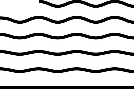
The Ballad Pier’s graphic identity and one of their graphic assets


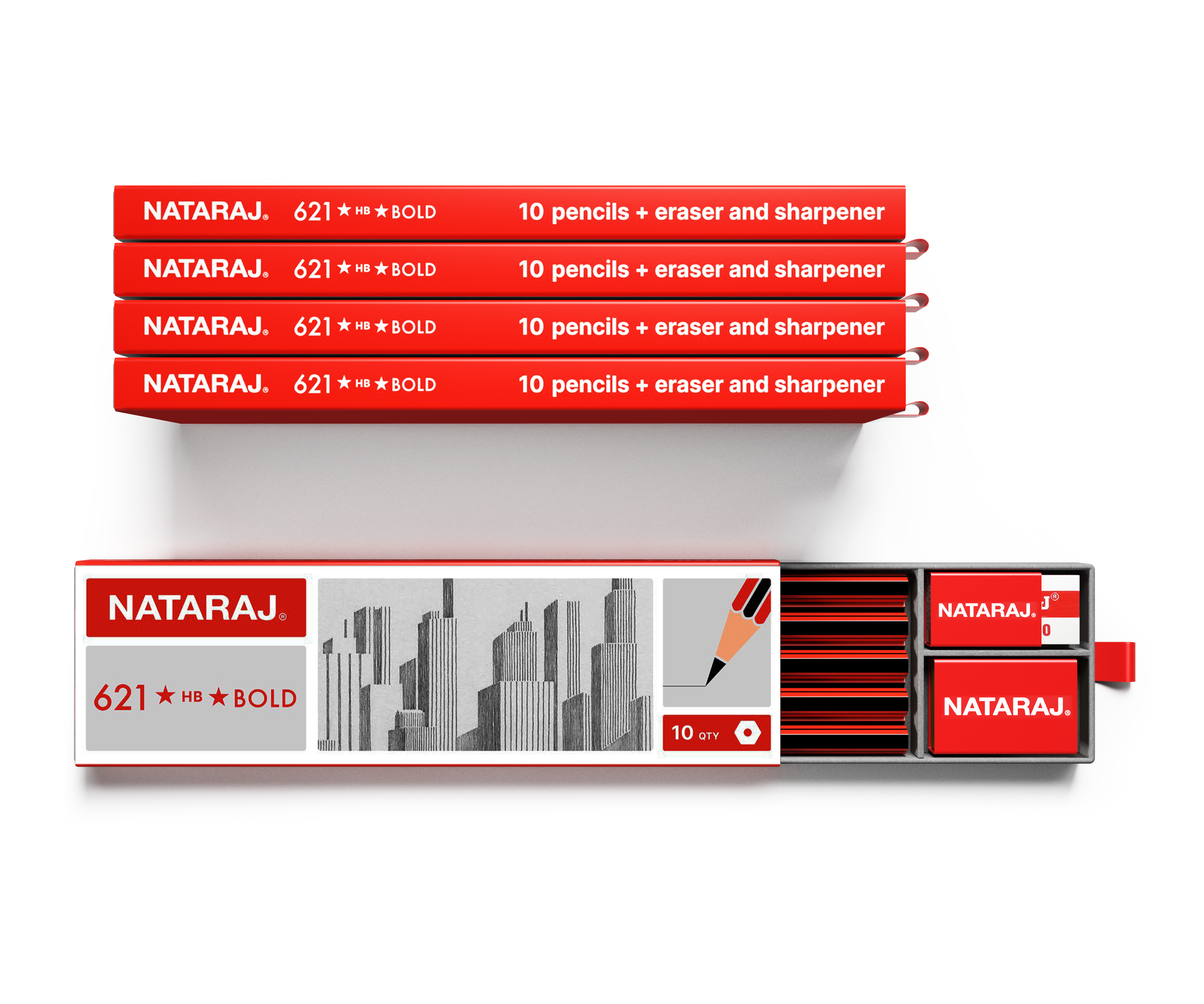
Hindustan Pencils packaging design
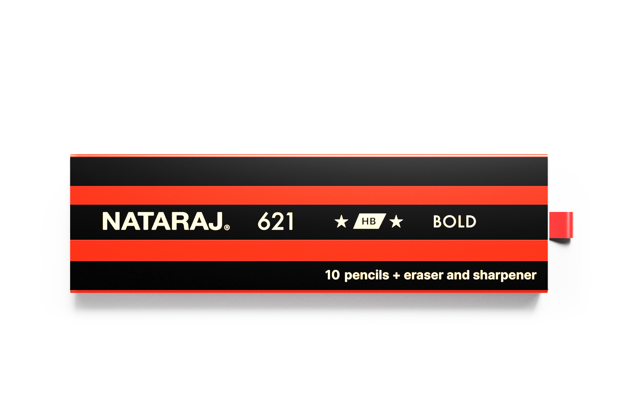

Nataraj 621 pencil is the most recognisable pencil in India. Their present packaging underplays the iconic red and black stripes on the pencil and focuses more on repetitive messaging and illustrations.
When asked to present a design direction for the packaging, we felt it to be best to celebrate the 621 pencil appearance and carry the stripes and the pencil graphics onto the packaging. A small detail includes a red loop to pull out a tray that holds the pencils, an eraser and a sharper.
An alternate packaging concept explored a graphic system that can be extended across 621 as well the other pencil sub brands.
Rather than complex messaging, a very cost effective table top paper dispenser displays the package with a label that simply says ‘The better pencil’.
Our hope is to have this dispenser placed on the cash till counter across multi category small and large format shops and encourage people to buy an original iconic pencil from India.
Collaborator: Venu Ravindranth
Our hope is to have this dispenser placed on the cash till counter across multi category small and large format shops and encourage people to buy an original iconic pencil from India.
Collaborator: Venu Ravindranth


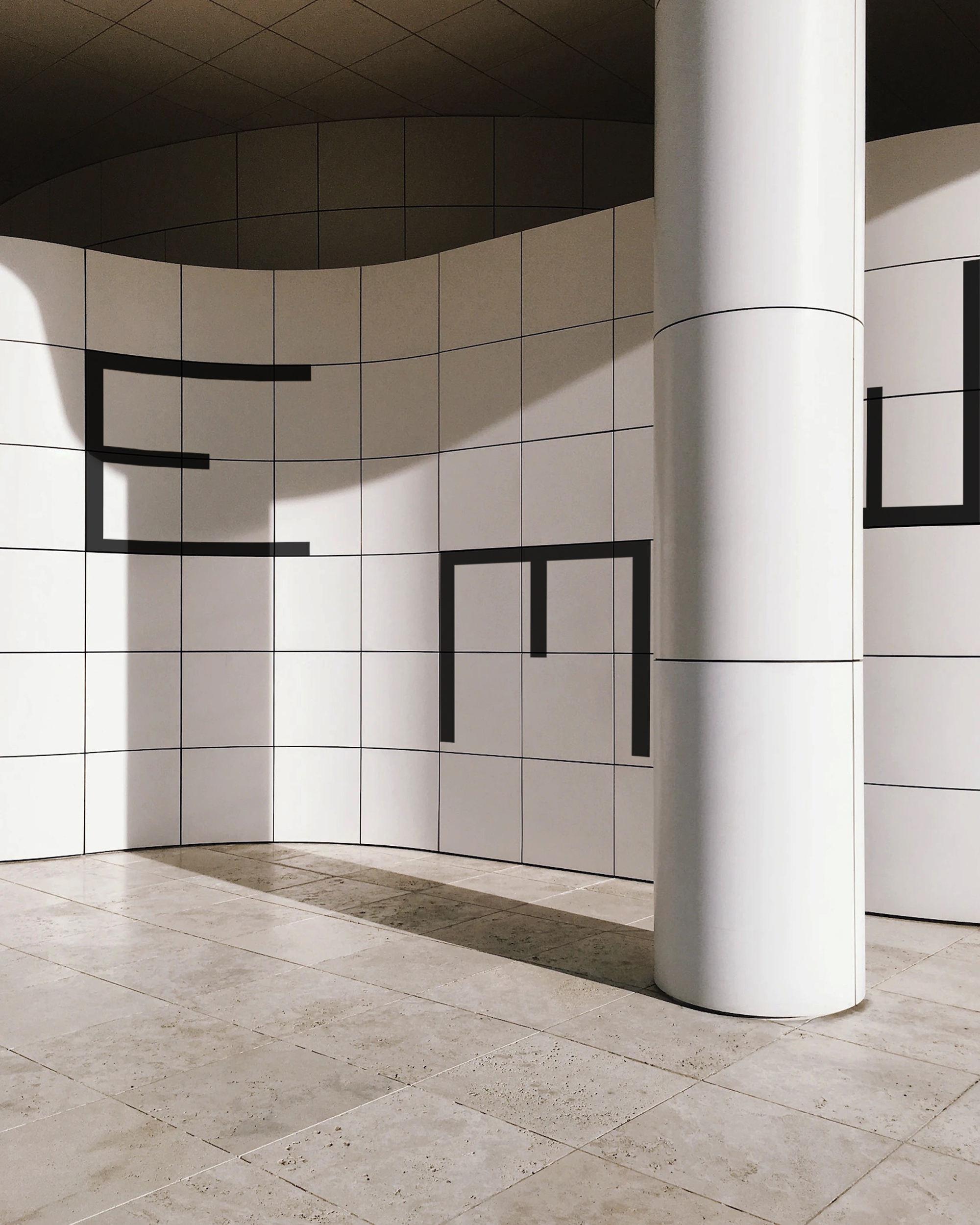
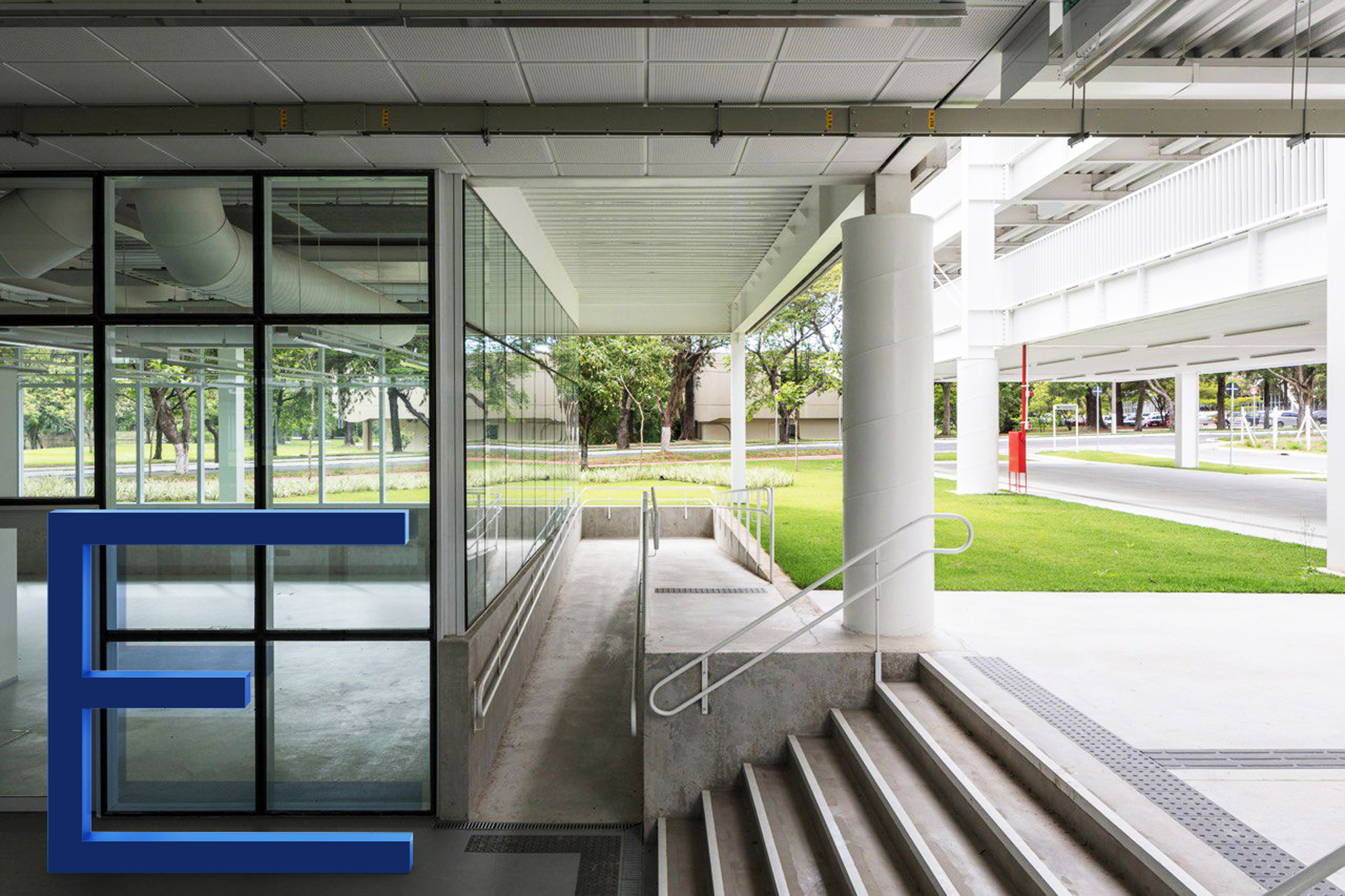
Elsewhere brand positioning, nomenclature, identity design

Elsewhere is a real estate development brand owned by LaRuche Group with a sharp focus on design. The brand is driven by its love of design ideals: design simplicity, systems thinking, materiality, visible construction details, technology and innovation. Elsewhere proposes to build homes across India and other geographies and reach an audience that shares similar values of design and simplicity.
Elsewhere holds architects and designers such as Le Corbusier, Tadao Ando, Carlos Scarpa, George Nakashima, Luis Barragan, Mies Van Der Rohe and the Bauhaus design as its inspiration for proposing projects with authorship and originality.
Elsewhere holds architects and designers such as Le Corbusier, Tadao Ando, Carlos Scarpa, George Nakashima, Luis Barragan, Mies Van Der Rohe and the Bauhaus design as its inspiration for proposing projects with authorship and originality.
We developed a graphic identity that translates its design ideology to their contemporary practice. Built from the foundation of a minimal form and type, the identity encompasses the expressive values of the brand across collaterals.
Elsewhere sits comfortably under the Creator Brand archetype offering a brand promise of Innovation with a tone of voice as being Inspirational, Daring and Provocative.
Elsewhere sits comfortably under the Creator Brand archetype offering a brand promise of Innovation with a tone of voice as being Inspirational, Daring and Provocative.
Using type, a visual device and a wide colour palette as the foundation of the identity, the tools communicate the character Elsewhere’s work and design ideology.